
1 Introduction
The development of technology affects the learning methods used in education systems with new concepts such as distance flexible learning (DFL), electronic learning (eLearning) and mobile learning (mLearning) [1]. MLearning is an evolution of ITB's eLearning program (http://kuliah.itb.ac.id), combining the ability of electronic learning with the benefit of flexibility [2]. The MLearning application with video conference system was developed by Bandung, et al. [3], motivated by the problem of eLearning not being sufficiently flexible. User interface limitations on the mobile web makes students prefer accessing applications via a computer desktop. Therefore, an Android-based learning application was developed to ensure that students who are unable to attend classes can access it anytime and anywhere [3]. However, the development of the mLearning application was mainly focused on the implementation and functionality of the application, without considering the user interface design.
The user interface (UI) plays an important role in applications. It affects user effectiveness and learning outcomes. It is important for a designer to understand how to design UIs in a good way [4,5]. The purpose of the UI is to improve usability and shape the user experience. Usability is a quality attribute that represents the ease of use of a UI design [6] and how it can be used by a certain group of users to achieve certain goals effectively and efficiently, and make them satisfied within a certain context of use [7]. The user experience is the response of the user when interacting with certain products [8].
In a computer-based learning system, information is processed by the user through the UI as interaction intermediary [9]. The design process of an UI often poses challenges and difficulties to designers, as it must clearly deliver the information and deal with aesthetic goals [10]. The most common and widely adopted strategy for designers to convey information clearly and make users achieve their goals effectively is by visually directing the user's attention along certain paths through the web page design layout [11-13]. Meanwhile, to find the final design, the designer must design the layout iteratively, exploratively and correctively [14] to match user requirements and expectations.
Previous research has tried to solve the visual attention problem. One of them is the research by Pang, et al. in [13]. They proposed a user attention model based on temporal user attention behavior, applied in an automatic system. It is aimed at helping designers to create a visual path along the components of a web page by directing the user's attention to achieve his or her goal effectively. This approach improves user attention by automatically managing the scale, position, distance, and color of the content on dynamic web pages. Thus, it effectively directs the user's attention to the information that is relevant for achieving his or her goal.
Web and mobile design have similar characteristics. They both consist of a group of different elements that are semantically related to each other (e.g. text, images, and buttons) in 2D space [13]. This study tried to implement this model on a different platform, i.e. a mobile application, for which there are specific requirements. Mobile application design focuses on efficiency and discoverability [15]. Efficiency is a decisive aspect of user performance related to effectiveness [7]. Since there are limitations related to the screen size of mobile devices, it is important to deliver the information precisely and maintain user efficiency when they interact with the system [15]. Moreover, it is important to satisfy the usability goal of discoverability by supporting the ease of use in exploring the content, features and functions of the application [16,17].
Hence, this study proposes an attention model for mobile application design based on the user attention model from Pang, et al. in [13], which can
automatically analyze user attention and give recommendations for design improvement based on the efficiency of the layout design. The proposed model aims to help designers to direct the user's attention so he or she can reach their goal in the most efficient way and automatically analyze the iteration process in usability engineering by considering effectiveness and efficiency. By directing the user's attention, it is hoped that the mLearning application can be improved in such a way that it results in a better learning experience and improved student performance (effectiveness and efficiency) toward the UI design.
2 Related Works
2.1 Design Optimization and Automation
In [18], Jamil developed the Interior Point Algorithm and improved a UI layout adaptively by using quadratic programming for linear object functions. However, UI design is not just a collection of linear components or content that is read in sequence from top to bottom. UI design can use several reading patterns, depending on how the designer wants their design to be read [10]. The research about design automation by O'Donovan, et al. in [10] proposed an energy-based model. The model optimizes the scale and position of each component but does not consider other aspects, such as color, font type and text line breaks. It was implemented on single-page graphic designs such as posters, advertisements, leaflets, and others [10].
In contrast, web-based and mobile-based applications have a dynamic graphic design covering multiple pages. Thus, Pang, et al. [13] built their model to enable web designers to manage user attention through the visual flow of the interface design. The user attention model was built by analyzing eye-gaze fixation and transformed it into a transition and order path. The model was used to build a system that can automatically adjust the ratio, scale, distance, position, orientation, intensity, and color contrast of the components of web page designs [13].
The research by Pang, et al. [13] is the most relevant model for our research, a study on mobile applications. However, the user attention model still has some room for improvement. Firstly, the adjustment of the design depends on what the designer wants or needs. Secondly, the model directs the user's attention in order to make users accomplish their task effectively, but the efficiency of the usability factor is not considered.
2.2 User Interface Impact on Users
A user interface (UI) is the visual display or appearance of an application, website, or other technologies [19]. A UI is a medium for users, the access point to interact with the design. The UI design process aims to result in a good interaction for users in order to improve the usability of an user interface [20]. Usability represents how easily users can access an interface design. Usability is a quality feature that measures the usage convenience of a UI and refers to methods for improving the ease of use of a system through the design process [6]. ISO 9241-11 [7] explains that usability is how a product can be used by a certain group of users to achieve certain goals effectively, efficiently and gain satisfaction within a certain context of use.
The usability of a technology is important because it deals with user performance, effectiveness, and efficiency [7]. Effectiveness refers to accuracy and completeness in achieving certain goals. Efficiency refers to resources spent by the user to increase the accuracy and completeness in achieving their goals [7]. Moreover, users always have their own insights, feelings and responses toward the product; this is called the user experience (UX) [8,21].
2.3 Visual Attention
Visual attention is what users perceive in a design or the specific area on which they focus their attention. Understanding how users perceive and how users pay attention to a visual design is an important factor that can help designers make a design more effective [13]. As mentioned in prior studies, visual attention follows certain reading patterns that are widely used, e.g. the Z-pattern, the F-pattern, bottom-up and top-down [22,23]. However, the user's visual attention is not only determined by these patterns. Designers can manipulate the user's attention by arranging the interface's visualization appropriate to the goal or task the user wants to accomplish [13].
Creating an attention path to guide users toward the achievement of their goal is done by many web designers, since it delivers the information efficiently and helps users accomplish their goals more easily and quickly [11,24].
3 Methodology
Since this study concerns usability, two methodologies that have been developed to create UIs (usability engineering by Jakob Nielsen [25] and the user attention model by Pang, et. al [13]) were adopted in the iteration process. The user attention model was modified to help the designer refine the UI design and help users achieve their goals efficiently. This paper proposes a recommender system by adapting and modifying the model of Pang, et al. as shown in Figure 1.
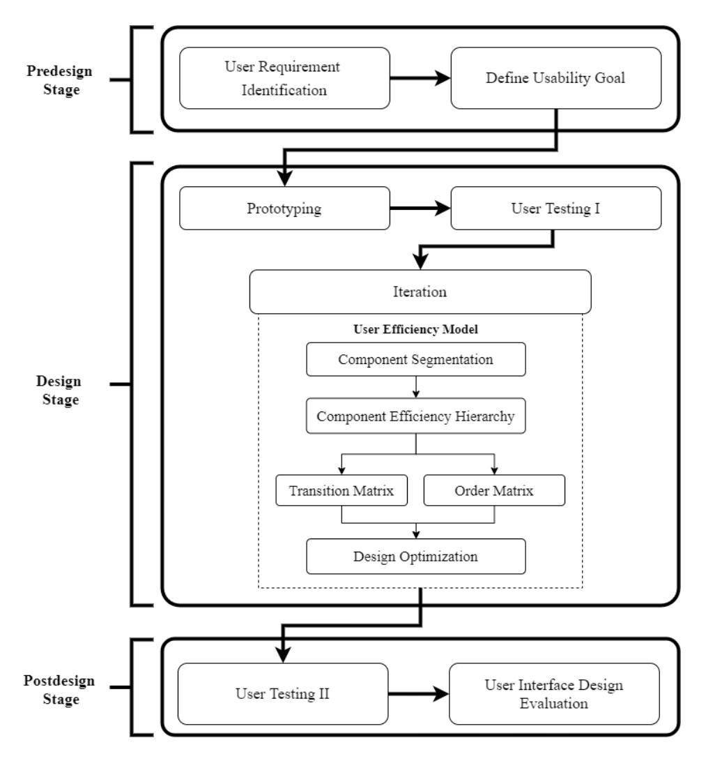
Figure 1 Proposed method.
3.1 Pre-Design Stage
The first step was identifying the user requirements of the mLearning application and transforming them into a flow diagram to know the interaction of the features over the different pages. After that, the designers defined the usability and the user experience goals that must be fulfilled by the design. In this study, the usability goal was based on user performance: the effectiveness and efficiency of the UI design and the UX. The usability goal was discoverability, since this factor is affected by user attention.
3.2 Design Stage
In this stage, the designers made a high-fidelity prototype that already had a wellbalanced layout of the user interface, called the first version of the design. Then, user testing was performed to test the first design version among 20 participants. During the test, their faces and screen activities were recorded.
User testing was held under task-driven condition, as shown in Table 1. Each participant was asked to finish tasks without receiving any clues about task completion and with no time limitation. After finishing several tasks, they were interviewed to collect user attention data within the design to validate the record.
Table 1 User testing tasks.
| Scenario | Related Page | |
|---|---|---|
| Task 1 | User should enroll certain subject | Home |
| Task 2 | User should find certain material in certain subject | Subject Menu |
3.2.1 User Efficiency Model
This research proposes a user efficiency model based on Pang, et al. in [13] to develop a recommender system for design optimization to direct user attention to the most efficient component. The attention model of Pang, et al. consists of two related constituents of attention motion among the components, i.e. transition and order. Both have their own modeling. Our proposed model creates a transitionand-order model based on the efficiency factor. Since efficiency is determined by time [7], the proposed model modifies both constituents by calculating the number of steps there are between a component and achieving the goal. The transition model is expressed as ( ( ) → ()), where − is the number of users that shift from to . The order model is expressed as ( ( ) < ()), where < is the number of users that see component right before .
3.2.2 Component Segmentation
The next step was segmenting the components of each one-page design. Design elements that are classified as components are icons, buttons, text related to tasks, and hyperlinked images. Each component of the design page was separated by the designers into a single component by making a virtual boundary segmentation.
3.2.3 Component Efficiency Hierarchy
Our proposed model modifies the arrangement of hierarchy in [13] by choosing the most efficient component as the highest level of the hierarchy because this research aimed to make a model that can guide users to the most efficient component. This means that the most efficient component has the least number of steps (l) to task completion.
More steps are less efficient or less related or there is no step that cannot be used to achieve the goal. Thus, this paper modified the ordered sequence (S) in [13] to \(S_E\), where \(S_E\) is the expected efficiency sequence. Each page design in this research has a specified path in an ordered sequence of hierarchical component efficiency, expressed as \(S_E = \{c_1, c_2, ..., c_k\}\), where \(c_1\) is the most efficient component and \(c_k\) is the least efficient component.
3.2.4 Transition Matrix
The user attention data from the first user test were used to make a transition matrix as in [13]. This matrix is used to see the number of users who transition from one component to another component in a page design [13]. The transition matrix is expressed as \(T(c_i, c_j)\) [13], where T is the percentage of users that shift their attention from component \(c_i\) to component \(c_i\).
3.2.5 Order Matrix
An order matrix was used to study the order of the temporal sequence of user attention toward the design during the first user test [13]. The order matrix is expressed as \(O(c_i, c_j)\) [13], where O is the percentage of users that see component \(c_i\) before component \(c_i\). The order matrix was normalized as Eq. (1) [13]:
\[\hat{0} = \sum_{i=1}^{k} \frac{O(c_i, c_j)}{\sum_{i}^{k} O(c_i, c_j)}\] (1)
Then the normalized matrix is added up across the rows of each component as the order probability of actual user attention, expressed as in Eq. (2) [13]:
\[h(c_i) = \sum_{i=1}^k \hat{O}(c_i, c_k)\] (2)
Getting the actual user attention \(S_A\) from the calculation of \(h(c_i)\) is done by sorting them from the largest to the smallest.
3.2.6 Design Optimization
Design optimization was based on how much energy was needed by each component compared with the baseline of the total page design energy. The energy baseline was calculated from the condition where the hierarchy matches 100% with hierarchy \(S_E\). This means that the user attention of the tested users conformed to \(S_E\). Furthermore, the actual energy of the page design that we want to refine is also calculated.
This energy term was developed based on Pang, et. al [13] as attention term \(E_{att}\). \(E_{att}\) is used to direct actual user attention to conform to the sequence hierarchy \(S_E\). The attention term is formed from the order term \(E_{att}^0\) and the transition term \(E_{att}^T\) with Eq. (3) [13]:
\[E_{att} = E_{att}^0 + E_{att}^T (3)\]
The order term \(E_{att}^{O}\) is used to ensure that \(c_i\) in \(S_E\) is noticed before its successor \(S_i\). This term is defined as in Eq. (4) as follows [13]:
\[E_{att}^{0} = -\frac{1}{|S_{E}|-1} \sum_{C_{i} \in S} \frac{1}{|S_{i}|} \sum_{s \in S_{i}} [p_{o}(c_{i} < s) - p_{o}(s < c_{i})]\] (4)
where s is a member of set \(S_i\) and \(S_i = \{c_j | j > i, c_j \in S_E\}\). Then, the transition term \(E_{att}^T\) is used to ensure that the way the user reads the components matches the sequence of the components in \(S_E\). This term is determined by Eq. (5) below [13]:
\[E_{att}^{T} = -\frac{1}{|S_{E}|-1} \sum_{C_{i} \in S_{E} \setminus C_{k}} \left[ p_{t}(c_{j}|c_{i}) - \max_{e \in N_{i} \setminus C_{i}} p_{t}(c_{k}|c_{i}) \right]\] (5)
where \(N_i\) is the neighboring component of \(c_i\) directly adjacent to it and e is a member of set \(N_i\). Since mobile phones have a compact screen and our model includes all components on a page, we replaced variable e from [13] with \(c_k\). Thus, the transformation of variable e in \(p_t(c_j|c_i)\) and \(p_t(c_k|c_i)\) is defined as in Eqs. (6) and (7) as follows, respectively:
\[p_t(c_j|c_i) = \frac{p_t(c_i \to c_j)}{\sum_{i=1}^k p_t(c_i \to c_k)}\] \[\tag{6}\]
\[p_t(c_k|c_i) = \frac{p_t(c_i \to c_k)}{\sum_{i=1}^k p_t(c_i \to c_k)}\] (7)
The attention energy of each component is compared with its baseline. The difference shows the designer if the energy of each component should be increased, decreased, or retained. Then, the designer iterates the design based on the recommendation from the energy term.
3.3 Post-Design Stage
After the redesign process was finished, a second user test was performed with the same participants. It was used to evaluate the usability and user experience of mLearning after its UI was iterated based on the proposed model. The efficiency was measured by the overall relative efficiency metric, the effectiveness was measured by task completion, and the user experience was measured by the first-click percentage.
4 Result and Discussion
Two page designs ('Home' and 'Subject Menu') were chosen to represent different tasks. Figures 2 and 3 show a comparison of the designer's expected user attention (left) and the actual user attention (right), which were totally different.
Then, the attention energy was calculated to know each component's attention energy in order to make a recommendation for the design iteration process based on Eq. (3). Based on the \(E_{att}^T\) for the page 'Home' (see Figure 4), the lowest attention energy (indicated by a solid line) was shown by \(c_1\), which means that this component had the largest gap with its baseline (dash line). The users passed over \(c_1\) and \(c_2\) because they were too small and did not look like clickable buttons.
The highest energy was owned by \(c_5\) and \(c_6\), which indicates that the users tended to focus their attention on large pictures with bright colors contrasting with the background. As shown in Figure 2, \(c_1\) was read after \(c_5\), \(c_3\), \(c_6\). This component had low energy because it was not read according to the sequence in which the page should be read. The actual user attention of page 'Home' was \(S_A = \{c_5, c_3, c_6, c_1, c_2, c_7, c_8, c_4, c_9\}\).
Figure 2 Design version 1: user attention comparison for the page 'Home'.
Figure 3 Design version 1: user attention comparison for the page 'Subject Menu'.
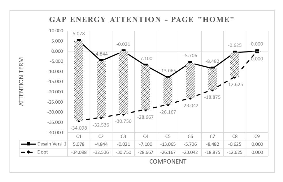
Figure 4 Attention gaps for the page 'Home'.
The \(E_{att}^T\) for page 'Subject Menu' (in Figure 5) shows that \(c_1\) (solid line) had the lowest attention energy and had the largest gap with its baseline (dash line). Meanwhile, \(c_2\) had the highest energy and was closest to its baseline, since most users accomplished task 2 by first looking at this large and eye-catching menu. They said that they did not even see the other components because they already found \(c_2\). Moreover, they did not realize that the goal of the second task could be achieved with only one click on \(c_1\), because its color did not attract their attention. As shown in Figure 3, the actual user attention of the page 'Subject Menu' was \(S_A = \{c_2, c_5, c_3, c_6, c_4, c_1\}\).
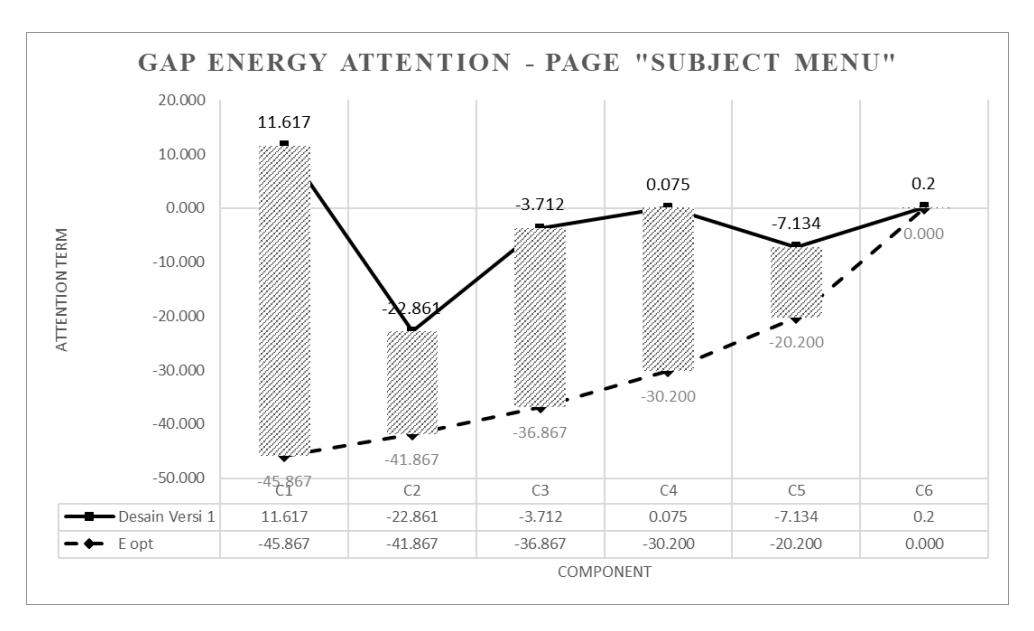
Figure 5 Attention gaps for the page 'Subject Menu'.
After that, the designer refined both UIs referring to the energy gaps generated by the recommender system by looking at the stripe-bar in Figure 4 to iterate the page 'Home' and to Figure 5 to iterate the page 'Subject Menu'. Making an automatic design refinement in graphic design is very difficult [10] and sometimes does not deliver a satisfying result [13], since it involves artistic taste, which is impossible to compute. Hence, this study used the energy gaps as a benchmark for the designer to iterate it manually
Figure 6 presents the result of the design iteration process by adjusting the color, contrast, brightness, size, and font thickness in each design. For example, \(c_1\) of page 'Home' (left) was changed by adding a boundary that makes it look like a clickable button and it was made yellow and the font was made larger and bold to make it stand out more. Then, \(c_5\) and \(c_6\) were modified by changing the partition into three columns with a darker background color and making the icons smaller. The icon's color was deliberately made less bright than that of buttons \(c_1\) and \(c_2\). Another significant change was in component \(c_2\) of the page 'Subject Menu' (right). To make the users notice \(thc_1\), the icon of the subject was changed by adding a correlated icon with a larger size and make it vertically arranged with a lighter background (grey). To make the user read \(c_1\) before \(c_2\), the designer decreased the size of each icon of menu \(c_2\) and changed the background to a darker color (black).
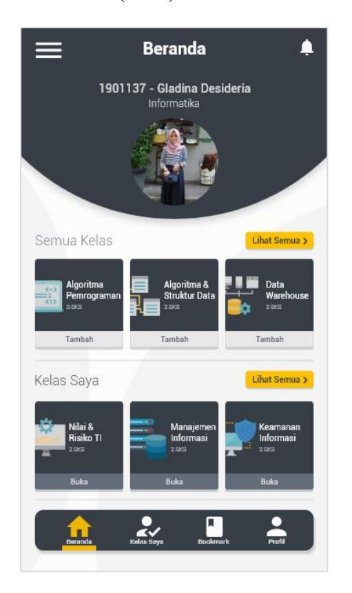
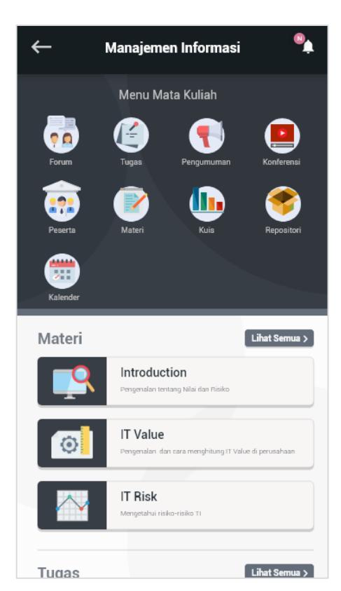
Figure 6 Result of design refinement (design version 2).
After the design iteration was conducted, design version 2 was tested among the 20 participants. The result of the second user test for the page 'Home' showed that the proposed model could increase the attention energy \(E_{att}\) of some of the components. As presented in Figure 7, \(c_1\), \(c_2\), \(c_3\) and \(c_6\) had higher attention energy than before (see the solid line). Even though the model could not completely raise the user attention to baseline energy (shown in Figure 4), at least \(c_1\) now had the highest attention energy. This means that the users chose \(c_1\) as the initial point of their order and transition matrix and saw it as the most efficient component to complete their task. Although the energy of some of the components was increased, the actual user attention of the page 'Home' was still not sequenced as expected. The actual user attention was \(S_A = \{c_7, c_1, c_3, c_5, c_6, c_2, c_4, c_8, c_9\}\). Users tended to read the label of component \((c_7)\) first and then looked for the component that only related to their task \((c_1)\). Also, they preferred looking at an attractive picture \((c_5, c_6)\) or at the bottom navigation \((c_3)\).
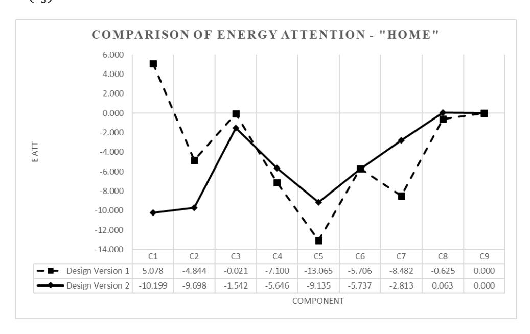
Figure 7 Attention energy comparison for the page 'Home'.
The result for the page 'Subject Menu' in Figure 8 shows that some components \((c_1, c_3, c_4)\) had attention energy enhancement, indicated by the solid line. Although \(c_1\) strongly increased, it still could not exceed the energy of \(c_2\). \(c_2\) constantly grabbed the user's attention and was the component that was most visited by the users. Nevertheless, the actual user attention of this page almost reached the expected user attention \(S_E\) with \(S_A = \{c_1, c_4, c_2, c_3, c_5, c_6\}\). This proves that the design iteration could change how the users read the components. The same as with the page 'Home', the reason why \(c_4\) was second in the order of \(S_A\) was simply because the users tended to read the label of something first or right after they looked at something to make certain.
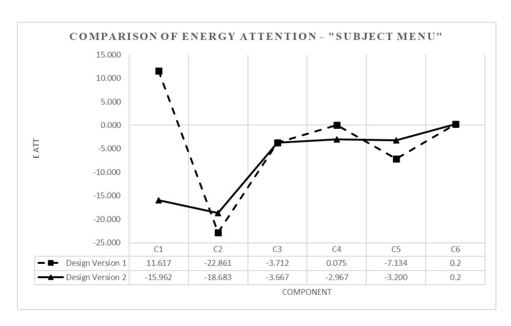
Figure 8 Attention energy comparison for the page 'Subject Menu'
4.1 Usability Evaluation
An evaluation related to reaching the usability goals (effectiveness and efficiency) was performed. The effectiveness was measured by task completion according to [26,27] and the efficiency was measured by overall relative efficiency based on [26,27]. Table 2 presents the result of the usability evaluation.
Table 2 Usability evaluation.
| Usability goals | Metrics | Design version 1 | Design version 2 |
|---|---|---|---|
| Effectiveness | Completion rate | 92.5% | 90% |
| Efficiency | Overall relative efficiency | 83.65% | 85.58% |
After the design iteration from design version 1 to version 2, the effectiveness of mLearning decreased from 92.5% to 90%. However, this number is still in the safe range and above average. Sergeev in [26] states that products with an effectiveness range of 90-100% are within the 'good' range and Sauro in [28] states that the average rate of task completion is 78%. In contrast, the efficiency increased from 83.65% to 85.58%. The design refinement helped the users to complete their task more rapidly by directing the user attention to the most efficient component.
4.2 User Experience Evaluation
Figure 9 shows the discoverability of each component on the page 'Home'. The result shows that in the usability test on design version 1 (stripe bar), 50% of the users first clicked on \(c_3\), 30% first clicked on \(c_1\) and 20% first clicked on \(c_6\). However, in the user test of design version 2 (solid bar), the discoverability of the most efficient component increased: 65% of the users first clicked \(c_1\), 25% first clicked \(c_2\) and 10% first clicked \(c_3\).
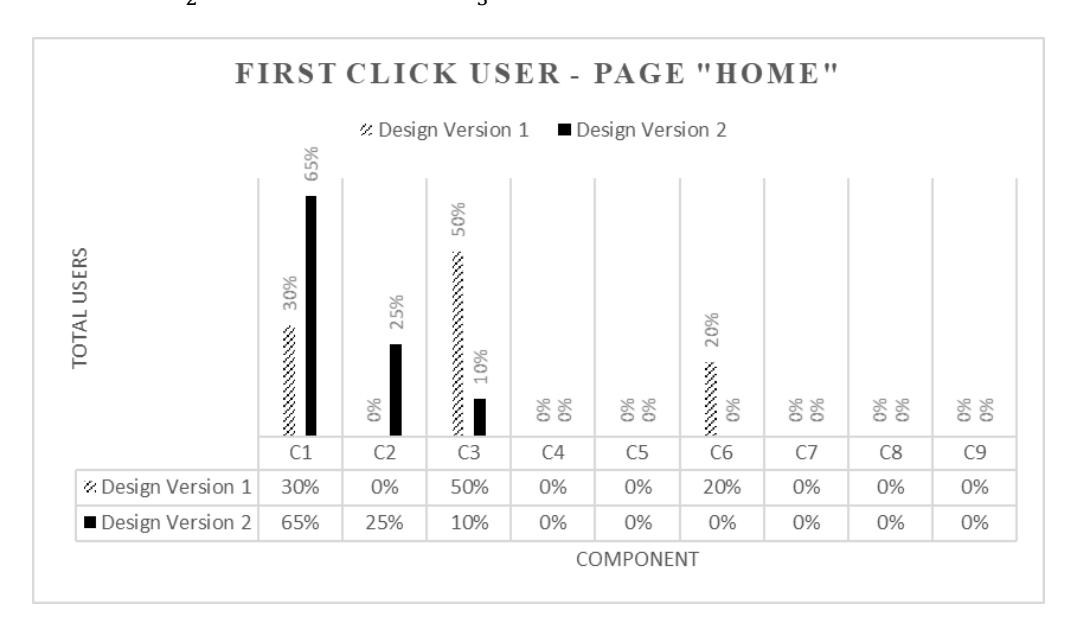
Figure 9 Discoverability for the page 'Home'.
Figure 10 shows the discoverability of the page 'Subject Menu'. The result shows that in the usability test of design version 1 (stripe bar), most users (80%) first clicked \(c_2\), followed by \(c_3\) (20%). Similar to the previous page, in the user test of design version 2 (solid bar), the discoverability of the most efficient component increased: 50% of the users first clicked \(c_1\), 15% first clicked \(c_2\) and 35% first clicked \(c_3\). The result shows better discoverability of the most efficient component within \(S_E\) on both pages, which reduced the task completion time and increase efficiency.
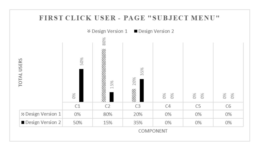
Figure 10 Discoverability for the page 'Subject Menu'.
5 Conclusion
The proposed model for design refinement could successfully direct user attention to the most efficient component. The components in the first user test that failed to attract user attention were noticed by the users in the second user test. The user experience goal, i.e. discoverability, helps users finish their task by being able to quickly find the most efficient component related to their task. The efficiency of the mLearning application increased from 83.65% to 85.58% between the first and the second user test, but the effectiveness decreased slightly.
From this study, other facts about visual user attention were revealed. First, users were interested in components with pictures and were attracted by colorful, bright and contrasting components. Size and layout also grabbed their attention more. The users tended to look at the textual information in a button first to make sure they clicked on the right button. The area of a mobile application that received most attention from the users was from the middle-top to the bottom of the screen. Discoverability has a positive impact on the efficiency of a user interface design. The more discoverable a component, the faster users complete their task. Thus, it is better if the designer directs the user attention to the most efficient component.
This research had several limitations. Some things still need to be improved in a future research. First, this recommender system is not yet able to provide definite and detailed suggestions about which color is supposed to be changed, to what
size a component should be changed, and other adjustments. It only shows what components should be improved and the designers then has to refine them intuitively. Second, in a next research it would be better to consider other usability and user experience goals to give a broader insight into user attention in mobile applications. Finally, since it is difficult to see at what component a user's eye gaze is directed at while using a compact mobile phone screen, the position of attention a could be determined more accurately if it was analyzed by an eye tracker.