

SARI
Salah satu tahap yang paling rnenentukan dalam proses kartografi adalah pernilihan simbol untuk memetakan data. Hal iri disebabkan oleh kenyataan bahwa simbol itu banyak sekali macamnya.
Manfaat peta sebrgai media komunikasi akalr sangat terasa bila simbol yang dipilih tepal atau cocok dengan maksud serta tujuan pembuatan peta tadi.
Tulisan ini membahas bagaimana cara memilih serta rnenggunakan simbol untuk suatu persoalan, khususnya yang menyangkut masalah distribusi.
* Tulisan ini dibuat sebagai usaha untuk mengandisa masalah penyajian data dalam pembuatan Atlas Nasional Indonesta, yang merupakan studi/bagian dad pekedaan t]-f'et tesearch war&) dalam MSc. Cartogaphy course, ITC, Enschede, Thc Nethetlaj\ds, 1982
** Staf pengajar pada Jurusan Teknik Geodesi, ITB-Kelompok Bidang Keahlian (KB() fotogramctri, Kartografi dan Remote S€nsing, sub kelompok kartografi.
In troduction
A r.nap contains information or data. This information is presented by means of symbols. ln other words, symbols are used to convey information. One of the tasks of cartography is to translate and represent this inforntation into map symbols. In most cases, this task is very critical. Here are some reasons: first, there are so many symbols which one can select; second, a map as a medium of communication should meet the purpose and also the need of the users;third, there are of course limitations such as scale, content, etc (Robinson, 1978). Thus, it is evident that the purpose of the nrap as well as the need of the users can be fulfilled if the choice of symbols for a particular information is correct ( Lewis. 1977).
With respect to graphic presentation, symbols fall into three basic catagories - point, line and area while information as mapping data can be differentiated into four classes: point, line, area and volume (Keates, 1973).
As a matter of facl betwecn symbols and mapping data there are some relatioDships. For a general guide rule, point symbols are used for point data, line symbols for line data and area symbols for area and volume data (Bos, 1973).
Apart from graphic presentation, there are other concepts of cluracteristics to be nrapped: qualitative and quantitative. In many cases, the application of the concept deals with distribution of statistic phenomena. Absolute representations, for example, refer to point and line syrnbols, such as: dots, squares. flow lhes, etc; while relative representations referto area symbols, e.g.: choropleth (Dickinson, I 973).
Although there is a distinction between absolute and relative representations in rclation to a particular symbol on the map. it is quite common to show these aspects of represenlation in conrbination for one particular purpose. For exam-Plc, in one area where administrative units are shown in relative representation it is also possible to represent an absolute distribution within each administrative unit. These two aspects of the same situation can usually be accommodatcd on one map. saving space and work and giving convenient of complementary aspect of the situation (Chang, 1976).
The problem
The idea of the con)bined implication was used because of the cartographer's efforts to make the best use of infortnation or data available, in relation - from the user's point of view - to further study.
Questions such as: what sort of phenomena cor.tld be extracted from information/data given, or to what extent did information/data meet the purpose, etc, were also an interesting part of the whole cartographic process.
In a particular problem of mapping industrial workers in Sumatera, Indonesia, the following data were given:
- a. population; number of people, with 2 age group divisions distributed up to the second level of administrative unit (thus 'propinsi' and 'kabupaten'; note that Indonesia has three levels of administrative unit, i.e.: propinsi, kabupaten and kecamatan).
- b. Industry, number of employees/labourers of the so called light industry with 5 divisions:
- (1) food
- (2) building & construction
- (3) chemical
- (4) handicraft
- (5) others
Data refers to the second level of the administrative unit.
The data were taken from statistics of 1976 and supplied by The office of Cencus and Statistics, Jakarta.
In principle, making the best use of available data (for example: combining absolute/point symbols and relative/area symbols), were suitable here. Therefore the number of employees/labourers of light industry could simply be shown with 5 divisions in absolute value using point symbols, such as: bar, pie graph or block pile over the area of one particular administrative level — as a back ground — in terms of relative value, such as: density. It was requested that combination of absolute and relative point and area symbols will not spoil either perception or legibility.
Further, the scale of the base map to be used for presentation was 1:2,500,000.
The approach
Based on the available data, population did not refer to the acreage (areal extent), which means that relative values cannot be calculated. One could obtained the acreage from other sources. However this was not done here. So it is clear that the distribution of population, as a relative value and also as a back ground has failed because no calculation could be made.
What other sort of information from the data available should be used as a background?
Further study showed that there are possibilities of showing the total number of workers in light industry over the total working population as a background. Here, the assumption was made from divisions of age group in population data (first age group — over 17 years old — is considered as working population) (see
Table 1). It can be applied to the second administrative level in order to show a better distribution.
The remaining problems are shapes of unit areas, number of classes and class limit determinations.
The next problem that arises is concerning areas of the administrative units. The structure of administrative units in Indonesia indicates that certain towns may have the same administrative level as the particular area where in it town is located. As the scale of the base map is 1:2,500,000, it is clear that towns will be represented by means of point symbols, e.g.: dots. Thus there are areas (area symbols) and towns (point symbols) of the same administrative level.
Most of those towns are important and it may be that more than one town exists within an area (see Fig. 1). On the other hand, important towns sometimes employ more workers than an area to which the town is geographically referred to (see Table 2).
Bar and pie graphs (see Fig. 2a and 2b) for showing divisions of distribution — in terms of absolute value — are execellent symbols, but the consideration of scale and space available will pose a problem.
From data available it is evident that there is a large discrepancy (range) between minimum and maximum values for using bar graphs (see Table 3).
Generalisation may be the solution, but again this does not apply here, as the user want the absolute value. So, in representing the minimum value of 5 workers as 1 mm, then the maximum value of 3335 workers will be 667 mm. This is of course far too long. Consequently these symbols will not meet the purpose.
The second choice is using a pie graph. As a full circle it will represent the total number of workers and will be divided into 5 sectors as a proportion of a whole, it seems that this is a better solution. If one stick to the problems of absolute value, the only way to represent a full circle is to take the value as it is and determine the radius of the circle based on that velue. Usually this is implemented by taking the square root of the value to be proportional to the radius (R). Using formulae \(\sqrt{\text{value}} = R\), the range of radius from data available is between 1 and 26 mm (if \(\sqrt{5} = 1\), then \(\sqrt{3335} = 26\)).
This means that the problem of range is somewhat solved, but if we look at the space available it may raise problems. First, it will spoil the background and second, it is difficult in terms of perception, which also implies the legibility aspect. If we consider only the first problem, some may argue whether this is really a problem. Several thematic maps and atlasses gave solutions to similar problems, drawing pie graphs within areas of relative values, neglecting the problem of the background. It is true that if the distribution phenomena is only emphasised in terms of an approximate distribution over the area, then the consideration of the background has no sense.
Table 1 The 1st age group of population and its total number of workers where the total is considered as the number of working population in one particular area. The total number of workers in light industry is shown on the right.
Province (1st adm. level): Sumatera Barat
| No. | Kotamadya/Kabupaten (2nd adm. level) | POPULATION | WORKERS IN LIGHT INDUSTRY | |||||||||
|---|---|---|---|---|---|---|---|---|---|---|---|---|
| (1st age group) | (2nd age group) | Total | Types of industry | |||||||||
| male | female | male | female | 1st age group | 1 | 2 | 3 | 4 | 5 | TOTAL | ||
| 1. | Padang | 65.695 | 62.363 | 50.328 | 49.739 | 128.058 | 180 | 95 | 35 | 95 | 95 | 415 |
| 2. | Bukittinggi | 18.607 | 19.992 | 16.183 | 15.579 | 38.599 | 420 | 130 | 20 | 20 | 100 | 690 |
| 3. | Sawahlunto | 3.649 | 3.684 | 3.011 | 3.042 | 7,333 | 25 | _ | _ | _ | _ | 25 |
| i | ĺ | |||||||||||
| 12. | Pesisir Selatan | 66.326 | 74.438 | 68.492 | 76.700 | 140.764 | 40 | 20 | _ | | - | - | 60 |
| 13. | Tanah Datar | 80.973 | 95.948 | 68.769 | 71.921 | 176.921 | 960 | 20 | _ | - | 985 | |
| 14. | Sijunjung | 48.497 | 48.936 | 41.061 | 40.907 | 97.433 | 230 | 25 | 5 | _ | 20 | 60 |
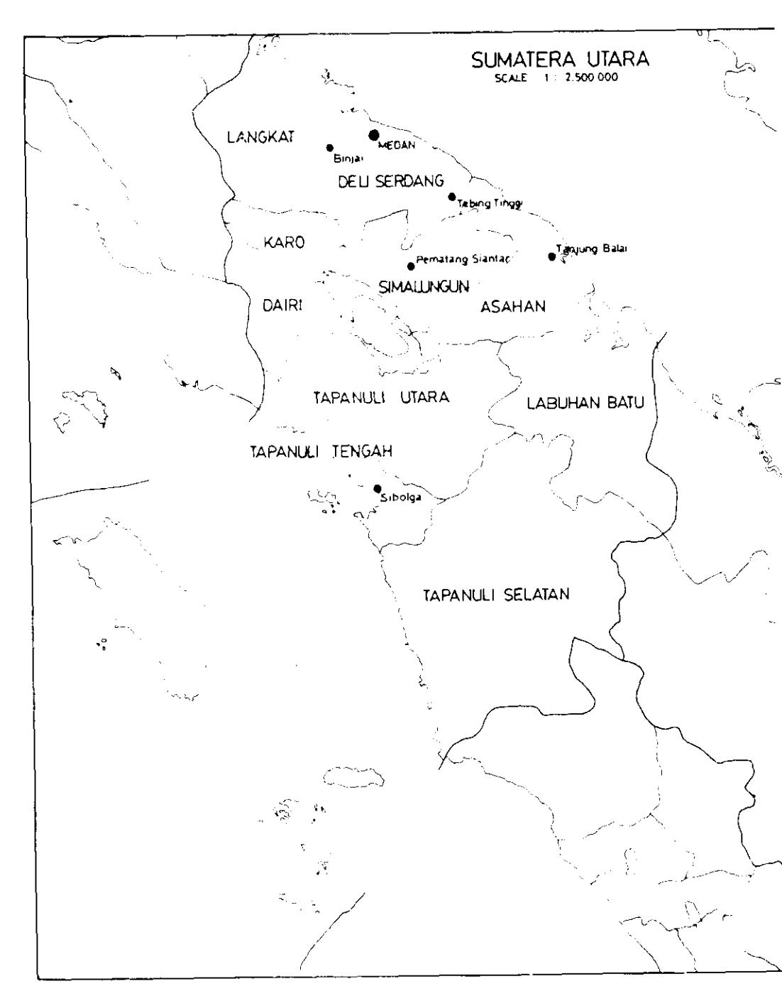
Figure 1 In the second administrative level of 'kabupaten' Deli Serdang, there are 3 towns: Medan, Binjai and Tebing Tinggi where the towns have the same administrative level as 'kabupaten'.
Table 3 Medan, the capital of the province/important town, employed more workers than the area of 'kabupaten' Deli Serdang where the town is geographically located
Province: Sumatera Utara
| Vatamedus/Valunatan | Workers in light industry | |||||||
|---|---|---|---|---|---|---|---|---|
| Νo. | Kotamadya/Kabupaten (2nd adm. level) | Total | ||||||
| 1 | 2 | 3 | 4 | 5 | ||||
| 1. | Medan | 1010 | 680 | 200 | 460 | 985 | 3335 | |
| 2. | Tebing Tinggi | 180 | 10 | _ | 10 | 45 | 245 | |
| 3. | Binjai | 115 | _ | 10 | 55 | 180 | ||
| 4. | Deli Serdang | 1000 | 180 | 15 | _ | 35 | 1230 | |
Figure 2a
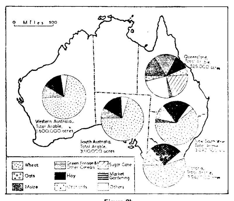
Figure 2b
Figure 2 Application of bar and pie graph. (Dickinson, G. S.; 1973; fig. 123 and 133).
However, this is not the case here. Therefore, the idea of having a pie graph as an absolute value over the area in a relative value as a background will not solve this particular problem.
The solution
As bar and pie graphs create problems of background, another solution must be found. Several possibilities have been investigated and finally block-pile symbols area choosen.
This symbol is one of the possibilities of absolute value representation. Absolute values can be depicted in one particular block-pile by a unit of blocks or cubes. Placing it on the map within the relevant administrative unit is easy, because in this particular problem, it saves space. When applied to a town, which has the same administrative level as an area, it can be implemented by simply putting an indication on it.
On determination of class intervals for relative area symbols, it shows that the density of total number of workers in light industry compare to the total working population in second administrative level, has a small deviation. T'he range of percentage is O,02% to I ,8%. This value has no significance. However in relation to the relative value, symbols can still be represented. Nevertheless this does not apply here. Instead, class intervals are based on standard deviation, since the area of the second administrative level in 7l and a better distribution are needcd. As a result,4 class intervals are determined (see Fig. 3).
Table 3 The discreoancv between values
Region : Sumatera
| No. | Kotamadya/Kabupaten | Total number of worke,s in light industry | ||||
|---|---|---|---|---|---|---|
| 1 . | Aceh Selatan | 145 | ||||
| 1;. | Sabang | 1 0 | ||||
| za. | Medan | 3335 | ||||
| 59. | Musi Banyuasin | 2815 | ||||
| oo_ | Bengkulu Utara | |||||
| 71. | Tanjung Karang | 56 | ||||
Conclusion
An application of block-pie symbols in this particular problem is prornising. Comparisons of value - the number of workers in industrial divisions - can be shown by means of proportional values.
Block-piles can also be arranged in such a way that as a whole it gives a good impression of d istribution.
References are made to Fig. 6, in which the industrial workers in Sumatera are portrayed as block-pile symbols of absolute point symbols in combination with relative area symbols.
Figure 3 shows how it is applied to a particular area, in this case a crowded area of West Sumatera.
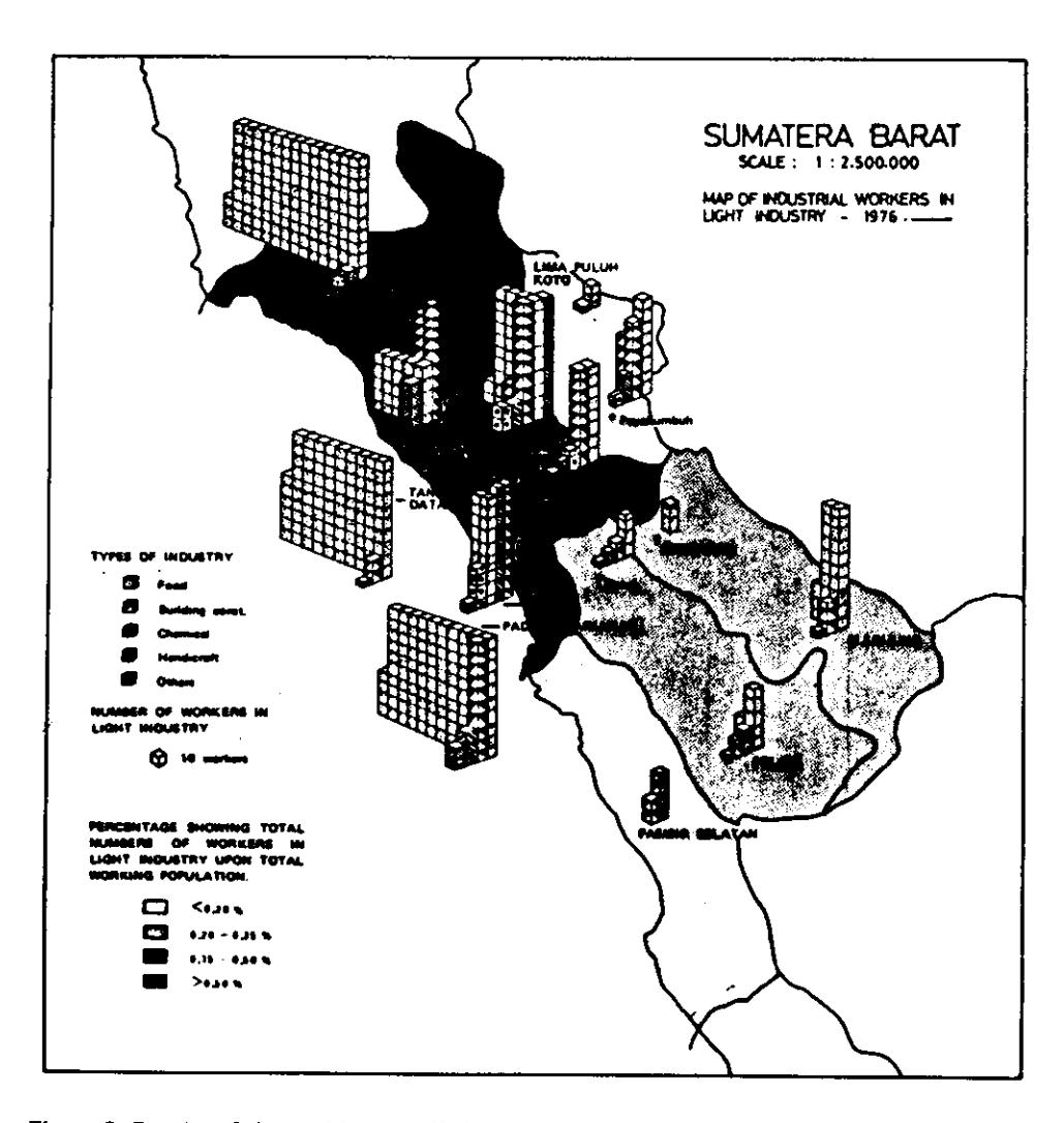
Figure 3 Results of the problem, applied to a typical crowded complex area.
Acknowledgement
I deeply appreciate the help of A. Brown, MA (ITC, Enschede, The Netherlands). for his guidance and encouragement throughout the preparation of this research work.