
1 Introduction
Hospitalization has a psychological impact on pediatric patients. Research has shown that hospitalization can be a traumatic experience for both children and parents. The hospital can be a wholly new place and atmosphere for children, causing certain reactions and greatly affecting them during hospitalization [1]. Furthermore, hospitals are complex and often high‐stress environments where people need information to be able to better understand, navigate and use the surroundings. Thus, information provided by environmental graphics is needed, i.e. a signage system to help visitors find their way. Moreover, a family-friendly environment is important in helping parents to overcome the stress of their child's hospitalization, contributing positively to the patient and family experience [2]. At Hermina Hospital Depok, there is currently no uniform signage system, which makes visitors tend to ask for directions from security personel instead.
Based on the existing problems, it is necessary to design a communicative, attractive and educative environmental graphic design (EGD) that uses color coding to support child development. Color coding means to use color to communicate meaning and to emphasize the message and differentiate it from other messages [3].
Based on the phenomena above, the following research problem was formulated: (1) how to create an environmental graphic design (EGD) for a children's hospital that is communicative, attractive and educative, and (2) what is the role of color coding in design? The purpose of this study was to design an effective EGD in a children's hospital as a means of communication and education for patients and visitors, especially children. Another aim was to apply color coding to a complex environment, i.e. a children's hospital.
2 Literature Review
2.1 Environmental Graphic Design (EGD)
The Society of Environmental Graphic Design defines environmental graphic design (EGD) as a diverse field that embraces the planning, designing, and installation of graphic elements in the built environment [4]. EGD has a clear goal, i.e. to communicate information through words, symbols, diagrams, and images. EGD plays an important role in creating a clear environment and providing opportunities for people to be able to find their way directly [5]. There are three important components in EGD [5].
The first is a signage or wayfinding system through which people can orient themselves in a place. Signage is a system of signs carrying symbols and textual communication in environments with high mobility, which avoids verbal language limitations [6]. Related to the context of buildings, Rubenstein [7] defines signage as a system of signs that serves to provide information and communication. In a hospital, the information provided can include things such as a hospital floor directory, registration flow, and children's health information. Carpman, Grant & Simmons [8] argue that healthcare facilities need a coordinated wayfinding system because the easiness or difficulty of wayfinding affects stress.
The second component is related to the overall interpretation of the environment supported by infographics that display data or facts combined with visual aesthetics, using design elements such as color, form, composition, rhythm and unity. The term infographics refers to information in the shape of images [9].
The third component is placemaking, which creates a unique identity, a brand image as well as a 'sense of place'.
2.2 Color Coding
According to Calori in [3], color can play an important role in environmental graphic design, i.e. to contrast with the environment, to emphasize the meaning of the message, to differentiate messages from each other, and as a decorative element. Moreover, the use of color is recognized as an important component of creating a pleasant and homely environment, which can contribute to the medical treatment and healing [10].
Leonard, et al. [2] points out that the use of bright colors in signs makes them stand out from their background. Text should have sufficient contrast to be readable. Moreover, color plays a role in determining whether the contrast of the sign is sufficient for the environmental sign. Color also plays a role in underlining the meaning of the message to be conveyed and also in making one sign distinguishable from another. For example, red for danger and emergency messages and yellow for messages that need attention (Figure 1).
Figure 1 Yellow lines on an escalator.
Another example are paths indicated on the floor of an emergency room with three colors: red, yellow and green. Red indicates the path for patients who need urgent treatment (emergency). The color code on the floor provides solutions for explaining directions, regulations or restrictions in an environment used by people of many different nationalities and language backgrounds. Color is used to reinforce messages and to differentiate the foreground in the form of text or an image from the background.
Previous research focused on reducing errors and improving infant patient safety by color coding labels and charts to support identification. The idea was to control infection besides preventing medication and testing errors. The results showed that patient safety was successfully improved using color coding [11]. A recent study showed that playground improvements had significant positive effects on physical activity levels when color coding was applied. For example when using red for sports play areas, blue for multiple activities, and yellow for quiet play [12].
3 Method
This paper presents a case study conducted at Hermina Hospital, Depok. A literature study was conducted as the first step. Secondary data were collected from multiple sources to help the researcher become familiar with the problem under study [13]. Sources were books, journals, e-books, the hospital's internal data and other appropriate sources. Subsequently, observation was conducted at Hermina Hospital, making photo documentation of the existing signage and the hospital building. Observational studies can be used as a form of evidence to support design decisions [13]. Observation was conducted to determine issues with the current environmental graphics at Hermina Hospital. In-depth interviews were conducted with child psychologists, nurses and designers who were experts in environmental graphic design. Questionnaires are used for indirect data collection. In this study, a questionnaire was distributed in Hermina Hospital. The respondents were parents who accompanied their children to the hospital.
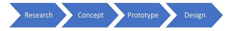
Figure 2 Linear Design Process (Adopted from O'Grady & O'Grady [13]).
For data analysis, a comparison matrix was compiled to compare several objects juxtaposed in multiple columns. Melinda Hospital, Bandung and Limijati Mother and Children's Hospital, Bandung were used as the comparison objects. This competitor profiling provides a broad understanding of the market condition and history [13]. This study used a linear design process (Figure 2), beginning with formative research to define the problem and then progressing with concept development, prototype, design (production and delivery).
4 Result and Discussion
Hermina Hospital has been established by community health center PT. Medikaloka Husada. The hospital specialized in midwifery and child health care
before it was converted to a general hospital. The Hermina Hospital logo (Figure 3) contains the following meanings: the health emblem (green) designates health. The baby figure (red) designates a healthy baby. The mother figure (yellow) designates the capital of a prosperous.
Figure 3 The logo of Hermina Hospital.
Wilia (Deputy Head of the Marketing Division at Hermina Hospital, Depok) in [14] points out that the current signage in the hospital is not fully effective; many visitors end up in the wrong room. Actually, there is signage to direct visitors, but it is not visible and insufficiently informative. Some areas need more signage for directing outpatients, such as the lobby (front office) and the second floor of the building. The information required concerns registration flow, doctors' schedules, hospital services, and health information.
According to Waskito (environmental graphic designer) in [15] to be effective, signage must use a standard letter, be sufficiently large in size and height. In Hermina Hospital, the locations should be clearly presented and large letters should be used. The materials used for the signs depends on the budget of the institution. For Indonesia using acrylic painted signs is a solution that is inexpensive and easy to execute. Colors used in a hospital should be 'clean' and children's hospitals usually use bright colors or other colors that are appealing to children. The signs in a children's hospital should avoid sharp parts for safety reasons. Also, the signage should put emphasis on graphic elements such as icons without diminishing the meaning of the message.
According to Heliani (educational psychology and child development lecturer) in [16], one of the characteristics of well-developed children is a good grasp of the knowledge; the child can easily order what is learned and properly understands it. Children have different levels of development, intelligence and perception. The treatment of children at each level should be different. Furthermore, Heliani states that it is important for children to learn to understand signs, so that they are trained to find out information independently.
Colors that appeal to children are the primary colors, i.e. red, blue and yellow, as these are eye-catching when they are not mixed with other colors. Environmental graphics in a children's hospital should have a large size, contain brief and easy to understand information, and the font size should be large, and the images should have an interesting shape. Leonard, et al. in [2] suggest that using a single bright color for the background makes signs more eye-catching and standardizes them.
| Design elements | Hermina Depok Children's Hospital | Melinda Hospital | Limijati Mother and Children's Hospital |
|---|---|---|---|
| Typography | Sans serif | Sans serif | Sans serif |
| Color | Color green as brand identity for the text, white background | Black for text, white background and blue supergraphic for the brand identity | Black for text, white background with pink supergraphic for the brand identity |
| Pictogram | Arrows | Arrows | Arrows |
Table 1 Comparison Matrix [18].
The following conclusions could be drawn after analyzing the environmental graphics at the three hospitals (Table 1): there is a lack of visual information through environmental graphics at Hermina Hospital. The lack of difference in color between the foreground (text and pictogram) and the background on the panels leads to low readability. There is no uniformity in the use of environmental graphics and color coding has not been implemented. Furthermore, the environmental graphics should educate children.
4.1 Design Concept
According to Sendjaja in [18] both profit and non-profit organizations have four functions, i.e. informative, regulatory, persuasive and integrative. Based on this distinction, the communication concept used for EGD in Hermina Hospital does not sufficiently perform the informative and persuasive functions. Infographics and color coding should be used to represent the floor plans and other important information. Thematic environmental graphics should be used to persuade children to learn to understand signage and read information in public spaces. The creative concept uses animal elements in the environmental graphics. According to the interviews with the psychologists, children and especially toddlers are interested in animals. They are interested in something that can make a sound and that they are able to interact with [16].
4.2 Design Result
The development of communicative, attractive and educative environmental graphics has been identified as a means to conduct medical practice using a child-friendly approach. All signage should be interrelated through a common design theme [17]. The environmental graphic design could for example use a theme from various animal habitats on each floor: an ocean theme on the first floor, a beach theme on the second floor, a forest theme on the third floor, a desert theme on the fourth floor, and a sky theme on the fifth floor. On each floor, the different rooms could be given names according to the habitats of animals. Thus, the names of these animals identify the rooms. Color coding is used to support the themes: blue for the ocean theme, orange for the beach theme, green for the forest theme, yellow for the desert theme, and light blue for the sky theme (Figure 4).
Figure 4 Themes for each floor [17].
The identification signs are given the same themes (ocean, beach, forest, desert and sky). Their color is aligned with the theme of each floor. Directional signage is placed in front of the elevator providing information on the floor plan of each floor (Figure 5).
Figure 5 Directional sign (left) and identification sign (right) [17].
Regulatory signs (Figure 6) use color coding adapted from the American National Standard Institute (ANSI) officially used for safety sign. Green and blue are for general messages, indicating no possibility of physical injury (safe). Yellow is for danger messages indicating no possibility of accident or death (caution). Red is used for warning and danger messages (frequent causes of serious injuries or death).
Figure 6 Regulatory sign [17].
Operational signs (Figure 7) include visiting hours and schedules of doctors on duty. The color used is white, being a neutral color. White also represents cleanness and hygiene.
Figure 7 Operational sign [17].
5 Conclusion
Hospitals are complex environments so they need signage and wayfinding for providing information and for communication purposes. In Hermina Hospital, Depok there is no uniformity in the signage system in the complex consisting of old and new buildings. Moreover, it should be considered that many children are potentially afraid to go to the hospital. In addition, children need to get early education on understanding signage in public spaces.
When using color coding, the colors can attract attention. Color coding is not only used for traffic signs or safety signs. The use of different colors in different spaces can separate and define specific areas. Color coding can make places that may induce panic, such as airports or hospitals, feel more comfortable. Color coding is used as a strategy to differentiate areas in a place and provide an understanding of the layout of a complex building. Finally, issues with the current signage in a children's hospital in Indonesia were dealt with by using a color coding concept and thematic environmental graphic design.
The design developed for the children's hospital in this case study adopted color coding to distinguish different floors. The colors used in the design were dark blue, orange, green, yellow, and light blue, in line with the theme of each floor. Moreover, the place making function in this case was realized by applying a thematic EGD to each floor.
This paper is a design report. For further research, a more comprehensive review on the research object needs to be conducted and some relevant issues from the case study need to be addressed. This research was limited to a case study of one particular children's hospital. The study of the same concept applied in a school building to foster interest in learning is a topic that could be investigated in a future research.
Acknowledgment
Authors would like to express their gratitude to Mrs. Nita Wilia, Deputy Head of the Marketing Division at Hermina Hospital Depok; Endra Waskito, in-house designer at Gusto Sign, Bandung; and Mrs. Heliani, Lecturer of Educational Psychology and Child Development at Maranatha Christian University, Bandung for contributing to this study as interviewees.