
1 Introduction
Eating can mean accepting the culture behind the cuisine. A traditional dish is defined as food consumed by ethnic groups in specific areas, prepared according to recipes that are hereditary. The ingredients come from a local area and have characteristics that are not found in other areas [1]. Indonesia is known for its flavorful traditional local cuisines with a great variety of spices and distinct cooking methods that take a long time, which are now becoming more rare, especially in urban communities. Indonesian traditional cuisine is not only about taste but also functions as a symbol of social unity and hospitality. For example, it can be used to strengthen family bonds, develop friendships and provide hospitality when members and non-members of a group eat together [2].
The desire for traditional Indonesian cuisine in urban communities has encouraged people to enjoy it in a more practical way. Those who have sufficient money and time can enjoy traditional dishes by eating them in a restaurant, while those who want to be more efficient and do not have much
Received November 14th, 2018, 1st Revision July 11th, 2019, 2nd Revision November 19th, 2019, Accepted for publication April 6th, 2020.
Copyright © 2020 Published by ITB Institute for Research and Community Services, ISSN: 2337-5795, time to prepare food can choose instant traditional Indonesian food. Those who live abroad and still want to enjoy the homey taste of Indonesian cuisine may also favor this option. For practical reasons, traditional Indonesian cuisine can be prepared using instant traditional cooking spices together with fresh ingredients such as meat and vegetables that must be added. At present, many traditional Indonesian dishes are packaged complete with ingredients, while some can even be eaten directly.
Producers from the food industry create traditional cuisine that can be easily prepared using instant cooking methods while at the same time retaining its nutritional value, hygiene and traditional flavors. Thus, instant Indonesian traditional cuisine is created, for example, instant mangut, instant liwet rice, instant yellow rice and instant tiwul from a variety of brands are on the market. This instant traditional food is marketed in supermarkets, gift shops and even sold online, so anyone can enjoy it, anytime and anywhere.
Each region has its own traditional cuisine with local flavors. Local people from a region and others may long for that flavor that will remind them of home. Traditional instant food needs a packaging design that is emotionally appealing without ignoring functionality. Even when the product is marketed abroad, to keep the brand and product in the mind of the consumer, designers need to pay close attention to the visual and verbal elements. Visual and verbal elements in packaging design are more appealing when they convey the taste of the food to the consumer. Consumer emotions will be stimulated so that they are interested in buying the product, because the consumer not only wants the product but also a satisfying experience [3]. When Indonesian consumers go out to buy the product, they should be able to recognize the product in the shop quickly and easily. International consumers who travel to Indonesia should also be able to discover the product easily. It is important to be able to describe the packaging if you ask someone else to buy the product for you [4].
This research analyzed which visual and verbal design elements need to be present in the packaging design of instant traditional Indonesian food products so that the design is functionally and emotionally appealing. Visual and verbal elements that have an attractive appearance and are in accordance with the contents of the product will attract potential consumers [3]. Increased sales of local products will increase Indonesia's creative economy, which is currently one of the leading sectors of the country's economy. Indonesia has an excellent opportunity to improve its economy through the development of culinary businesses because Indonesia is a country that has a wide variety of regional specialties, with more than 5300 types of authentic Indonesian food. The taste of traditional cuisine can attract consumers and provide a satisfying experience [5].
2 Packaging Design and the Role of Color, Imagery, and Type
In Indonesia, packaging design first gained attention around the 1950s. At that time many supermarkets emerged and the range of products on offer became more diverse, resulting in the need for distinctive packaging designs. Packaging arranged on displays of goods of the same category compete visually to draw attention of potential consumers by displaying the product's special characteristics and persuading consumers to buy them. Four essential elements of a packaging design attract the attention of consumers, namely color, physical structure, symbols and typography [6]. Attraction is emotionally related. This means it can persuade consumers to buy the product just because the packaging design causes a positive emotional response. Emotions affect the human mindset in making decisions and their impact can be negative or positive. When a person is comfortable, happy, able to exchange ideas, able to imagine and think creatively, their emotions will be positive. Positive emotions stimulate a person to make choices and make decisions on the fly. Negative emotions have the opposite effect [7]. To be called unique, a packaging design not only has to be different, but also fun to look at and able to affect a person's feelings. In shops, some products look different and attract more attention than others; this is due to the different shapes, colors, material or packaging technique. Packaging wrapped in dried leaves or Lamtoro leather with a small label, for example, look different compared to packaging solely made of transparent plastic with a screened label [8].
Ergonomic factors also affect the form of packaging and the convenience it provides to the consumer. The package needs to be easy to carry and easy to open and the contents removed easily. In addition, the ratio between the size of the packaging and its contents, flexibility in storage and the display of the product also need consideration. All of them add a functional appeal to the product [9,10]. Global culture influences the development of one's palate in design visualization, which in turn will result in designs that vary visually or are mixed from various sources (eclectic). This also happens in food packaging design. In packaging design, color is the first consumer-identifiable element before any of the other visual features. Color triggers a particular response in the central nervous system and brain cortex (cerebral cortex), activating specific thoughts, memories and perceptions that improve the ability of consumers in responding to the information. The effects of color arise from acculturation and physiological processes, which mutually affect each other. Physiologically, colors with long waves are provoking, while colors with short waves are calming. These characteristics of color physiology help to develop cultural associations. The color red as a long-wave color is the most eye-catching color and for example the red color of lipstick is perceived as a sexy color that is very provocative [11].
According to Klimchuk & Krasovec [6], after color, consumers will first look at an image before they read text. In food packaging design, images can communicate visual language. Moreover, theoretically, visual language can communicate taste, smell, temperature, evoke appetite, connote a lifestyle, promote a mood and stimulate product usage. Some rules that need to be considered in displaying images on food packaging designs are as follows: (1) the image must evoke the taste of the product; (2) the image must be appealing; (3) instructional images must be simple, informative and functional; and (4) the image placement must match the overall packaging design layout [6].
2.1 Emotional Design Aspect
A design is determined not only by functional aspects but also by emotional aspects. There are three different emotional aspects in relation to good design. Firstly, the visceral aspect – visual elements in a design that attract consumers at first sight. Secondly, the behavioral aspect – visual elements in the design that are easy to use. Thirdly, the reflective aspect – visual elements in the design that are emotionally appealing and provide a positive experience [7].
The activity of buying a product is influenced by emotions. Emotions can stimulate buying decisions. When a consumer buys a product, he/she not only pays attention to product quality and usability but also wants a satisfying experience when buying it [3].
2.2 Likert Scale
The Likert scale is used to measure the attitudes, opinions, and perceptions of a person or group of people about social phenomena. The researcher decides the research variables. The research variables are determined by the researcher such that information can be obtained from the results and then conclusions can be drawn [12].
3 Methodology
This study used a qualitative method to analyze the study object using the packaging design parameter theory combined with a quantitative method applied to the analysis of the respondents' opinions a five-point Likert scale (strongly disagree, disagree, doubt, agree, and strongly agree). This research was conducted in four stages. In the first stage, we observed the predetermined objects of study and identified the visual elements in the packaging designs, using nine adjectives to represent the features that characterize the three aspects of design emotion theory (see above): (a) the visceral aspect, represented by the adjectives: attractive, modern, unique; (b) the behavioral perspective, described by the adjectives: ergonomic, hygienic, informative, and available on the market; (c) the reflective aspect, represented by the adjectives: tasty and familiar. These were the research variables. In the second stage, the choices of the nine adjectives that were determined in the first stage were compiled in a questionnaire, which was distributed to respondents. Their responses were measured using a 5-point Likert scale. In the third stage, we analyzed a number of packaging designs from the perspective of visual communication design theory using the nine adjectives above. In the final phase, we compared the results of stages 2 and 3 to find similarities and differences.
4 Data and Analysis
4.1 Object of Research
Fifteen traditional Indonesian instant traditional food products were found, from which seven were chosen to be represented in the case study, considering that there were more than three flavor variants for each product and that they could be purchased in marketing areas such as supermarkets, online stores, and social media. The packaging of each of the seven selected products had unique and interesting visual and verbal communications, which will be discussed below. Figure 1 shows the seven selected products.
4.2 Research Respondent Sample
The research respondent sample consisted of 30 women, ranging from 20 to 60 years old with professions such as housewife, employee, teacher and design student in their final year. The reason was because women tend to cook more often than men, and although these liwet rice products are labeled as 'instant', there is still some preparation required before serving them.
4.3 Stage of Data Analysis
After observing the study objects, the next step was identifying the visual elements in the packaging designs using the nine adjectives/features related to design emotion theory, as discussed above. The nine features were compiled in a questionnaire to be further investigated. The function of the features was to identify the respondent's interpretation of the instant food packaging design. The nine features were as follows: (1) hygienic, (2) attractive, (3) informative, (4) flavor, (5) familiar, (6) unique, (7) modern, (8) ergonomic, (9) available in the market. These nine features are associated with the essential function of packaging (numbers 1, 2 and 3); with user emotions (numbers 4, 5 and 6); and with user activities (numbers 7, 8 and 9).
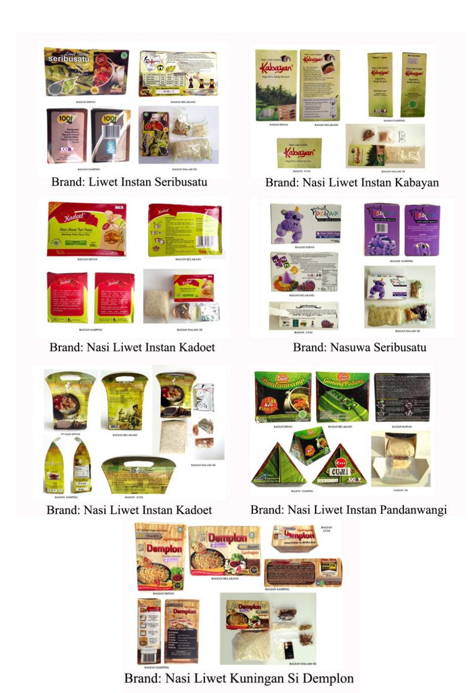
Figure 1 The seven samples that were used as the objects of study.
Below is the method of calculating the score for each package design based on the questionnaire filled out by the respondents. The respondents filled out a questionnaire to assess each package using 9 adjectives. The total number of packages assessed was 7; each respondent filled out a questionnaire totaling 7 pages.
The assessment was done by choosing between: strongly disagree – value = 1; disagree – value = 2; doubt – value = 3; agree – value = 4; and strongly agree – value = 5. The higher the value, the more positive the response. As an example, the evaluation of the hygienic feature for packaging number 1 of the Seribusatu brand was:
| Respondents rated strongly disagree (STS) 0 x 1 | = 0 | ||
|---|---|---|---|
| Respondents rated disagree (TS) 4 x 2 | = 8 | ||
| Respondents rated doubtful (R) 6 x 3 | = 18 | ||
| Respondents rated agree (S) 17 x 4 | = 68 | ||
| Respondents rated strongly agree (SS) 3 x 5 | = 15 | ||
| + | |||
| Total | 109 |
The average value for the hygienic feature for packaging 1 was 109/30 = 3.6, i.e. 'tend to agree'. Each feature was counted like the example above. The overall value for each packaging was obtained by taking the average of the values for all 9 features.
For example, packaging number 5 of the brand Neng Geulis had the following average scores: hygienic = 4.1 + attractive = 4.1 + informative = 3.9 + flavor = 4 + familiar features an average rating of= 3.4 + unique = 3.9 + modern = 3.7 + ergonomic = 4.2 + available on the market = 3. Total score: 34.1, while overall average score was 34.1/9 = 3.8. The highest overall average score was 3.8 and the lowest was 3.4.
In addition, we also looked at which will one had the highest score out of the seven packagings. For example, for the informative feature: packaging 1 Seribusatu score = 3.5, packaging 2 Kabayan score = 3.8, packaging 3 Kadoet score = 4, packaging 4 Nasuwa score = 3.8, packaging 5 Neng Geulis score = 3.9, packaging 6 Pandanwangi score = 3.8, packaging 7 Si Demplon score = 4.2. Hence, packaging 7 Si Demplon had the highest score for the informative feature.
The scores for the 9 features obtained from the 7 packagings added together give the score shown in Figure 2. For example, for the ergonomic feature for packaging 1 Seribusatu score = 3.7, packaging 2 Kabayan score = 3.6, packaging 3 Kadoet score = 3.7, packaging 4 Nasuwa score = 3.6, packaging 5 Neng Geulis score = 4, packaging 6 Pandanwangi score = 3,4, packaging 7 Si Demplon score = 3,7. Total 25.7. The average score of the ergonomic feature was 3.7.
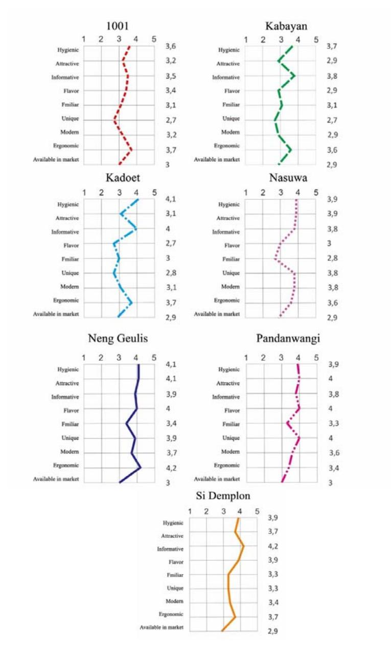
Figure 2 Semantic diagram of the respondent opinion results.
| N o | Brand | (1) Hygie nic | (2) Attra ctive | (3) Inf or ma tive | (4) Flavo r | (5) Famil iar | (6) Uniq ue | (7) Mod ern | (8) Ergon omic | (9) Avail able in mark et | TOT AL | AV G | RA NK |
|---|---|---|---|---|---|---|---|---|---|---|---|---|---|
| 1 | 1001 | 3.6 | 3.2 | 3.5 | 3.4 | 3.1 | 2.7 | 3.2 | 3.7 | 3 | 29.4 | 3.3 | V |
| 2 | Kabayan | 3.7 | 2.9 | 3.8 | 2.9 | 3.1 | 2.7 | 2.9 | 3.6 | 2.9 | 28.5 | 3.2 | VI |
| 3 | Kadoet | 4.1 | 3.1 | 4 | 2.7 | 3 | 2.8 | 3.1 | 3.7 | 2.9 | 29.4 | 3.3 | V |
| 4 | Nasuwa | 3.9 | 3.9 | 3.8 | 3 | 2.8 | 3.8 | 3.8 | 3.6 | 2.9 | 31.5 | 3.5 | IV |
| 5 | Neng Geulis | 4.1 | 4.1 | 3.9 | 4 | 3.4 | 3.9 | 3.7 | 4.2 | 3 | 34.1 | 3.8 | I |
| 6 | Pandan Wangi | 3.9 | 4 | 3.8 | 4 | 3.3 | 4 | 3.6 | 3.4 | 3 | 33 | 3.7 | II |
| 7 | Si Demplon | 3.9 | 3.7 | 4.2 | 3.9 | 3.3 | 3.3 | 3.4 | 3.7 | 2.9 | 32.3 | 3.6 | III |
| TO | TAL | 27.2 | 24.9 | 27 | 23.9 | 22 | 23.2 | 23.7 | 25.9 | 20.6 | |||
| AV | ERAGE | 3.9 | 3.5 | 3.8 | 3.4 | 3.1 | 3.3 | 3.4 | 3.7 | 2.9 | • | , | |
| RA | NK | I | IV | II | V | VII | VI | V | III | VIII | • |
Table 1 Summary of the respondent's opinion using a 5-point Likert scale.
Notes: * Y-down: to find the highest to lowest ranking for each packaging feature
Table 1 shows that the average values ranged between 2.9 and 3.9. This range can be divided into three classes: a score between 2.6 and 3 indicates that the respondents were doubtful; a score between 3.1 and 3.5 indicates that the respondents quite agreed; a score between 3.6 and 4 indicates that the respondents fully agreed.
Table 2 Analysis of study object comparison using the parameters of packaging design theory and respondents' opinions.
| HYGIENIC (1) | ||||||
|---|---|---|---|---|---|---|
| Α | All packagings list the certification number of food product health standards (BPOM RI, P-IRT). | |||||
| The packagings include a plastic protective sachet for product/contents in direct contact with the | ||||||
| outer packaging. | ||||||
| В | Average score 3.9 | |||||
| С | All packagings meet the hygienic packaging requirements determined by government law. | |||||
| ATTRACTIVE (2) | ||||||
| A | Attractiveness of packaging can be achieved through color, image, motifs, physical structure and typography. | |||||
| • The most unique packaging structure is featured by the Neng Geulis brand, which resembles a | ||||||
| traditional bag called a jinjingan, and by the Pandanwangi brand, which is shaped in the form of a | ||||||
| prism. | ||||||
| • The color purple, which is rarely used for food packaging, is featured by the Nasuwa brand, making it more attractive compared to the other packagings. | ||||||
| • The thick and large font sizes on the Si Demplon brand packaging give an attractive impression. | ||||||
| В | Average score 3.5 | |||||
| С | Attractive packaging can be achieved by the use of a unique shape (not an ordinary rectangular | |||||
| box), the use of colors that are uncommon and an uncommon typeface for the brand name. | ||||||
| Not all packaging samples are attractive. | ||||||
| INFORMATIVE (3) | ||||||
| A | All packaging designs fulfill the informative function. | |||||
| В | Average score 3.8 | |||||
| C | All packagings meet the informative standards arranged by government laws. | |||||
| TASTE (4) | ||||||
| A | In food products, consumers generally need pictures of the real food to identify the taste of the | |||||
* X-right: to find the value for each packaging feature
dish. A photograph can convey the taste of the food. All packaging samples use photos, with different visualizations.
- Four brands show photos of the cooked rice complete with traditional side dishes and special pots to picture liwet rice to represent the taste of the product. (Brands: Seribusatu, Neng Geulis, Pandanwangi, and Si Demplon)
- Two brands show photos of raw ingredients and icons related to the product, such as rice, sacks, rice fields and spices, but these do not represent the taste of the product. (Brands: Si Kabayan and Kadoet)
- One brand, Nasuwa, show photos of steamed rice shaped like a hippo, resembling Japanese bento for kids.
- B Average score 3.4
- C Not all packagings represent the taste of the product. The taste of the product is best represented through photos of the traditional liwet rice, dominating the front of the packaging. Packagings that show pictures of raw ingredients are considered to be insufficiently representative of the taste of the product.
FAMILIAR (5)
- A A familiar impression of a packaging design can be attained through visuals and text. Visual familiarity is represented by photographs of liwet rice decorated with side dishes, liwet pots, illustrations of a traditional Sundanese kitchen atmosphere, emblazoned mothers, rooms of woven bamboo, and banana leaf texture commonly used for food packaging. Familiarity in text is represented by words such as neng geulis (Sundanese language, meaning a beautiful girl), pandanwangi (a type of rice from Cianjur that is famous for its fragrance), Kabayan (a legendary Sundanese figure), si demplon (Sundanese nickname for a sexy woman), kadoet (gunny rice sacks in Sundanese).
- B Average score 3.1
- C For the visual aspect, the packaging of Nasuwa uses a novel icon, so it is considered unfamiliar.
- For the textual or language aspect, what is considered familiar is neng geulis, which is a Sundanese expression that is still frequently used. Pandanwangi is also still popular as a type of rice sold in the market.
- The word kadoet is rarely used because people are more familiar with the word sack, while Kabayan as a legendary figure is currently unpopular. The word seribusatu does not reflect anything so it is considered unfamiliar.
Even when the packaging uses icons and text that are related to the origin of liwet rice, which is a traditional Sundanese dish, the respondents were only somewhat familiar with the product. Maybe this was because the distribution of the product was not yet comprehensive in the market.
UNIQUE (6)
- A Unique means being different from others so that the packaging will attract more attention. The uniqueness can be seen from the visuals used in the packaging, including photos, motives, colors, physical structure, symbols, and typography. Each of the seven study objects have their own uniqueness.
- In terms of color, Nasuwa's product is dominated by purple and white, which creates a unique impression because purple is unusual for traditional dishes.
- In terms of the physical structure, Pandanwangi's product is shaped like a triangular prism, and Neng Geulis' product is sold in a tote bag, which both create a unique impression.
- In terms of typography, Nasuwa uses a non-formal typeface in six colors, creating a unique impression.
- The banana leaf motif used on Pandanwangi's packaging and the woven bamboo motifs on Neng Geulis' packaging give a unique impression.
- B Average score 3.3
- C Some packaging designs do not convey a distinctive impression.
| MODERN (7) | ||||||
|---|---|---|---|---|---|---|
| A | The seven packaging designs are produced with modern printing techniques and materials. | |||||
| B | Average score 3.4 | |||||
| C | The average value of 3.4 indicates that all packagings ae considered rather modern because all | |||||
| packagings were produced with modern technology, whereas the images give a more traditional | ||||||
| impression. | ||||||
| ERGONOMIC (8) | ||||||
| A | The average volume of the seven packaging designs is 250 to 300 grams. The packagings can be | |||||
| held in one hand, are not too heavy, easy to carry and also easy to put on display. Only two | ||||||
| packagings use a perforation so that the packaging can easily be torn open and the content can | ||||||
| easily be removed (Seribusatu and Nasuwa brands). | ||||||
| B | Average score 3.7 | |||||
| C | All packagings meet the ergonomic standards. | |||||
| AVAILABILITY IN THE MARKET (9) | ||||||
| A | The distribution of these traditional Indonesian instant rice products is not very wide yet. | |||||
| B | Average score 2.9 | |||||
| C | All packaging samples are still not well known by consumers and are considered to be inadequate | |||||
| in terms of availability. This can be an indicator that the producers of instant traditional food | ||||||
| should further promote their products, both conventionally and digitally. | ||||||
Note: * A: Analysis of the study object using packaging design parameter theory.
* B: Analysis of respondents' opinions using a Likert measurement scale.
* C: Analysis results from A and B.
Based on the analysis, conducted by bringing together the opinions of the researchers with the views of the respondents shown in Table 2, it can be summarized that all seven packaging samples fulfilled the hygienic and informative features according to the standard government regulations on packaging and labeling. Besides that, all packagings were considered ergonomic and modern, but none had attractive and unique features that stood out. From a design perspective, the packagings used visual and verbal icons that were sufficient to represent the product, but due to insufficient distribution of the products, the familiar feature was not optimal. All seven sample packaging designs did not fully meet the taste feature.
Efforts to increase sales of local products continue to be pursued by SMEs and the government. One local product that uses a unique packaging is Chocodot, i.e. a small aseupan and boboko (Sundanese kitchen tools) as packaging (Figure 3). The product looks unique as a Sundanese souvenir. There is also government support for SMEs. Since 2003, the Ministry of Industry and Trade has facilitated SMEs through 'Packaging Clinic' facilitators, who help SMEs to design their packaging to be more unique so that their image will be enhanced and the competitiveness of domestic products is increased. Until now 24 Packaging Clinics have been established in 22 provinces. The government also continues to encourage SMEs to make unique product packagings by holding packaging design competitions. One of them was a competition for processed products made from fish that was held in 2019 (Figure 4).
Figure 3 Chocodot chocolate's unique packaging.
Figure 4 One of the contestants presented a unique traditional packaging using the Mega Mendung batik motif for the scales of the fish (a traditional icon).
5 Conclusion
Based on the explanation above, most of the investigated packaging designs were functional, but to make the appearance of packaged products more appealing emotionally there are several things that can be done. Firstly, an unusual color and shape of the packaging will give a unique impression. Secondly, for instant traditional food packaging it is necessary to convey a conventional image rather than a modern image. Thirdly, using visual and verbal icons referring to the origin of the traditional dish that are still relevant today will create familiarity. The output of this research is expected to help SMEs and designers create packaging designs that are more unique, are emotionally more appealing for instant traditional food products, specifically from Indonesia.