
1 Introduction
The ability to detect and comprehend colors is inherent in all humans. People have employed color in a variety of ways throughout history, including ceremonial, religious, political, social, and psychological purposes. Color has also had a role in the formation of society, revealing the distinct strata among its
participants. Historically, the first pigments were made by combining soils (red and yellow iron oxide) with animal fat, burnt wood, charcoal, and natural chalks. Since then, the history of color has been a constant source of scientific advancement and inquiry. Early humans created a mixture of basic colors from everyday utensils and natural pigment discovered or ground from their surroundings such as natural organic plants or minerals in the form of small rocks, ground bones, vegetable sources, abalone shells, and so on. However, most prehistoric 'artists' (the term 'artist' in this context refers to an individual who painted the cave walls) employed monochromatic tones of charcoal combined with saliva and natural animal fat to coat either their body or their fellow cave dwellers. Color has posed two primary limits in this contemporary context: first, its limitation to be found in certain places as the capacity to get them locally or dig them out of the ground, as with iron-manganese oxide, red & yellow oxide; and second, the emotional content that is delivered visually. The Ancient Greeks believed that everything was made up of four elements: air, fire, water, and earth. This theory was introduced around 450 BC and was supported by Aristotle (384-322 BC), who believed that the four elements made up everything in the terrestrial sphere and that the heavens were made of a special weightless and incorruptible fifth element called 'ether'. Aristotle also declared that colors are the simple manifestation of the visible object which was made up of the element's combination of fire, air, earth, and water [1].
Color is a feature of light, which is an electromagnetic radiation through which energy is carried, according to scientists today. Looking up at the sky, natural light, sometimes known colloquially as 'sunlight', is made of electromagnetic vibrations of various wavelengths moving in all directions in an undulating pattern [2]. Objects and surfaces receive, absorb, and reflect electromagnetic radiations corresponding to different wavelengths of light. However, our sense of sight and our visual perception is limited to a very small range of this visible spectral wavelength of light, between approximately 380 nm and 780 nm (1 nm = 0.000001 mm), referred to as the visible spectrum of light, which ranges from violet or reds to blues [3]. The term 'light' is also sometimes used as a synonym for electromagnetic radiation, which encompasses not only the ultraviolet, visible, and infrared range but also the X-ray and gamma-ray ranges and the radio ranges [4]. This visible spectrum is generated when natural light flows through a glass prism and is rearranged according to the light wavelength in a linear band, which is the only way we humans can see electromagnetic radiation. In the seventeenth century, Sir Isaac Newton [5], an English mathematician, physicist, astronomer, theologian, and author, described as one of the most influential scientists of all time, experimented with splitting sunlight into visible linear bands of color, identifying and naming them as 'hues' of:
Red, Orange, Yellow, Green, Blue, Indigo, and Violet, commonly known as (ROYGBIV).
Frans Gerritsen (b. 1925), Dutch educator, writer, and color consultant, presented four major primary historical lines of thinking on color perception in his 1975 book, The Theory and Practice of Color: A Color Theory Based on Laws of Perception.
- i. No physical phenomenon takes place between the eyes and the object observed;
- ii. There is radiation from the eye in the direction of the object;
- iii. Sight is an interaction between images ejected by the object and something like a fire from the eye; which sees as a spirit or soul; and,
- iv. The object we perceive sends out rays to which our eyes are sensitive and which we able to see [2].
Many of these theories persisted until about the seventeenth century. It was not until Sir Isaac Newton experimented with glass prims that the actual nature of visible light and color was discovered. Newton was a wonderful scientist, a genius who laid the groundwork for modern thinking, but he was also a sorcerer and alchemist – a highly unorthodox Christian by today's standards [6].
He was someone whose knowledge of the entire universe included both its ultimate mystery and its all-encompassing principles. The number six was unimportant in Newton numerology and symbolism, since there were seven planets, seven days of the week, seven musical notes, and so seven colors in the visible spectrum. The issue is, why did he choose the name, 'indigo' for this particular color, which is not represented in the pigment color wheel of six colors? Perhaps Newton could have used it to divide the violet from the blue, but he could also have chosen turquoise to separate the green from the blue, or maybe he could have separated the pale violet from the deep purple as the spectrum fades into darkness [6].
It should be noted that by the eighteenth-century English dye manufacturers used to classify many official shades of indigo (from light to dark), as 'indigo' can be split into a wide range of shades, such as milk blue, pearl blue, pale blue, flat blue, middling blue, deep blue, queen's blue, and so on [7]. Basically, there are two color notations to refer to [8]:
a. The first is the RGB (Red, Green, Blue) color model, which is known as additive light, which is defined as a quality of a color model that forecasts the appearance generated by concurrent distinct lighting components. For example, adding red to green light yields yellow, and merging all three (RGB) primaries together yields white.
b. The second is the RYB (Red, Yellow, Blue) color-pigment model, which is intrinsically 'subtractive', and from which the perspective of physical pigment mixing can be understood.
A good example is a movie projector, which projects an image in RGB but is reflected through the RYB scheme when it reaches a white screen [9]. Another example of additive mixing can be seen on the television screen, where pictures of red, green, and blue phosphorous dots on the surface of a cathode ray tube are created. A changing stream of electrons is used to create these cathodes, which consist of fluorescent bulbs.
The focus of this article is to examine how such schemes may be applied as color painting devices. Their classification can then be used to understand works of relevant literature that are available in print copy or electronically via the internet. The discussion may serve as evidence in the field of fine arts, particularly painting; raising awareness among institutions, students, teachers, and art practitioners about the effort to understand these distinguishing factors and underlying processes for art experts using the eye-hand color selection and mixing method. The authors believe that it will also serve as a springboard for additional study in the subject of color theory studies as part of a continuing effort to support creative practices in general.
2 Literature Review
A quick survey into an academic source such as Google Scholar showed that there is a vast bibliography of publications on 'color' and themes related to 'color', both in hard print and electronic means, ranging from the light spectrum system to the physical color-circle system employing a substance known as 'pigment'. Nonetheless, this study employed a historical method as the primary point of reference for understanding color differentiations employing RYB (vs) RGB. The discourse expands on and provides essential terminology utilized in the creation of the previously described issue. It also presents, discusses, and compares various color systems, such as Newton's additive light spectrum linear band and several developments of the so called 'color circle–color wheel' presented by various artists and scientists, as well as from several theorists from the fields of chemistry, physics, and psychology, resulting in Johannes Itten's 'color circle' (pigments) used by several artists. In this arrangement Itten also placed 'tints' and 'shades', where tints are lighter and more tending to light or white, and shades are darker and more tending to black; chroma color saturation refers to the quantity of pure chroma/pigment in the hue (see Figure 11).
3 Research Methodology
This study used an empirical approach of direct observation on a number of artists such as Georges Seurat, Edward Munch, Wassily Kandinsky, Paul Klee, Josef Albers, Pablo Picasso, Joan Miró, and Mark Rothko; these artists bring together a large number of very different art movements, which developed in response to each other in a very short period of time, from the neoimpressionism of Seurat to the color field painting of Rothko, with an emphasis on variations of subtractive color. It is critical to have a clear definition, explanation, and description of RYB and RGB colors, which are visually pleasing in terms of human experience.
4 Discussion and Results
When humans perceive light shining on an object to be red or blue, they conclude that these features are inherent in the object. They may also conclude that these red or blue colors are an attribute of the perceived object that our visual system detects, or it may be a means of seeing certain properties of the light on the object that our visual system reveals and creates, which is then interpreted by the brain. This has long been a subject of scientific, physiological, psychological, and historical discussions amongst many different parties seeking to reach a consensus, although few make the distinction between color as a perception and the properties of light, and objects that we see as their colors [10]. Under specific selective pressures, our sensory visual system has evolved to furnish us with information about our surrounding environment. For generations, scientists and artists have investigated the impact of color and the interactions that different colors have with one another. A wide range of theories, laws, and concepts have evolved to describe how color is perceived and how this knowledge may be used in art, design, and science [11]. While there is no need for artists and designers to be conversant and know all color theories and principal developments from history, understanding the fundamental relationships between colors and their combinations can benefit designers to make more informed and confident selections. After all, it is considerably simpler to develop a work that is aesthetically appealing and better at delivering the client's message when well-understood design principles and standards are used [12].
When artists manually use color pigments, they mix different quantities of paint to create new colors; however, the more pigments they add to the mixture, the darker the color becomes or appears [13]. Theoretically, when these primary pigments (RYB) are combined, black should be the result; however, a muddy dark brown color is usually the result. When two complimentary colors, such as red and green, are mixed, the outcome should be somewhere in the middle-grey
shade range, that is, in the black and white scale of nine standard grey colors, were the neutral or middle shade is called 'grey', and so on. A similar result does not occur when using the additive color selection of light (RGB) due to the fact that this selection would be automatically decided by the software. Offset printing is a method of mass-production printing where images on metal plates are transferred (offset) to rubber blankets or rollers. The print media use a different set of colors known as CMYK, where the paper usually does not come into direct contact with these metal plates. In this process it is vital to note that color has several characteristics, such as brightness, lightness, colorfulness, saturation, brilliance, and chroma.
Color has an effect on our conscious and subconscious minds, but it is unclear how and when color is the key incentive for influencing behavior. In certain circumstances, subtle alterations in color may result in noticeable behavioral changes. For instance, research by the University of Rochester discovered that males were 10% to 20% more attracted to a lady dressed in red compared to her twin dressed in similar pastel colors.
Color may well be energizing, calming, interesting, and even irritating, but converting that into a reliable recipe to sell things or have viewers evenly pay attention to a client's message is a long way off [12]. The capacity to perceive the surrounding world using light in the visible spectrum reflected by objects in the environment is characterized as visual perception. Perception is the way we think about or understand something or someone [14]. Light, as we know and experience it, has an effect on how colors look to us.
When light enters and travels through the human eye, it first passes via the cornea before reaching the retina. In the retina, there are numerous layers of photoreceptors known as rods and cones, which are light-sensitive cells. The rods are active at low light levels and are responsible for low spatial acuity, whereas the cones are active at higher light levels and are capable of handling color vision. They are designed to convert light into electrochemical signals to be transmitted to the brain, which occurs in the cerebral cortex. These signals then travel through the optic nerve and reach the thalamus. Light that enters the eye is sampled by three classes of light-sensitive cells in the retina, known as cones. In order to understand color, it is necessary to appreciate that the effective spectral sensitivities of these cones are not static; rather, they change with the illumination conditions and the responses of spatially neighboring cells. Furthermore, the three classes of signals from the cones are processed by the neural pathways that lead from the retina to various areas of the cortex in the brain [15] (see Figure 1).
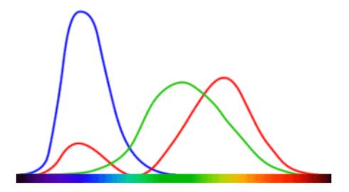
Figure 1 CIE 1931 defines qualitative links between the distribution of wavelengths in the electromagnetic visible spectrum. The graph shows how lines of green, blue, and red correspond to signals after they have been processed by the brain. The spectrum bar is commonly known as a rainbow bar [16].
Among the most frequent light sources are the natural sunlight and man-made light, such as incandescent light, fluorescent light, or light emitting diodes (LED). Sunlight is called white because it has a uniform distribution of the whole visible color spectrum. Man-made light sources, such as fluorescent or incandescent lights, do not have an equally distributed color spectrum; they emit more of one color than others. The distinctiveness of white light becomes obvious in the local context, influencing the way color is seen and the surface that reflects it. Paintings and colored sketches created in an outdoor situation, for example, would appear different when seen indoors under a man-made light source [15]. Although there are various publications providing basic guidelines for museum lighting [17], the principles and standard procedures used by museum lighting designers and curators to select lighting arrangements and light sources are not adequately documented. There are three main criteria for selecting an artwork's illumination: (1) replicating the lighting configuration intended by the artist or the one under which the artist painted or sculpted the piece; (2) the specific effect or interpretation intended by the curators; or (3) the preference and visual impressions expressed by observers as tested in carefully controlled experiments [18].
Another example related to natural light is the Impressionist painting movement, which originated in a group of Paris-based artists in the nineteenth century, a movement characterized by work that ventured away from precise, defined lines in order to capture the light and essence of a fleeting moment. It became one of the most impactful eras of art history associated with artists such as, Eduard Manet, Claude Monet, Pierre-Auguste Renoir, Edgar Degas, Paul Cézanne, Henri Matisse, Camille Pissarro, Berthe Morisot, Mary Cassatt, and Joaquín Sorolla, as some of the most representative Impressionist painters.
The effect of light changing mood happens when artists or designers utilize manual or digital visual colors, patterns, or graphical structures that are particularly appealing to interface users since these digital images are seen only via the viewer's mind. Understanding color, its properties, dimensions, and phenomena is useful as key information in many professions of the design field, but it is essential in the field of fine arts. Although color may be used to affect and guide spectator emotions (in marketing, advertising, selling real estate, decorating an operation room), it also adds another level to feelings of excitement, pleasure, restfulness, and so on.
As we all know, there are several aspects of color that may be studied – historical, cultural, physiological, chemical, and psychological – leading to various types of color notations that can be used. Firstly, the (RYB) red, yellow, blue colors are typically used by artists, as it aids in the combining, blending, or mixing of physical pigment-paint colors producing a tangible outcome (artwork). Secondly, the (RGB) red, green, and blue light spectrum, is an additive color system producing a wide variety of other colors, which was designed for online/digital users and refers to the light filter combination as on a computer, tv screen and other mobile devices.
'White light' is the additive mixture of all the basic colors in this palette (RGB), and the opposite, 'black/dark' is generated by the absence of light in this color system. Even some large-format printers employ RGB-based color interpretation systems [12]. The CYMK (cyan, yellow, magenta, and black) color system is often utilized in offset printing output (see Figure 2).
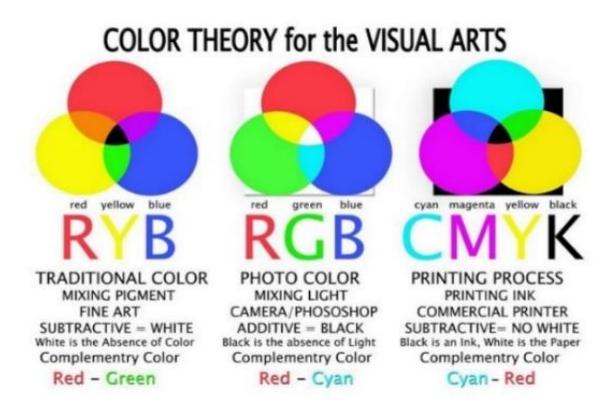
Figure 2 Subtractive pigments (left) vs additive light-center & CMYK print (right) [19].
When various wavelengths of light are mixed together, additive colors arise. For example, an equal quantity of pure red light added to blue light results in reddish violet or reddish purple, but the eye perceives it as magenta. The percentage of light intensity differs upon each light mixing component [20]. If there is a greater proportion of blue light than red light, the output is a darker tone. These color mixing techniques are more important for printing output than for painters.
Synesthesia is described by the Merriam-Webster dictionary [21] as "the state in which stimulation of one sense results in simultaneous involuntary sensations by one or more other senses" (Merriam-Webster.com, n.d.). Color synesthesia (color-graphemic synesthesia) is a condition in which letters or numerals are believed to be colored by nature. Color synesthesia is a good illustration of how varied color association can be. When creating something, artists and designers need to keep in mind that an audience may either deliberately or unknowingly ascribe a meaning to each color. If synesthesia is present, a reaction by one sense may even result in a reaction and changed perceived associations by another sense, altering how a person interacts to the design or artwork [12].
Human eyes are sensitive to the effects of different wavelengths in the visible spectrum; mixing the three wavelengths of RGB (red, green, and blue) produces white light as we sense it; however, if an artist or designer mixes the physical pigments of red, green, and blue, the result is something dark brown, close to black as we sense it. Obviously, in this personal experience a sense of objectivity of our perception is related to features disclosed by vision that are inherent properties. To summarize, inherent properties are those that an item possesses independent of its interactions with other things. These are distinguished from relational qualities, which define how an item is related to other objects or perceivers. The 'objective-subjective' distinction, on the other hand, compares our awareness of things as they are 'in themselves', i.e., regardless of our distinctive viewpoint of things, with subjective cognition that is contaminated by our particular stance towards things. According to objective intuition, visual experience represents the intrinsic properties of things, whereas subjective intuition takes vision to represent how an object stands in relation to a viewer [22]. This is an important point to understand for designers and artists when it comes to the use and application of colors. The RYB (red, yellow, and blue) color system, is the color wheel that people learn in school. They are taught that these are called the primary colors, followed by the OGV (orange, green, and violet) colors as secondary colors, and the mixture of a primary color and a secondary color will lead to a tertiary or intermediate color on the twelvecolor wheel chart. Again, it is vital for artists and designers to comprehend that physical-colored objects do not create light; rather, the color is reflected when some wavelengths are absorbed. This process is known as subtractive color (See Figure 3).
Figure 3 Subtractive color: additive color shining on an apple received by the eye [23].
5 System of Color Notation
Various models of color wheel theories and color notation systems have been developed, adapted, and modified since the seventeenth century. In 1666, the same year that the Great Fire of London destroyed the city, the 24-year-old Isaac Newton attempted to find the basic truth behind the nature and science of colors. He began experimenting with glass prisms and beams of light. In his book Optics (1704), he experimented with the diffraction of a light-beam through a glass prism to create the visible spectrum; it was not ground-breaking in and of itself, but rather a parlor trick that was widely known. Newton, however, took it a step further, forever altering our perception and comprehension of color; he used another glass prism to compose back the wavelengths and recombine them again [24]. Newton believed that the visible spectrum of white light comprises the fundamental seven colors (see Figure 4). He also developed and arranged the colors of the visible spectrum's linear band into a circular layout, a pattern that is still in use today, with an updated title, 'the color wheel'. This color circle was created using a natural light beam rather than any actual pigments. Newton established the fundamental ground color theory for all others who came after him, arguing against basing their work on his experiment [6]. Thomas Young (1773-1829) proposed that the eye has three photosensitive receptors: red, yellow, and blue, and that color is recognized by the superposition of these three receptors.
Figure 4 The dispersion of light according to Newton's theory, also known as Newton's spectrum bar [25].
Scientists, artists, and philosophers, in that order have been at the forefront of color theory development [26], with contributions from physicists, chemists, and later on from psychologists and physiologists. These color theories have emerged from numerous scientific and perceptual discoveries. However, early artists had a totally different connection with color than modern painters. This was due to two factors: a) limited color selection available in the market to choose from; b) the lack of information on how colors interact with one another. Early artists had to plan their compositions with the best possible limited color combinations in mind. The majority of the pigments were handcrafted by the artists or apprentices in their workshop [24]. These early artists chose their own color palette based on empirical knowledge, material availability, and years of experience and expertise. A significant relationship was created between the use of colors throughout history and Newton's new theory that resulted from the blending colors from the visible spectrum, which require the usage of colorpigment mixtures in painting. The ancient Greeks believed that color was a continuous progression from white to black, with yellow being slightly darker than white and blue being somewhat lighter than black. The colors red and green were at the center of that scale. This system going from bright to dark was likewise unwaveringly believed by mediaeval thinkers. It was not until the eighteenth century that the notion of primary colors, such as red, yellow, and blue (RYB), and secondary colors, such as green, orange, and violet (OVG), was developed. Newton's most contentious concept concerned the visible spectrum, which he wrote about in Optics. He argued that white and black were no longer colors, and so the visible spectrum no longer went from light to darkness. Newton's chromatic wheel also organized the connections between complimentary colors – the new notion that color combinations were extremely powerful together, such as green and red or blue and orange.
In the history of painting, complementary hues would have a tremendous impact on future art; for example, well-known painters such as Vincent Van Gogh and Edvard Munch employed them to provide structure and strong dramatic effects in their works [24]. The Impressionists were the first group of contemporary artists to realize the full potential and influence of colors, which is perceptible light converted to pigments, with the study of natural light and its effects being a significant emphasis in their works [20]. Their goal was to bathe the subject in sunlight and paint the atmosphere to capture a moment in time. They would juxtapose two complementary colors, placing them next to each other causing a sensation in the viewers eyes that makes the color created appear more intense and vibrant. In post-impressionism, this method of painting developed into what is called pointillism [20], which is a multi-colored dot method established primarily by French artists using a pictorial approach that employs a spectrum of colors underpinned by color theory and presents complicated pictorial compositions such as a landscape with human figures.
Among the most notable of these French artists was Georges Seurat (1859- 1891), who approached this task almost as if it were a scientific equation, delving into the physics of optics and how it influences color composition. Using Impressionist pictorial methods as a starting point and then branching out, he studied the scientific theory of chromatic vision and decided to build his paintings with tiny uniform touches of pure colors placed next to each other like in a mosaic on canvas, hoping that the colors would blend in the viewer's retina (or better, in the mind) without losing any of their intensity and luminosity. He labelled this method 'divisionism,' which eventually became known as 'pointillism;' nonetheless, several other painters believed that this technique jeopardized the readability of their paintings since it eliminated curves and divided shapes and zones into colorful dots [27] (see Figures 5).
Figure 5 Painting by George Seurat. a) Sunday on the Island of La Grande Jatte, 1884-1886. Oil on canvas, 207.50 cm x 308 cm. b) Painting details, center area [28].
In general, chemists associate pigments with the subtractive system of primary colors red, yellow, and blue. Pigments are mainly used in industry, research, and production, and are related to the molecular structure of dyes and pigments, as well as other properties such as color fastness, consistency, and preparation. According to scientific studies, human eyes do not report the whole color spectrum as they do in a physicist's laboratory. Human vision is highly adaptive to the relative qualities of light, therefore the color reported to the brain through the sense of sight is an apparent color based on the surrounding areas and light source. The simplest example would be to see a beam of sunlight reflected on the shiny surface of a CD creating the visible spectrum. The beam of light visible to the sense of sight is an immediate unconscious response from the viewer's brain. Colors have been described and associated by psychologists in numerous symbolic terms, for example, subjective perception, expressive effects, meaning, and emotion.
There is also a history of color in art and its relationship to social and cultural issues. One example would be the color red. In Western society, there is a link between 'red' and 'gender' that stretches back at least to the Middle Ages.
In China red and white are the colors associated with happiness and death respectively. Today, red is considered to be the color associated with pleasure and good fortune: on important occasions such as weddings, monetary presents known as hongbao are presented in red lacquered envelopes. Red, being the color of blood, is also strongly associated with power [24]. Sican Funerary masks of the ancient rulers in the north of Peru once graced the face of a deceased ruler with 'cinnabar red' pigment, covering it with a mask in the pattern of the face paint worn by the ill person in life. Beside red and blue, yellow is one of the subtractive main hues. For some individuals, yellow is linked with sickness, such as decaying flesh, jaundice, or gallstones. When used for groups and mass occurrences, the connotations can be much more negative. Because of the skin type of the Chinese immigrants, the influx of immigrants from the East, particularly China, into Europe and North America in the early twentieth century was dubbed the 'yellow threat' [24].
Historic research can help us to establish the features of how color was employed in the past, and considering that, Westerners have a long record of discounting everything blue. Reds, whites, and browns ruled supreme during the Palaeolithic and Neolithic eras. The colors black, white, and red were highly appreciated in ancient Greece and Rome. Blue was associated with savagery, especially among the Romans; historians of the time reported that Celtic soldiers painted their bodies blue, and Pliny accused ladies of doing the same before partaking in wild parties [24]. Another aspect to note is that several theorists, such as Jacob Christoph Le Blon (1667-1741), developed theories based on three main colors he termed 'primitive', which Le Blon subsequently broke down by mixing different proportions to create new colors. He developed the first printing process based on three colors (RYB – red, yellow, blue) and later a four-color subtractive process creating the CMYK system. The inks used for printing cover the background, which is usually the white of the paper, using a halftone dot pattern. In offset lithography (CMYK) colors are utilized, but in most situations, an artist or designer will be needed to convert all images and imagery from RYB colors to CMYK colors before submitting the files to a printer.
In the United States, Europe, and Asia, standardized Specifications for Web Offset Publications (SWOP) guidelines are utilized. They provide the percentage of CMYK values required to achieve certain hues, ensuring that the colors specified will match the finished print result. The paper stock (whether coated, uncoated, or matte) and whether a varnish or aqueous coating (a thin plastic film that normally protects the ink) is used or not will also influence how color appears on print media [12].
Moses Harris (1730-1787) expanded on Le Blon's primary pigment concept. In his book The Natural Color System (1766), he developed the red, yellow, and blue 'primitive colors' as the first full color circle, placing the primaries at an equal distance from one another. Johan Wolfgang von Goethe (1749-1832) was by all accounts the first to study the physiological effects of color, leading him to arrange the color wheel symmetrically and diametrically, where colors reciprocally evoke each other. Philipp Otto Runge (1777-1810), painter and draughtsman, established that there are only three basic colors – red, yellow, and blue – in a letter to Goethe in 1806. He also converted the flat twodimensional color circle into a three-dimensional color sphere with two opposed curved triangles with white at the top and black at the bottom, showing color gradients from light to dark (see Figure 6).
Michel-Eugene Chevreul (1786-1889) observed that when colors are positioned next to one other, the colors seem to be different from what they are, thus colors affect colors in their vicinity [29]. Hermann von Helmholtz (1821-1894), a German physicist and physician, made significant contributions to a variety of scientific domains. His contributions to psychology and physiology are well recognized, as are his mathematics of the eye and his theories of vision, visual perception of space, and color research vision. He also aimed to offer empirical theories on depth perception, which he defined as the capacity to perceive the environment in three dimensions and the distance of an object. Helmholtz and Hering had a heated argument because they held opposing opinions on spatial and color vision.
James Clerk Maxwell (1831-1879) picked up where Thomas Young left off. Wallschlaeger et al. [2] demonstrated that a triangle color notation of red, green, and blue produces a superior set of primaries compared to red, yellow, and blue [30]. Johann Friedrich Wilhelm von Bezold (1837-1907) founded his color theory on the additive primaries of red, green, and blue; he also distinguished between hue, tint, and shade, which Munsell subsequently included into his three-dimensional color system. The Bezold effect is similar to Josef Albers' (1888-1976) color relativity principle [31], which describes how colors are affected by their surrounding colors. It was further developed by Itten under the principle of simultaneous contrast, where a color is affected by the surface (inducing field) in which it is contained, a theory often used by designers.
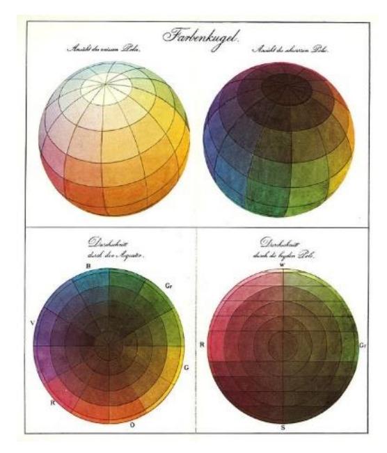
Figure 6 Runge's Farbenkugel – color sphere (1810). From light colors to dark shades. Water-color on paper [32].
According to Ewald Hering's (1834-1918) experience, a conscious subject needs four distinct colors – red, green, yellow, and blue – in order to describe perception, in addition to white and black, which together constitute the fundamental human eyesight [2]. Ogden Rood (1831-1902) developed a theory of three colors – red, green, and blue – with white at the center and the hues or purest colors at the outside position of the circle. Rood's asymmetrical double cone put the purest colors around the center, white at the top, and black at the bottom. The tints and shades are the colors that exist between them. Alois Hofler based his theory on a four-color octahedron polygon of red, green, yellow, and blue situated at each of its corner bases, with white at the top, grey in the middle, and black at the bottom. American painter Albert H. Munsell (1858-1918), may be considered the father of modern color classification [20]. He wanted to create a rational way to describe each color based on the visual impact of the hue using decimal notations of numbers instead of color names, which he considered misleading. This color system began with five basic colors – red, yellow, purple, green, and blue – followed by five secondary or intermedia hues [2]. He also gave each color a number notation in order to identify and arrange them more effectively. He created a three-dimensional cylindrical color circle with the value on the vertical axis, white at the top and black at the bottom, characterizing the attribute of the color as 'hue.' The color was measured horizontally around the cylinder in degrees; the chroma was measured radially outward from the vertical axis; and the value was measured vertically from zero (0) black to ten (10) with white at the top of the vertical axis (see Figure 7).
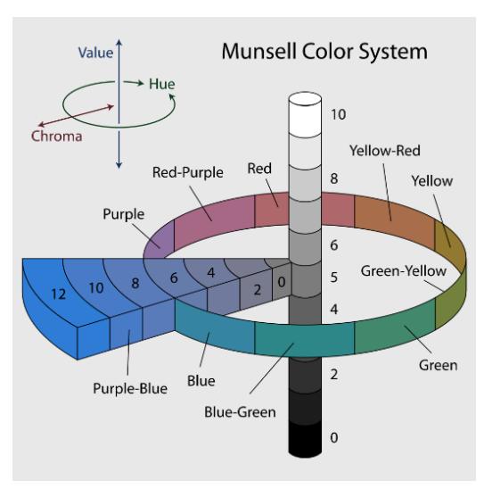
Figure 7 Munsell color system: 3-dimensional representation, color sphere (1943) [33].
A point to highlight is that two colors positioned on opposite sides (red and green) and with similar chroma and saturation were considered complementary colors, and when mixed together, they would cancel each other out by producing a grey value (red + green = grey), besides when these two colors are placed next to each other they would generate the strongest color contrast. This method of allocating colors next to each other for the purpose of creating a painting is called 'pointillism', where each color maintains its intrinsic properties. This color notation model provided a clear comprehension and was an objective manner of handling color theory that moved away from a purely theoretical approach and toward a much more practical and technical approach. The United States Bureau of Standards accepted this language for working with colors under this system [20], and it was the predecessor for modern color systems such as Pantone (widely used for printing, fashion, and interior design), or Trumatch (a four-color matching method that organizes colors logically based on hue/saturation/brightness-HSB).
Wilhelm Ostwald (1853-1932), a German chemist, developed a color system theory based on eight colors – red, orange, yellow, purple, blue, turquoise, sea green, and leaf green – arranged on a twenty-four color segment, constructed into two double cone systems that stem from the four proto-colors red, yellow, blue, and sea green [34]. Michael Jacobs (1877-1958), a Canadian sculptor, used three basic primary colors – red, green, and violet (basically blue-violet) – to represent subtractive pigment mixing, which he called 'spectrum primaries', along with three secondary colors – yellow, blue, and crimson – which he called 'complementary', and arranged them to form a calyx flower. Jacobs described and emphasized the psychological significance of his particular and quite idiosyncratically complicated color combination in his book, The Art of Color (1923). Faber Birren (1900-1988), an American color consultant, explained the asymmetrical structure of his color circle relative to the distribution of warm and cool colors in his book, Principles of Color: A Review of Past Traditions and Modern Theories of Color Harmony (1969) [2].
Johannes Itten (1888-1967) created his own theory to describe how each of us perceives color. Artists and fine art students all across the globe utilize Johannes Itten's color wheel chart today. He was a Swiss theorist and expressionist painter, designer, and teacher. He studied and taught colors from a scientific and artistic perspective together with the painter Wassily Kandinsky.
Figure 8 Painting by Wassily Kandinsky. Yellow-Red-Blue (1925). Oil on canvas, 127 cm x 200 cm [35].
Wassily Kandinsky (1866-1944) explained in his book, Point and Line to Plane (1926) that music and colors were inextricably linked, associating each musical note with an exact hue. This idea of aligning colors with musical notes may have originated with Newton, who linked the seven colors of the visible spectrum to the seven musical notes [6]. Kandinsky, like many of the German painter's colleagues and contemporaries, was a mystic who despised the values of progress and science and wished for the world's regeneration via a new art of pure interiority. In his passionate and sometimes befuddled book, Concerning the Spiritual in Art, published in 1912, he explores the psychological effects of pure colors, claiming that a vibrant red hue, for example, may generate the same impact as a clarion call. His conviction that it was feasible and important to achieve communication between spirits in this manner prompted him to disclose his first three attempts at chromatic painting, which were the ones that truly kicked off what is now known as abstract art [29] (see Figure 8). Kandinsky was a pioneer of abstract art developed from color, line, shape, and texture to create a rhythmic visual experience that evoked an emotional response [36], which he called the 'aesthetic experience'.
Paul Klee (1888-1940), in his book Pedagogical Sketchbook (1925; Miller & Lupton, 1991) [37] distinguishes three dimensions or orders of painting: the line which is related to the measure, the tonality which is related to the weight, and the color which is related to the quality, which he sees the highest dimension. These three variables intersect, with color as the first quality, measure as the second, and weight as the third [38]. For both Kandinsky and Klee, the sensorial potential of color was its true power, whether neatly categorized or not [39].
The German-born art educator Josef Albers (1888-1976) [40], was another member of the color theorists that Bauhaus produced, each adding their own unique twist to the quest to decipher color. Each visual describes the materials employed, such as oil painting on canvas, watercolor on paper, mixed medium, or oil on board; this information is given at the end of the paintingvisual/images to validate the type of work identification. Physical artworks produced in the domain of fine art such as painting would use physical pigments such as RYB on a hard surface called the support, generally canvas or board. Alberts as an artist and educator also dealt significantly with color. He studied color (RYB), its connections, and its influence on his pupils at Yale. He famously stated that if you asked fifty pupils what they saw when they saw red as physical pigment, you would get fifty different answers.
This subjectivity can be difficult for designers, unless they understand how to offset perception discrepancies and generate color combinations that are more likely to accomplish the desired outcome. Albers was interested in what happens when colors (physical pigments) interact with one another, as happens frequently when different colors are used in a single composition. As a matter of fact, he put his students through activities aimed to develop their ability to produce effective color groups [41]. Albers and Itten both felt that relatively modest alterations in color groupings and tonal values may yield intriguing outcomes and that a person's ability to make good color selections could be enhanced through practice and study [13] (see Figure 9).
Figure 9 Painting by Josef Albers. Homage to the Square, 1951. Oil on fiberboard, 101.3 cm x 101.5 cm [42].
Lyonel Feininger (1871-1956), a German-American painter and leading exponent of the Expressionist movement, and Gerhard Marcks (1889-1981), under the direction of the German architect Walter Gropius (1883-1969), were both associated with the Weimar Bauhaus School of Design, and their contributions underpin much of what is currently understood about design principles and color theory, which is taught across many different academic institutions. Although Gropius was notorious for his personal contempt for the use of color in his buildings, his desire for discussion was such that color theory was taught as part of the school's necessary foundation course, and it is noteworthy that he encouraged artists to do this rather than architects. Itten was motivated by a desire to imbue the visible spectrum with a logical framework.
Color was also essential for the development of the Spanish artist Pablo Ruiz Picasso (1881-1973), particularly in the blue and rose series that preceded his Cubist work. Picasso's preference for blue led him to choose it as the dominant color of his palette for many years, giving birth to his so-called Blue Period. The Blue Room and the large-format painting known as Evocation – The Burial of Casagemas (1901) marked the beginning of an intimate and personal symbolism in Picasso's work (see Figure 10(a)), in which a new plastic statuary and vigorous form, as well as reaching the limit between parody and assimilation of the great masters, coexist in an almost monochrome palette that tends to empty and lighten the color, depicting an ascension to heaven that recalls El Greco and Zurbarán [43].
Figure 10 (a) Paintings by Pablo Picasso. Evocation – The Burial of Casagemas (1901). Oil on canvas, 150 cm x 90.5 cm [44]. (b) Acrobat Family with Monkey (1905). Mixed media, 104 cm x 75 cm [45].
Itten's identification of particular colors with specific emotions had the most influence on modern theory. Color is defined as a force with radiant energy that affects us favorably or adversely, whether or not people are conscious of it [46]. Itten further said that all 'tints' reflect the brighter and better aspects of life, whilst all 'shades' represent darker, sadder, and negative energies. He also attributed colors the qualities of being 'warm' or 'cold', detailing how colors interact with one another and how they affect individuals physically and psychologically [47]. Itten stated, "he who wants to become a master of color must see, feel, and experience each individual color in its many endless combinations with all other colors. Colors must have a mystical capacity for spiritual expression, without being tied to objects" [39].
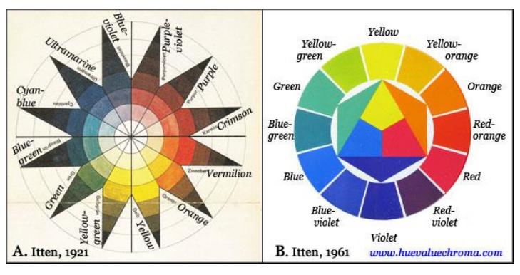
Figure 11 Johannes Itten. Watercolor – color circle (1961). Current color wheel, tints, and shades [48].
Itten created the well-known twelve-step color circle, which is currently utilized by artists all over the world. This two-dimensional circular system arranges the primary colors red, yellow, and blue (RYB) according to their hue and equally to their brightness, viewed in a black and white range known as a-chromatic color (from the Greek prefix 'a' meaning 'without' or absence of chroma) (see Figure 11).
The Itten color circle was based on divisions from a group of equilateral triangles of six color pigments only, i.e., the pigments of the primary colors red, yellow and blue (RYB), and the secondary colors orange, green and violet (OGV), are located within a hexagon shape, and the other twelve intermediate or tertiary colors are located between the triangle and hexagon points (see Figures 12). The yellow hue is placed hierarchically at the top of the equilateral triangle shape due to its brightness property, red on the right, and blue on the left bottom. These three colors comprise the notion of equilibrium and balance, which states that all of the primary colors are present in the field of vision while the eye is at rest and this is an activity that the eye does all of the time [34]. The main wavelength in an additive light source refers to the colors red, green, blue (RGB), and in its practical manifestation red, yellow, blue (RYB), and refers to subtractive primaries such as physical pigments. Therefore, under this interaction of colors, any artist can create a harmonious color combination successfully or create a very disharmonious combination that feels different. As soon as there is a combination of these three colors in different proportions, the result is harmonious and pleasing to the eye of the beholder. So, if two complementary colors are chosen from the color wheel (pigment) and are mixed together, the result is a grey color.
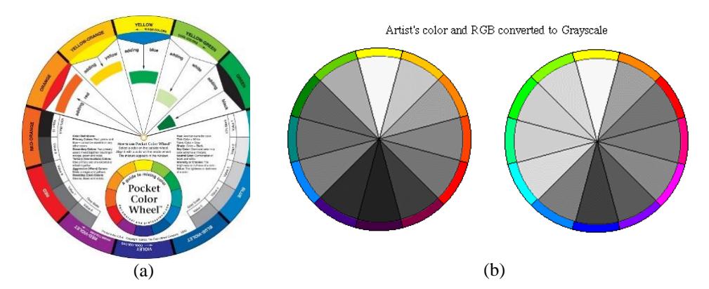
Figure 12 (a) Color circle of twelve colors [49]. (b) Color circle converter to grayscale RYB and RGB [50].
Studying this process of combining colors, Itten recognized an objective law for assessing this harmonious combination. Itten stated: "The primeval essence of color is a dreamlike sound, is light turned into music. The moment I think about color, form concept, set sentences, its fragrance disintegrates and I only hold her body in my hands" [51]. Other sets of harmonious colors can be generated from this color pallet, such as monochromatic, analogous colors, complementary colors, split complementary colors, triadic color, tetrad rectangle shape combinations, and square shape combinations of four colors. Both the tetrad rectangle shape combinations and the square shape combinations obey the double split complementary color selection. Itten identified two fundamental qualities for a 'color' to be seen by the beholder: color accuracy/reality and color impact/effect. Color accuracy (reality) refers to the physically and chemically analyzable pigment, which is often known as 'hue' or 'dye'; 'color impact' (effect) refers to the perception of color created in the beholder's eye and can only be revealed through color comparison. Some people may call this color contrast. As Itten stated: "The deepest and the most essential secret of color effects remain invisible even to the eye and can only be seen with the hearth, because it eludes the conceptual formulation" [51].
In her 2017 book The Secret Lives of Color, Kassia St. Clair [24] discusses how various painters employed symbolic meanings of specific colors in their works. For example Rothko, who said that his artworks concentrated mostly on the 'human aspect', put layer upon layer of crimson in his gigantic paintings. According to art critic Diane Waldman, it connected color "with fire and blood." [26]. Two of Van Gogh's works from the 1880s, Yellow House, an oil painting on canvas commonly known as a street landscape, and French Novels and Rose, which shows a set of books with a Bible haphazardly placed onto lovely heaps in a still-life style. Color was a significant motivator for Van Gogh and many other artists and philosophers of his period, and it became a symbol of the time and of the rejection of the restrictive ideas of the Victorian age [24].
In the period from 1924 to 1927, the Catalan artist Joan Miró created a series of paintings that were unlike anything he had ever made before. One of his works of 'peinture-poésie' [poetic paintings] is an enormous canvas that combines text with mysterious symbols and represents his interest in dreams and the subconscious. Only three elements float on the empty canvas: in the upper left corner, the word 'photo' is written in elegant sinuous calligraphy; on the right, a patch in the shape of a blue popcorn, and below, black letters sit on barely visible pencil lines that serve as a guide for their size, and in handwriting the text "ceci est la couleur de mes rêves" [this is the color of my dreams] [24].
Since the sense of touch does not register intrinsic properties in the way sight/vision does, there is less resistance to the notion of relational touch. That is not to say that we should never revise historically entrenched intuitions. If people do resist historic preconceived notions, what does a relational phenomenology of color actually look like? The goal is to consider colors in a personal sense as the way things/objects appear to oneself. One may argue that the visual experience through the sense of sight of a 'thing/object' as being colored, builds a relation that exists between the thing and oneself – this visual perceptual relationship is the means by which one comes into contact with the thing/object [22]. As such, everyone may experience color as it affects the perception of form, the dimensions, and the qualities of space as well as how it affects how we feel and behave. It is understood (tacitly) that the abovementioned artists working in de domain of fine arts – especially in painting – all used color as a physical pigment (subtractive color scheme) in their creative process; they did not used any (additive) color schemes.
Finally, color in the forms of RYB or RGB exists only in the mind; it is a perceptual response to light (RGB) or physical pigment (RYB) that enters the eye either directly from self-luminous light sources or indirectly, from light reflected by illuminated objects. The nature of light and the spectral reflectance properties of objects were therefore described in the early part of this article. Subsequently, this article offers an account of the historical development of subtractive (RYB) and additive (RYB) color schemes.
6 Conclusion
What we see is what appears. It is not simply the color of an item but all of the factors that impact its interpretation addressed by the brain. Historically, color has had an effect on every element of human life. This is perceived by the brain and is impacted by the illumination on the item; this viewing activity happens in the eye. Color is what a person senses. It is the outcome of the physical change of light shining on an object perceived by the human eye, understood by the brain, and conceptualized in the mind. The color of an item (thing) is determined by the selective absorption and dispersion of light. There exists an unlimited and ever-expanding number of color hypotheses. For example, the public debate in the eighteenth century was based on Newton's visible light (a spectrum of seven colors); according to his color light spectrum arrangement, a mixture of orange and green light would yield yellow light, but many of his opponents' theorist colleagues mixed orange and green color pigments and to their dismay the result was a grey, muddy color. There are no unbiased systems in color organization [47]. Mussell's color theory (based on pigment) was essentially an intuitive technique that still dominates color education in American classrooms today. Understanding what the color order system is about might make more sense if it were separated from its current context.
When understanding color, two things must be considered: first, how the color appears visually, and second, how the color is understood by the observer.
Color, like temperature, is entirely subjective; colors (pigments) can only be described as 'cold/cool' or 'hot/warn' when compared to a similar color. For example, two unique types of reds known as Indian red vs. cadmium red or red vermilion or something similar; one of these may be seen as somewhat warmer or cooler than the other. Color may also transmit meaning based on cultural, historical, or psychological influences. Color selection within the color wheel involves an understanding of how color vibrates, a phenomenon known as color saturation. To be similar and harmonic, the color wheel (RYB) must vibrate at the same saturation level, which is when the color (RYB) achieves its brightest peak, and when the color (RYB) pigment is gone. This is called de-saturation, bringing the color closer to white. Another point to note is that certain colors advance and many others recede in physical space; this is a psychological phase in the mind's processing of how colors are perceived and experienced; warm colors are typically simpler to distinguish than cool colors. Understanding the RGB light spectrum, these colors will feel frigid regardless of their visual appearance – with the exception of the red hue – and translating them to physical pigments provides new challenges to any artist or designer. Color perception is also far more complex and influenced by characteristics such as 'form' and 'shape'. According to psychology and physiology, no two people perceive or have the same interpretation or impression of any particular color.
As a result, 'seeing' colors is a much more complex and intricate process than merely the optical reception of stimuli and the associated physiological activation of the sensory cells in the cerebral cortex [52]. Color perception entails 'feeling' it with our inner psyche, our conscious self, in order to be aware of it. We know and comprehend that the sun's radiation governs life, and that the broad range of wavelength radiation that reaches us is visible as white light, which contains energy and can be measured by many means. Color (as the physical experience) on the other hand, is a gift of human evolution that has been passed down as a hereditary feature for the survival of the vegetative and animal kingdoms. As a result, several new disciplines of inquiry may yet arise.
Acknowledgement
The author would like to thank Prof. Sherry Blankenship and Mr. Ken Tan for their assistance and positive discussion throughout the development of this paper.