
1 Introduction
It is known that colors can evoke memories and emotions, and these associations have value in design. Much of the previous research on this topic has been conducted to understand the psychology of color, which involves analyzing the impact of color on human emotions, perceptions, and behavior [1-6]. However, it is difficult to determine universal associations because the associations between words and colors are often specific to culture and context. Nonetheless, some important universal color associations have been shown to exist, at least if cultural factors are removed [7].
The meaning of colors has been widely researched in many disciplines, including design, psychology, science, and marketing. Quoted from Won & Westland [8], aesthetic theory distinguishes between embodied meaning and reference meaning. Embodied meaning is the meaning that a color itself has; for example, the color yellow may be associated with optimism. On the other hand, the meaning of a color can also depend on the context, in which case it is called reference meaning. For example, participants in a survey on colors may be asked to rate a color on some semantic scale of a specific object (e.g., a chair); the result will turn out to vary with context. Theories about color and context have been developed, but some color meanings remain constant regardless of context. Therefore, both embodied meaning and reference meaning are often important in product color design and product packaging [8].
In an effort to meet the needs of users (designers and business practitioners) in selecting appropriate color palettes, design tools such as web-based color palette generator (CPG) applications can be utilized. To ensure their effectiveness, the design tools should include design information. The design information encompasses all data generated, used, consulted, or transformed in the design process, including material and non-material resources, as well as computational and non-computational tools, and both explicit formal formats and tacit, experiential knowledge [9]. The development of a CPG application could include the addition of design information such as color meaning, color contrast, color name, and industrial trends. The meaning of a color is defined as what a color means in different cultures and product categories. The contextual meaning of color ranges from cultural perspectives, psychological aspects, and historical significance, among others, which influence its application as well as trends and changes in meaning. The understanding of the contextual meaning of colors influences design decisions and, hence, is important design information.
Previous research has explored the meaning of colors [10, 11], but color information in design has not been extensively explored in practical or theoretical terms [12], highlighting a lack of studies addressing the meaning of color as design information. Spence and Velasco [13] studied a number of the cross-cultural differences between five countries in the meanings attributed to colors. However, their research only discussed six colors (black, white, red, green, blue, and yellow). Hence, it was particularly aimed at compiling significant design information about the meaning of colors to support design tool applications. The present research explored issues related to enhancing the relevant design information concerning the meaning of colors that should be provided in design tool applications by answering the question: what is the meaning of each color according to the literature.
This research collected and compiled references about the meaning of colors that can be used as design information in design tool applications. This paper attempts to make a valuable contribution to the literature by addressing the practical need for color meaning information in design tools, providing practical and actionable insights for designers. By conducting an initial contextual document review on research concerning the contextual meaning of colors, the authors identified color psychology and cultural meanings of colors as primary design information that could be included in design tools, thus providing comprehensive guidance for users in choosing color palettes that are suitable for relevant industries in terms of color selection and may enhance the attractiveness of products and inform cultural appropriateness.
2 Research Methods
To answer the research question (what is the meaning of each color according to the literature), data collection was done through literature studies by identifying relevant sources regarding color meaning. Contextual document review is a method of analyzing and evaluating documents within a specific context. It involves examining various documents related to a particular topic or research question and extracting relevant information from them [14]. The purpose of a contextual document review of literature resources about the meaning of color was to gain a deeper understanding of how colors are perceived, interpreted, and utilized in various contexts. The various contexts were sorted to be later determined as themes of information that can be utilized for color selection in design tools.
The contextual document review was conducted on three literature sources to extract significant information regarding basic and common colors. These three sources were selected based on relevance to the research topic. They were credible and reliable sources, being textbooks published within the last ten years. This ensures that the information obtained is up to date. Table 1 lists the three literature sources being studied.
| Author(s) | Year | Book title | Publisher |
|---|---|---|---|
| Richard G. Lewis [15] | 2014 | Color Psychology: Profit from the Psychology of Color. Discover the Meaning and Effects of Color | Riana Publishing |
| Karen Triedman [16] | 2015 | Color: The professional's guide. Understanding, appreciation and mastering color in art and design | North Light Books |
| Sean Adams and Terry Lee Stone [17] | 2017 | Color Design Workbook: A Real-World Guide to Using Color in Graphic Design | Rockport Publishers |
Tabel 1 Three documents being studied.
The research also collected colors that were considered to have consistent meanings in reflection of its themes of information. This was based on the research conducted by Brent Berlin and Paul Kay in 1969. They developed a theory of cross-cultural color concepts centered on what they call 'basic color terms' (BCT). The eleven basic color terms are: black, white, red, yellow, green, blue, brown, purple, pink, orange, and gray [18]. These are general color terms that are often used in design and are also often discussed in the color literature [19]. Therefore, the present research identified their meanings related to the determined information themes. After organizing the extracted data and assigning the categories based on the themes of information, the next step was to identify consistent meanings in the collected eleven BCT and then interpret the findings of the data analysis in relation to the research objective. Figure 1 shows the research framework and the parameters of analysis.
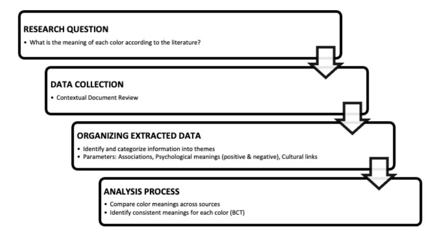
Figure 1 Research framework.
3 Result and Discussion
From the document review, four main information themes related to color meaning were identified, and eleven colors, known as the basic color terms, were collected. The four information themes focused on were: color association, positive meaning related to emotive perception, negative meaning related to emotive perception, and cultural links. This focus also determined the embodied meaning and reference meaning. These informative categories were later developed to inform users concerning the embodied meaning and reference meaning of colors.
3.1 Red
Tabel 2 Meanings of the color red.
| Red | Lewis (2014) | Triedman (2015) | Adam & Stone (2017) |
|---|---|---|---|
| Associated with | - Excitement, drama - Urgent passion - Strengths - Assertiveness - Appetite stimulant - Flame of the human spirit | - Fire - Blood | - Fire - Blood - Sex |
| Positive | - Vitality, activity - Desire, appetite - craving, blood, - Conquest, power - Masculinity, - Passion, strength - Energy, fire - Love, sex - Excitement, speed - Heat, leadership | - Energy - Strength - Power - Passion - Desire - Love | - Passion - Love - Blood - Energy - Enthusiasm - Excitement - Heat - Power |
| Negative | - Devil, danger, fire - Gaudiness - Blood, war, anger - Revolution - Radicalism - Aggression, stop | - War - Danger | - Aggression - Anger - Battle - Revolution - Cruelty - Immorality |
| Cultural Links | India: Associated with - purity (used as a wedding color) China: Symbolic of - celebration, good luck, and prosperity | Most of Asia: - Marriage, prosperity, happiness India: Soldier's - symbol South Africa: - Color of mourning | Ivory Coast, Africa: - Dark red indicates death France: Masculinity - Most of Asia: Marriage, - prosperity, happiness India: Soldier's symbol - South Africa: Color of - mourning |
From the contextual review, we could derive that the color red (Table 2) carries various meanings and is often associated with love, power, and energy attributes. In terms of its association with assertiveness, red expresses a power play or strength. Red is commonly utilized in brand recognition as a strategic element to influence the perception of the brand. The color red helps products stand out on shelves and becomes associated with the brand over time. The vibrant and attention-grabbing nature of red makes it suitable for enhancing the visibility and accessibility of products on shelves. The association with assertiveness or strength can convey a sense of confidence and authority, making it a popular choice in logos and branding for companies or products that want to project a bold image.
Regarding color psychology (negative/positive emotive perception), red is perceived positively as a vibrant and energetic color. It can evoke a sense of dynamism, excitement, and vitality. In this context, red is frequently used in marketing to grab attention and convey a sense of urgency. Red is also used to evoke a negative feeling, such as danger, or to point at something that should not be trespassed. For this meaning, red is often used in environmental graphic design or sign systems to warn, to stop, or to point at dangerous situations or conditions. In industrial settings, products with potential risks or specific usage instructions may use red in their packaging to draw attention to important information. This is particularly common in sectors like chemicals or pharmaceuticals. Apart from that, red is often used in stamps to signify promotions, discounts, or special offers, as the color catches the eye and can create a sense of urgency, making it effective for drawing attention to limited time offers or sales.
3.2 Yellow
From the contextual review, we could derive that the color yellow (Table 3) carries various meanings and is often associated with positive and energetic attributes. We could observe that an embodied meaning in the form of a positive perception is consistently shared by the three sources. This consistent embodied meaning in the case of yellow produces a perception of joy, happiness, optimism, intellect, and idealism. While yellow is generally associated with positive attributes such as optimism and energy, it can also have negative connotations depending on cultural context, personal experiences, and specific situations.
Regarding negative perceptions, the consistent ones are cowardice and caution. The perception of caution may derive from the characteristic of color that is attention-grabbing and in some cases overwhelming. For this emotive association, yellow is often used for warning signs, as some individuals may associate it with caution or potential danger. In certain contexts, yellow can signal a need for attention or alertness, which may evoke negative feelings. Apart from this, the historical association with the negative perception of cowardice derived from Western culture. This association has its roots in literature and symbolism and while it may not be as prevalent today, some negative connotations may still linger.
Tabel 3 Meanings of the color yellow
| Yellow | Lewis (2014) | Triedman (2015) | Adam & Stone (2017) |
|---|---|---|---|
| Associated with | - Happiness - Cheerful mood - Expansiveness - Lack of inhibition | - Sunshine | - Sunshine |
| Positive | - Enlightenment - Precious metals - Sunlight - Joy - Happiness - Optimism - Idealism - Wealth (gold) - Summer, hope | - Joy - Happiness - Intellect - Energy | - Intellect - Wisdom - Optimism - Radiance - Joy - Idealism |
| Negative | - Dishonesty - Cowardice - Legalism, betrayal - Caution, hazard, - Illness (quarantine) - Avarice, weakness | N/A | - Jealousy - Cowardice - Deceit - Caution |
| Cultural links | - Suggested to be used for: Children's products, holidays, tourism - Most Asian cultures: Imperial color with many of the same cultural associations as purple in the West | - Proto-Indo-European: Yellow was ghel and meant both yellow and green - Proto-Germanic: Yellow was gelwaz, subsequent incarnations of German had the word as gurl [Old Norse], gel [Middle High German], and gelo [Old High German]. - Old English: Yellow was written as geolu and geolwe | - Buddhist Culture: Priests wear saffron yellow robes - Egypt and Burma: Signifies mourning - India: Symbol of merchant or farmer - Hindu: Worn to celebrate the spring festival - Japan: Associated with courage |
Yellow produces a warming effect, arouses cheerfulness, stimulates mental activity, and generates muscle energy [16]. When yellow is used with black, it suggests warning – think stinging insects, traffic caution signs, and labels for hazardous materials [15]. Yellow is often employed in packaging to highlight safety information and cautionary instructions. It can draw attention to important details and alert users to handle the product carefully. Additionally, products related to energy, sports, or fitness may use yellow packaging to convey a sense of vitality and enthusiasm. This aligns with the energetic and positive aspects of the color.
3.3 Blue
Tabel 4 Meanings of the color blue.
| Blue | Lewis (2014) | Triedman (2015) | Adam & Stone (2017) |
|---|---|---|---|
| Associated with | Symbolically, blue is the color of the sky and the oceans - Seas, skies, peace, unity, harmony, tranquillity, calmness, coolness, confidence, water, ice, loyalty, conservatism, dependability, cleanliness, technology, winter, depression, coldness, idealism, obscenity, ice, tackiness, winter | N/A | - Sea - Sky |
| Positive | - Calmness - Relaxation - Unity - Tranquillity - Contentment - Gratification - Being at peace - Evoking a soothing | - Trust - Loyalty - Wisdom - Confidence - Intelligence - Faith - Truth - Heaven | - Knowledge - Coolness - Peace - Masculinity - Contemplation - Loyalty - Justice - Intelligence |
| Negative | N/A | N/A | - Depression - Coldness - Detachment - Apathy |
| Cultural links | - India: Associated with Krishna (a positive association) - USA: Red, white, and blue are still the biggest and best-selling combinations for packaging in the US | N/A | - Most of the World: Considered a masculine color - China: Color for little girls - Iran: Color of mourning - Western: Bridal tradition means love - Worldwide: Most popular corporate color |
From the document review, we found that blue (Table 4) is mostly associated with the sky and the oceans. Its consistent meaning ranges within positive associations. The meaning of calmness or coolness, for example, is embodied in natural elements such as sky and water. Positive associations with tranquillity, being at peace, intelligence, and loyalty are similar information shared by the documents. This can become the consistent information enhancing color palette generator applications. In some cultural contexts, a darker blue may suggest a perception of power and authority, inspire confidence, a sense of safety, and trustworthiness.
Blue is universally perceived as the best color for business, as it has the most positive and fewest negative associations across various cultures. A negative perception of the color blue is only stated in one document; hence, it cannot be perceived as common. In the context of industrial packaging, the application of the color blue may serve various purposes. In line with the association of dependability, truth, and knowledge, blue packaging can evoke a sense of trust and credibility, making it suitable for products where reliability and quality are crucial. This is often seen in pharmaceuticals, electronics, and automotive industries. The association with calmness, tranquillity, contentment, and relaxation is also in line with the healthcare industry, as the color conveys a sense of caring for self. Apart from that, association with cleanliness is useful for application in hygiene-related products or personal care items.
3.4 Orange
According to the review, the color orange (Table 5) is mostly associated with natural elements such as sunshine, orange, or citrus fruit, apart from other elements such as autumn or fire. With its vibrancy, it is associated with energy. The color is positively perceived as stimulating and inducing creativity and enthusiasm, among others. In contrast, no negative perception of the color is mentioned in the documents. Hence, it may become a perception related to the situation, such as a negative association with over-emotion related to overstimulation. Since these three emotive perceptions are shared by the three documents, they can be considered as consistently emerging meanings of orange, embodied in objects found in nature that induce similar emotive perceptions.
Since its consistently emerging meaning association with energy embodied in many natural objects, orange embodies a dynamic and energetic quality, symbolizing movement, action, and spontaneity. Hence, it is suitable for packaging for outdoor and adventure products, such as sports equipment, camping gear, or interior color. It gives the emotional perception of friendliness and fun to stimulate thinking and talking. As a color that induces creativity, orange can be effectively used in the packaging of products associated with artistic and creative industries, such as art supplies or innovative tech gadgets. Alternatively, when orange is paired with earthy tones, it can be applied in the packaging of environmentally friendly and sustainable products, conveying a sense of balance and eco-consciousness.
Tabel 5 Meanings of the color orange.
| Orange | Lewis (2014) | Triedman (2015) | Adams & Stone (2017) |
|---|---|---|---|
| Associated With | - Fire, vitality, warmth - Energy - Natural associations like sunshine, oranges, and carrots | - Joy - Sunshine - Tropics | - Autumn - Citrus |
| Positive | - Buddhism - Energy - Balance, heat, fire - Enthusiasm, - Flamboyance - Playfulness | - Enthusiasm, - Fascination, - Happiness, - Creativity - Determination, - Attraction, Success, - Encouragement, - Stimulation | - Creativity,, - Invigoration - Uniqueness, - Energy, - Vibrancy, Activity, - Stimulation, - Sociability, - Health, Whimsy |
| Negative | - Aggression - Arrogance - Flamboyance - Gaudiness - Over-emotion - Warning, danger | N/A | - Crassness - Trendiness - Loudness |
| Cultural Links | - Europe: Popular color with a strong appeal notably in Latin and French cultures - USA: Orange is the color most detested by Americans | N/A | - Northern Ireland: Signifies the Protestant movement - Native American Culture: Linked with learning and kindship - India: Hinduism - Netherlands: Orange is the national color because the Dutch royal family is referred to as the House of Orange-Nassau |
3.5 Purple
From the document review, we understand that the color purple (Table 6) is mostly associated with royalty, spirituality, magic, mysticism, and a hint of creativity and imagination. Purple is often linked to spirituality and mysticism, as the color conveys a sense of introspection, meditation, and depth. The depth and richness of purple contribute to a sense of mystery and intrigue, making it a color that captures attention and sparks curiosity. Hence, purple embodies mysterious and spiritual qualities.
Tabel 6 Meanings of the color purple.
| Purple | Lewis (2014) | Triedman (2015) | Adams & Stone (2017) |
|---|---|---|---|
| Associated with | - Magic - Horoscopes - Royalty - Palm reading - Clairvoyance - The occult | - Royalty | - Royalty - Spirituality |
| Positive | - Cool, Full of authority - Wealth, intelligence - Creativity - Sensuality - Spirituality - Wealth - Royalty - Nobility - Ceremony - Mystery - Wisdom - Enlightenment | - Royalty - Power, dignity - Nobility - Luxury - Ambition - Wealth - Extravagance - Wisdom - Independence - Creativity - Mystery - Magic | - Luxury - Wisdom - Imagination - Sophistication - Rank - Inspiration - Wealth - Nobility - Mysticism |
| Negative | - Cruelty - Arrogance - Flamboyance - Gaudiness - Confusion - Mourning - Profanity - Exaggeration | N/A | - Exaggeration - Excess - Madness - Cruelty |
| Cultural Links | - In some cultures, purple is the color of mourning. - on the blue side of the color spectrum, associated with mystical qualities. - on the red side, the associations are more sensual. | N/A | - Latin America: Indicates death - Thailand: Worn by widows mourning their husband's death - Japan: Represents ceremony, enlightenment, and arrogance |
In line with its mysterious quality, its perception as a royal color has long been associated with rarity as a common perception of royalty and luxury, further stemming from historical associations with aristocracy and wealth. The color is often used to convey a sense of opulence, luxury, and regality in various contexts, including fashion, design, and branding. Hence, purple has a consistent meaning that conveys a sense of royalty and nobility, carrying the historical associations of being a color reserved for the elite. Apart from that, the connection between purple and spirituality persists, representing wisdom, introspection, and a connection to higher realms of thought. This gives purple a consistent meaning that conveys spirituality and wisdom.
The documents present instances where purple is negatively perceived or associated with cruelty. Yet, this is likely due to specific cultural, social, or personal contexts rather than any inherent quality of the color itself. The cultural links also show instances where purple is associated with arrogance, mourning, or death. This cultural context may make purple an ambiguous color. Hence, it is important to carefully consider the target audience and the desired brand image when incorporating purple into packaging to ensure it aligns with the intended perception and message.
3.6 Green
From the document review, the color green (Table 7) is mostly associated with nature, growth, and the environment, symbolizing renewal, vitality, and the life cycle. The positive association with life, spring, and growth in nature makes the color be considered a balanced and harmonious color. This creates the association to feelings of calmness, stability, and equilibrium. As such, green embodies the meaning of natural vitality, where it manifests essence of natural vitality and growth found in the lushness of plants and the renewal of life. The calming quality of green embodied in its association with nature evokes a sense of calmness and relaxation, hence, the meaning of tranquility can be ascribed to the color green.
Green Lewis (2014) Triedman (2015) Adams & Stone (2017) Associated with - Optimism, good luck - Freshness, fertility - Suggest that things are getting better - As the color of money (USA), it has strong associations with finance, business, economic stability, and entitlements - Growth - Harmony - Plants - The natural - Environment Positive - Nature, spring - Fertility, youth - Environment, grass - Wealth, money - Good luck - Vigor, generosity - Growth - Harmony - Freshness - Fertility - Fertility, youth - Money, growth - Healing - Success - Nature, harmony - Honesty
Tabel 7 Meanings of the color green.
| Green | Lewis (2014) | Triedman (2015) | Adams & Stone (2017) |
|---|---|---|---|
| Negative | - Aggression - Greed - Inexperience - Envy, jealousy - Misfortune - Illness | N/A | - Greed, envy - Nausea - Poison - Corrosion - Inexperience |
| Cultural links | - India: Associated with Islam - China: Wearing green means a man's wife is cheating on him - Many countries: Immediately associated with ecology and environmental issues | N/A | - Islam: Associated with paradise - Ireland: Strongly associated with the symbol of four-leaf clover in Ireland - Celtic Cultures: The Green Man was the God of Fertility. - Native American Cultures: Linked with the will of man |
Green is also frequently linked to health, healing, fertility, and wellness, representing vigor, freshness, cleanliness, and a connection to natural living. The color is known to improve vision. This knowledge stems from its balance and healing quality. As a balanced color, green embodies the meaning of harmony and equilibrium, making it a visually comfortable and aesthetically pleasing choice.
In contrast, some cultures associate green with envy and jealousy. This negative perception may stem from the idea of the 'green-eyed monster', a phrase rooted in William Shakespeare's play Othello. The expression is used to describe jealousy or envy. Another negative perception is that green can be contextually associated with inexperience or naivety, perhaps because of its association with youthfulness, freshness, or unripe vegetation.
3.7 Pink
Although pink is included in the eleven basic color terms, only one document describes it (Table 8). From the document, pink is associated with baby girls, referring to its sense of femininity and softness. This association also creates the perception of youthfulness and playfulness, evoking feelings of innocence and joy. Hence, pink is positively perceived as a simple and sweet color, conveying simple and comprehensible emotions. The color pink embodies a sense of gentleness and compassion. It symbolizes empathy, understanding, and kindness. Certain shades of pink also embody delicacy and sensitivity, suggesting a gentle approach and a willingness to connect emotionally. From here, we could derive the consistent meaning of the color pink as symbolizing
softness, femininity, and affection, as well as youthfulness and playfulness, conveying a sense of whimsical aesthetic.
| Pink | Lewis (2014) | Triedman (2015) | Adams & Stone (2017) |
|---|---|---|---|
| Associated With | - Baby girls | N/A | N/A |
| Positive | - Simple - Uncomplicated emotions | N/A | N/A |
| Negative | N/A | N/A | N/A |
| Cultural links | - Pink has few cultural associations but is associated with gay culture in the West | N/A | N/A |
Tabel 8 Meanings of the color pink.
Although not mentioned, since pink is associated with baby girls, the color is prone to stigmatization and stereotyping. In some contexts, pink may be associated with gender stereotypes, limiting its perceived suitability for certain audiences or products. Pink can also represent an expression of individuality and self-expression, particularly when used in unconventional or unexpected ways, as in certain cultures in the West, where pink may well be seen as a color symbolizing gay culture. The innocent quality of certain shades of pink may drive the perception of immaturity or childishness, especially when used excessively or inappropriately. This subjectification may lead to a negative perception of the color.
3.8 Brown
From the document review, we found that the color brown (Table 9) is mostly associated with stability and security, roots (as a natural element), subtlety, warmth, welcoming quality, and a hint of sensuousness. Brown can convey a sense of reliability and stability in line with the grounded, organic, authentic qualities and solid nature of the earth. The sense may create another association with wealth, from wealth to premium or expensive taste. Another embodied meaning of brown is simplicity and authenticity, reflecting nature's unpretentious and genuine aspects.
From here, a consistent meaning of brown can be derived. Since brown consistently symbolizes natural elements and neutrality, it creates the meaning of being natural and neutral. On the other hand, the sense of subtlety and stability creates the consistent meaning of brown as a timeless color, giving way to the perception of traditional and classic aesthetics. In contrast, some shades of brown can also be perceived negatively, albeit influenced by cultural context.
Brown is commonly negatively perceived as a dirty color if used inappropriately, giving a sense of staleness. In certain contexts, brown may be perceived as dull or drab, lacking the vibrancy of brighter colors.
| Brown | Lewis (2014) | Triedman (2015) | Adams & Stone (2017) |
|---|---|---|---|
| Associated with | - Roots - Family security - Subtle - Warm, welcoming - Sensuous qualities | N/A | N/A |
| Positive | - Wealth - Subtle but expensive taste/premium | N/A | N/A |
| Negative | - Dirty - Unclean | N/A | N/A |
| Cultural links | - Cultural associations: Calm, depth, natural organism, nature, richness, rustic, stability, tradition, anachronism, boorish, dirt, dullness, filth, heaviness, poverty, roughness - India: Associated with mourning | N/A | N/A |
Tabel 9 Meanings of the color brown.
3.9 Black
From the review (Table 10), we found that most perceptions of the color black came from cultural associations. Some of these cultural associations are universal while others are not. They include association with power, formality, elegance, night, style, mystery, sadness, and death. Positive and negative associations are also observed. Positive associations include elegance, power, formality, and sophistication. Black is often associated with elegance and sophistication, conveying a sense of timeless style. It is commonly used in formal attire and settings to project a sense of seriousness and control; hence, it is also perceived as the color of formality and authority, which conveys a tone of strength and seriousness. In color therapy, black is believed to enhance strength and self-confidence. Black is also linked to mystery and intrigue, as it can conceal and create a sense of depth and ambiguity. Black conveys the idea of nothingness or extinction as it can signify the definite boundary beyond which life exists.
Although its cultural perception in which negative associations are universally shared, black consistently symbolizes elegance and formality. It is a color associated with high-end fashion, luxury, and formal events. Additionally, Black is often used in minimalist design, where simplicity and a lack of unnecessary elements are emphasized. With its associations of elegance, formality, and power, the color consistently conveys a sense of sophistication. From here, the consistent meaning of the color black can be derived. It is a versatile color widely used in industrial packaging design, particularly in sectors with a desired sleek and high-end image.
Tabel 10 Meanings of the color black.
| Black | Lewis (2014) | Triedman (2015) | Adams & Stone (2017) |
|---|---|---|---|
| Positive | - Sophisticated - Elegant - Modernism - Wealthy - Achievement-orientated women | - Burning, blazing - Glowing, shining - Power, formality - Elegance, mystery - Grief, strength - Dignity | - Power, authority - Weight, solitude - Sophistication - Elegance, formality - Seriousness, dignity - Mystery, stylishness |
| Negative | - Corruption - Emptiness - Depression | - Death - Evil - Gloom | - Fear, negativity, evil - Secrecy, submission - Mourning, heaviness - Remorse, emptiness |
| Cultural links | - Many socio-economic groups and cultures: The color of mourning, grief, and death - Many countries: Synonymous with conservatism (even fascism) | - China: Color for little boys - Asia generally: Black is associated with career, knowledge, mourning and penance - American, European, Japanese youth: Color of rebellion - Worldwide: Denotes dark-skinned people of sub-Saharan African ancestry |
3.10 Gray
From the review, we could derive that the color gray (Table 11) is mostly associated with neutrality. In this sense, the embodied meaning of gray is a sense of balance, serving as a harmonizing force between the extremes of black and white. It represents subtlety, wisdom, and anachronism. As such, gray consistently symbolizes stability, humility, and respect. This is the consistent meaning of gray as its timeless quality makes it suitable for conveying a sense of enduring elegance.
Gray is often perceived positively as a symbol of elegance, subtlety, and stability. It is appreciated for its ability to provide a neutral and timeless backdrop. On the other hand, gray can also be associated negatively with boredom, decay, and pollution, especially when it is not used thoughtfully. In the context of symbolism gray, a neutral color, represents the color of 'industry'. In some cases, this representation may create a negative association with industry, especially when being contrasted with the notion of ecology and environment, which is represented by the color green.
Tabel 11 Meanings of the color gray.
| Gray | Lewis (2014) | Triedman (2015) | Adams & Stone (2017) |
|---|---|---|---|
| Associated With | - Neutrality - Free from stimulus - Non-involvement - Concealment - Uncommitted - Uninvolved | N/A | - Neutrality |
| Positive | - Elegance, humility - Respect, reverence - Stability, subtlety - Timelessness - Wisdom - Anachronism | N/A | - Balance, security - Reliability, modesty - Classicism, maturity - Intelligence, wisdom |
| Negative | - Boredom, decay - Decrepitude - Dullness, dust - Pollution - Urban sprawl | N/A | - Lack of commitment - Uncertainty - Indecision, boredom - Moodiness, sadness - Cloudiness, old age - Bad weather |
| Cultural Links | N/A | N/A | - Native American cultures: Associated with honor and friendship - Asian: Means helpful people as well as travel - America: Used to represent industry, in contrast to the environment, represented by green - Worldwide: Often associated with silver and money |
3.11 White
In the document review (Table 12), we found several associations with the color white, including peace dove, light, cleanliness, sterility, innocence, crispness, peace, and purity. However, white is mostly associated with peace and purity, as these associations ae shared collectively by all three documents. From the documents, we could derive the dimension of embodied meaning and the consistent meaning of white. Since white is associated with cleanliness, white is considered to embody the idea of a clean slate and fresh beginnings. It symbolizes the potential for new starts and untarnished possibilities. Meanwhile, the clear and humble nature of white embodies the meaning of clarity and openness, representing a canvas that is ready for expression and creativity. The association of white as light embodies the quality of illumination, in terms of physical light and metaphorical meaning of enlightenment when observed in its cultural context.
Apart from its embodied meaning, the consistent meaning of white is derived from its universal usage associated with the perception of clean, simple, and pure. From here, we can see that white consistently symbolizes purity and simplicity. Hence, white is often universally chosen for weddings, medical settings, and spiritual contexts. From its quality of openness, white is considered to be versatile and can adapt to various meanings depending on cultural, religious, or contextual interpretations.
Tabel 12 Meanings of the color white.
| White | Lewis (2014) | Triedman (2015) | Adams & Stone (2017) |
|---|---|---|---|
| Associated | - Dove of peace | - Peace | - Light |
| With | - Crispness | - Purity | - Purity |
| - Tidiness | |||
| - Innocence | |||
| - Moral purity | |||
| - Cleanliness | |||
| - Sterility | |||
| - Blandness | |||
| Positive | - Reverence, Purity | - Peace | - Perfection |
| - Snow, peace | - Purity | - Wedding | |
| - Innocence, clinical | - Innocence | - Cleanliness | |
| - Cleanliness, | - Delicacy | - Virtue, innocence | |
| - Simplicity, security | - Refinement | - Lightness, softness | |
| - Humility, marriage | - Sophistication | - Sacredness | |
| - Winter, coldness | - Cleanliness | - Simplicity, truth | |
| Negative | - Surrender, sterility | N/A | - Fragility |
| - Cowardice | - Isolation | ||
| - Fearfulness | |||
| - Unimaginative | |||
| - Neutral, but pure | |||
| white is considered a | |||
| brilliant color capable | |||
| of producing optical | |||
| fatigue |
| White | Lewis (2014) | Triedman (2015) | Adams & Stone (2017) |
|---|---|---|---|
| Cultural links | - China: Symbolic of | N/A | - Japan and China: |
| mourning and death | Funeral color | ||
| - Worldwide: A white | |||
| flag is a universal | |||
| symbol for truce | |||
| - North America and | |||
| Europe: Light | |||
| skinned people of | |||
| Caucasian ancestry | |||
| - Indian: Married | |||
| women wearing white | |||
| invite unhappiness |
4 Applying Cultural Nuances in Color Perception Can Enhance Design Tools
The cultural significance of color is a well-documented aspect of design, yet it is often overlooked in practical applications. As this study revealed, colors are not universally interpreted but instead their meaning varies greatly depending on the cultural context in which it is used. For example, while red signifies danger in Western societies, it symbolizes prosperity and good luck in many Asian cultures, particularly in China and India [13]. This divergence in interpretation underscores the importance of cultural links to color theory, a field that must consider the socio-cultural and historical factors that shape how different communities perceive and use colors. In their theory of embodied and reference meaning, Won and Westland [8] further elaborate on this, distinguishing between a color's inherent meaning and the way its interpretation changes depending on context. Therefore, a deep understanding of color theory requires not only a psychological and perceptual analysis of colors but also an examination of their cultural relevance. Without this, designers and researchers risk applying color meanings too broadly, without sensitivity to the cultural nuances that influence color perception in different parts of the world.
The study of color meanings is especially pertinent to design tools, such as color palette generators (CPGs) or graphic design software, which are widely used by designers across various industries. Current design tools often rely on generalized interpretations of color, primarily focusing on basic colors like red, blue, and yellow [1]. While these primary colors are fundamental, their limited scope restricts the range of culturally appropriate color palettes that can be generated. The findings from this research provide a broader and more nuanced understanding of color meanings, incorporating the cultural, emotional, and psychological associations of colors such as green, orange, and purple, which are frequently overlooked. For example, green is often associated with nature and growth in Western contexts but can imply infidelity in Chinese culture [20].
By integrating these findings into design tools, the results can improve the user's ability to select color palettes more aligned with different audiences' cultural meanings and expectations. This expanded understanding of color meanings, supported by empirical research, could significantly enhance the functionality of design tools, making them more useful for global applications in packaging, marketing, and product design.
The broader implications of these findings also extend to how color theory is applied in various industries, particularly those reliant on visual communication. For instance, packaging design is a field that benefits greatly from culturally sensitive color choices. Research has shown that color influences consumer perception and behavior, with certain colors affecting the perceived healthiness or desirability of products [2]. The color red, for example, is commonly used to stimulate appetite and create a sense of urgency in food packaging, whereas blue often conveys a sense of trust and reliability, making it a popular choice for brands that prioritize these values [3]. These findings on color meanings can, therefore, be applied directly to packaging design, where culturally informed color choices can enhance product appeal and consumer engagement. Similarly, in corporate branding, understanding the cultural connotations of colors can help brands create more effective logos and marketing materials that resonate with their target audience.
Moreover, the inconsistencies in color meanings observed across different literatures point to a need for clearer frameworks or parameters for categorizing these meanings. While this study identified some consistent associations—such as red with 'passion' and 'energy' or blue with 'calmness' and 'reliability'—the varying interpretations found in different sources highlight the complexity of the meanings of colors [21]. To address this, the findings can be grouped into more specific categories based on positive and negative emotive perceptions, as well as cultural links, to offer clearer guidance for designers. For example, a color like yellow, which embodies both positive meanings ('happiness' and 'optimism') and negative ones ('cowardice' and 'caution'), can be categorized in terms of its dual perception in different contexts [15]. By creating such parameters, the findings would offer a more structured and consistent reference for design tools, helping users navigate the complexity of the meaning of colors with greater ease and precision.
Real-world applications of this research include case studies in product and packaging design. For instance, Coca-Cola uses the color red in its branding and Apple uses white and gray in its product design. These applications demonstrate how color theory, when understood and applied effectively, can significantly impact brand identity and consumer perception. Additionally, design tools that incorporate the findings from this research could offer better support for designers working in international markets, where culturally sensitive color choices are critical for brand success.
Understanding the cultural significance of colors makes it clear that colors are not universally interpreted. The cultural context in which a color is used often dictates its meaning, making cultural links a critical aspect of color theory. For instance, while red may symbolize danger in Western societies, while it represents celebration and prosperity in many Asian cultures. This divergence in interpretation highlights the importance of integrating cultural perspectives into the study of color theory. By doing so, we account for the variations in how colors are perceived and can tailor design tools to serve diverse cultural audiences better. Therefore, studying color meaning through a culturally contextual lens is essential for developing comprehensive design tools that consider the diverse interpretations of colors across the globe.
5 Conclusion
This research collected and compiled references on color psychology and color meanings that can serve as design information within design tools applications, such as color palette generators, graphic design software, and others. The research identified associations, both positive and negative perceptions, and cultural links derived from eleven representative colors (considered as basic color terms) found in the literature. From the data collected from three sources, we observed how each color is subjectivized into cultural, historical, and personal factors. Although the information derived from these three sources varied in terms of themes of information (color association, positive/negative, and cultural links), we could observe some consistent meaning shared by the sources. This subjectification of each color is driven by the embodied meaning that comes through the immediate perception of each color.
These findings were constructed into consistent color meanings as information that can be integrated into applications such as CPGs. These research findings are significant, as they offer valuable design information that can enhance the functionality of design tools. Current CPG tools often focus solely on primary colors—red, blue, and yellow—limiting their usability in cross-cultural contexts. By including a broader spectrum of color meanings, this research can support the development of more nuanced and culturally sensitive design tools. For example, incorporating meanings for colors such as green, which varies significantly in meaning across cultures (symbolizing jealousy in the West and fertility in many other regions), could provide designers with more precise information for their projects. Grouping the findings into consistent categories based on embodied and reference meanings, as well as cultural significance, will make these tools more robust and adaptable, ultimately leading to better
design choices in both packaging and graphic design applications. Additionally, the specific information can be integrated into CPGs to assist users in selecting color palettes that align with color meanings. The implementation of design information resulting from this research can provide comprehensive guidance for packaging designers and business practitioners in selecting appropriate color palettes. A better understanding of color meanings is expected to enhance the quality of packaging design and product appeal to consumers.
This study was limited to a document review of color meanings in general. It aimed to contribute significantly to the field of color theory by expanding the understanding of color meanings beyond the limited scope of existing tools and studies. It highlights the need to consider cultural, emotional, and contextual factors in the interpretation of color, providing valuable design information that can be integrated into tools such as CPGs and graphic design software. By offering a more comprehensive understanding of color meanings, this study provides practical insights that can enhance the design process, making it more culturally sensitive and effective across various industries. A limitation of the contextual document review methodology is that it relies solely on secondary data from selected literature sources, which may introduce bias due to the subjective interpretations and perspectives of the authors. The selection of these three sources, though credible, may not fully capture the diversity of color meanings across different cultures and contexts. However, direct testing of color meanings on packaging (as primary data) has not been conducted and other aspects, such as individual preferences and market trends, have not been fully considered.
Future research should focus on empirical testing of color meanings in realworld applications, such as packaging design, to validate these findings. This research would investigate whether the identified consistent color meanings are applied in practice across various industries that utilize packaged products, assessing their impact on product presentation and consumer engagement. By examining real-world applications of color theories in packaging design, particularly within relevant industries, researchers can evaluate the usability and suitability of identified color meanings for enhancing product presentation and consumer engagement.
Another study can be performed to explore the influence of packaging colors on consumer preferences and their impact on purchasing decisions. Additionally, it would be valuable to delve deeper into the emotional value of specific color combinations in packaging design. Consequently, ongoing contributions to the development of color theory and color combinations, as well as practical applications in packaging design, are expected to continue evolving.
Acknowledgments
This work was supported by the Directorate of Research and Community Service Telkom University National Campus Indonesia. For help with academic writing, the authors used Grammarly to check grammar and respond to the following AI prompts: Prompts created by Grammarly: "Make it sound academic" and "Improve it." Prompts the authors wrote: "What research question is best for this paper?" The authors used ChatGPT with prompts such as: "Revise the structure", "Write in a clear and academic tone", "Write in English".