
ABSTRAK
Piktogram merupakan tanda visual, gambar yang dibuat untuk menyampaikan komunikasi tanpa tulisan atau kata-kata. Piktogram pada signage dapat menyampaikan informasi atau menyampaikan larangan dan peraturan yang mudah dipahami secara singkat oleh pengunjung dari kalangan mana pun. Masalah yang teridentifikasi adalah Museum Lampung saat ini tidak memiliki piktogram pada signage. Oleh karena itu, desain piktogram pada signage di Museum Lampung penting untuk menyampaikan informasi secara singkat dan efektif. Penelitian ini menggunakan pendekatan kualitatif dan kuantitatif. Tinjauan pustaka, observasi pada tiga museum yang serupa, serta wawancara dan kuesioner dilakukan untuk mengumpulkan data. Tiga museum dibandingkan untuk mendapatkan data analisis. Hasil penelitian menunjukkan piktogram yang merupakan salah satu elemen signage penting untuk memperjelas informasi tanpa harus membaca teks. Penelitian ini mengusulkan piktogram pada signage untuk Museum Lampung dengan konsep visual yang mengadopsi identitas Lampung yaitu siger dan pola tapis. Penelitian ini bertujuan menunjukkan pentingnya menggunakan piktogram dalam komunikasi grafis. Diharapkan piktogram yang efektif pada signage dapat mengomunikasikan informasi yang diperlukan dan mudah untuk segera dipahami tanpa menggunakan banyak teks.
Kata kunci: komunikasi efektif, museum, piktogram, signage
INTRODUCTION
Pictograms are symbols that define objects, activities and concepts into a visual form that is simple and informative (Calori, 2007). Words symbols, icons, and pictograms are basically synonymous and used interchangeably. There are five elements in designing pictograms that are important to note, i.e. shape codes, excess information, element size, uniformity and simplicity (Arthur & Zlamalik, 2005).
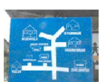
This paper discusses the pictogram on signage at the Museum of Lampung as a case study. From the preliminary study, Museum of Lampung provides less adequate communicative signage. This affects the comfort of visitors who are in the museum. One of the cases that often occurs is when visitors want to go to the toilet. Visitors find difficult to locate the toilet for the absence of an information board that directs them to the location they want to go, so they had to ask the clerk in the museum. Another shortcoming is the absence of the site plan to tell what areas there are in the museum building.
The presence of signage is important because it is not only intended to steer the place/ location, but also to inform the rules that exist inside or outside the building in this case Museum of Lampung. As for pictograms on signage is to convey information that helps visitors while in the museum area or convey regulation and prohibition which are easily understood briefly by visitors from any circles. The problems identified is that Museum of Lampung does not currently have a pictogram on any signage (identification, regulation, prohibition, directory sign). Meanwhile, previous study confirms that a simple presence of pictograms makes an easier identification and understanding of the scheme, i.e. Airport graphic representation system/ map (Adîr, Adîr, & Dobrescu, 2015). In addition, Huer (2000) in Clawson, Leafman, Nehrenz, & Kimmer (2012) studies how graphic symbols were perceived by various cultural and ethnic groups
Therefore, the design of pictograms on signage for the Museum of Lampung is one effort so that visitors can easily obtain the information needed or find the intended location. This is because the pictogram on signage is able to communicate information to visitors briefly and effectively. In addition, the design of pictogram adopt local identity of Lampung also will increase the attractiveness of this museum.
Based on this phenomenon, the problem formulation is how to design a pictogram on signage for the Museum of Lampung as an effective communication which also adopts Lampung's local identity. The primary objective of this study is to show the importance of using pictograms in a graphic communication.
Another objective is to propose a communicative pictogram on signage for the Museum of Lampung which adopts local identity to provide information needed by the visitor while in the museum including the location, the room layout, regulation and prohibition. It is expected that by the effective pictogram on signage be able to communicate the necessary information and easy to understand immediately without using a lot of texts.
METHODS
This study used qualitative and quantitative approach. Theory as well as references from several books, journals, and signage standard manual were collected to obtain data or information needed. The observation was done by observing the activities of the visitors as well as the officers who are in the Museum of Lampung. Interviews were conducted with visitors, Museum of Lampung officials, and signage practitioners to explore the sight, understanding, opinion of individuals on pictogram. Questionnaires were distributed to visitors who come to the Museum of Lampung and distributed daring through google docs in February 2016 to April 2016. Since the beginning, the questionnaire is only addressed to audiences who have visited any museum. 163 respondents were collected from questionnaires distributed. For the analysis, this study used a matrix analysis by comparing several pictogram on signage found on similar projects so that the visual differences of each object can be seen. The similar projects which are compared include the National Museum and the Museum of Bank of Indonesia.
RESULTS AND DISCUSSION Pictogram
Pictogram is a visual signor image created by humans for the purpose of accelerating and clarifying communication without text or words. A visual perception includes many areas in the human brain, which is more than 80 percent, followed by the sense of hearing 10 percent. Therefore, a visual marker has a strong influence on the human senses (Abdullah and Hubner 2006: 13 in Santoso, Dedi, & Silvia, 2013). There are a lot of pictograms which may be used in many other domains without problems concerning the graphic representation and the meaning of them. So, there are the pictograms for men/women toilets, the pictogram for a coffee shop and restaurant or a graphic representation for lift, escalator, stairs, or parking area which are understood by everyone. These kinds of pictograms have simple graphic drawing using a very familiar representation (Adîr et al, 2013 in Adîr et al., 2015).
Using image for communication is quite ancient. From Egypt Era till today, image and icon have been used extensively for communication regardless of literacy and language (Zender, 2006). The development of pictorial information systems was a product of changes in post-World War II period, but this dissemination followed the expansion of US business, the internationalism of commerce and culture that occurred in the post war period. The use of these symbols paralleled the international style of graphic design adopted by corporation for their communication (Ciochetto, 2003).
According to Arthur & Zlamalik (2005), "the topic of verbal message is the main thing that must be determined before designing pictograms, after determining the topic and then grouped into several categories of verbal messages that have been generally applied." The first is to simplify identification of messages to be delivered into a few words. An example is the topic of parking can be simplified into two messages among them : "Please park" or "no parking". After that set the context for the graphic to be applied. Graphics context has the ability to convey messages that vary from similar symbol that aims to convey different messages. As mentioned above, the words symbols, icons and pictograms are basically synonymous and used interchangeably.
Symbols used on the signage as a substitute for a sentence are more effective. For example, symbol P replaces parking, symbol hamburger replaces the word restaurant, or symbol ship replaces the harbor. These symbols should be easily understood in order to be effective and shorten communications. Symbols can overcome the language barrier, thus symbols can be very useful on the signage in public facilities where visitors gathered from a variety of languages and cultures such as airports, hospitals, hotels and an Olympic event.
In some cases, the symbols can be used alone without the words to communicate the necessary information. In other cases, the symbols can be used to reinforce the message, or as a second language to help users who do not understand the written words. There is a possibility that the symbols cannot be used at all to convey the information of the sign. It is almost impossible to design a sign that all the information consists of symbols.
AIGA, the leading design association, has developed fifty pictograms for the US Department of Transportation (DOT), which has become a standard symbol for wayfinding since 1981. The AIGA / DOT system is frequently used in signage. Quoted from Zender (2006), its visual form may have been more specifically influenced by their display in transportation environments such as airports and highway where movement and traffic flow are important considerations.
Arrows
Arrows are symbols that can be understood all over the world as a guide. They replace verbal instructions, typically consisting of a pointed head and a shaft. Arrows also a graphical representation of the physical arrows. However, arrows with shafts communicate more clearly than those without shafts, for the shafts reinforce the directionally of the arrows (Calori, 2007: 120). At this time, arrows are universally used since they are understood by all cultures, more flexible, requires less space than a verbal instructions, and have a consistent form to be used repeatedly (Follis & Hammer, 1980: 59). In order to be communicated clearly, the list of symbols and arrows require visual unity, clarity, and simplicity in graphic design.
Diagrams
Besides symbols, diagrams also convey information sign in the form of images. By far, the most common diagrams used in the signage is a map. Map is very useful in communicating the position of places and spaces, including transportation lines such as trains and buses, as well as wayfinding and navigation tool. Map is a visual replacement for complex directions if it is delivered in words. Map requires a fairly detailed understanding because many people need a long time to understand it. Map is generally regarded as additional information content for signage. In this case, colors can be used to differentiate locations and features, to code functional
elements of the site and to add personality, style or character (Gibson, 2009:100).
Case Study
The museum is an educational tourist place so that all people with any age, educational background and social status can visit the museum. Museum of Lampung has specific differences compared to other museums that further highlight the ethnic, cultural, and collections which are found in Lampung. Museum of Lampung provides a means of information such as labels on collectibles, audio to provide information to visitors about the museum as well as facilities and infrastructures. Visitors who arrive at the museum often asked the museum officials when they did not know which direction they should go to get to the destination, although it has been briefed before entering the museum. Museum officials also admit the lack of signage and wayfinding in this Museum of Lampung. Based on field observation, it was concluded that there is no communicative pictorial signage in Museum of Lampung.
However, pictograms are very useful in the signage for three reasons: (1) They are able to save space of sign; (2) the meaning of symbols can overcome the language barrier; especially to people who may not speak the native language of its place; (3) Sometimes they can help communication more clearly than words i.e. arrows. Pictograms communicate visually rather than verbally. This is supported by previous study finding that
Figure 1 AIGA/DOT symbol (AIGA, n.d.)
to convey a good communication without words it is necessary to have good representation because a graphic and visual language is above the languages (Adîr et al., 2015).
Pictogram on signage should be standardized and informative. In addition, signage must meet such standardization i.e. font, the size of the visualization, altitude level, as well as informative content element. It is said that the good graphics do not support the main functions of a signage and wayfinding. Preferably graphic elements are positioned as aesthetic value. This statement is emphasized by the interviews conducted with in-house designer from Gusto Sign that the signage is well said when the design results are informative while the graphic elements just as eyecatcher.
In addition to questions related to the museum in general, the symbols contained on signage Museum of Lampung are also asked. 52% of respondents found quite familiar with the symbols contained in signage and wayfinding at Museum of Lampung. 45% of respondents found the signage and wayfinding design at Lampung of Museum is currently less gimmicky, whereas 87% of respondents agreed that attractive signage and wayfinding design can affect the delivery of effective information.
In the last questionnaire, the respondents were given open questions of the signage at Museum of Lampung. Respondents had various opinions. Most said that the signage and wayfinding are still not good in terms of design. The monotonous design makes images become unattractive. It would be better if the design using colors and ethnic elements typical of Lampung which are made more modern but has elements of local identity. The good signage, should not only guide the visitors, but also
attract visitors to visit the museum, of course, with theme designs personalized to what is shown in the museum. Signage is supposed to be designed in such a way that is able to provide an educational effect on the public. However, the good signage not only conveys directions and information, but also indirectly brings environmental ambience museum itself.
Signage according to Calori (2007: 71-75) is classified into identification sign, directional sign, warning sign, regulatory/ prohibitory sign, operational sign, honorific sign, and interpretive sign. Whereas Gibson (2009: 47) classifies signage into identification sign, directional sign, orientation sign, and regulatory sign. This paper discusses pictogram on signage based on classification by Gibson (2009). Table 1 shows the matrix analysis on signage at three museums as observation objects (Museum Lampung, Museum of Bank of Indonesia and National Museum).
Based on the comparison of the signage in three museums, it is found that there are less signage that uses pictograms so that the message becomes less communicative, especially for foreign visitors. On the other hand, it takes a longer time to read the message delivered by the text. Whereas from some previous studies, it can be concluded that the pictogram is one of the informative signage design elements that are important to clarify the information without having to read the text.
Design
Creative concept of the pictogram on signage at Museum of Lampung uses local identity element of Lampung. Identity that will be highlighted on the design by adopting characteristic of Lampung i.e. tapis pattern that has become the building ornament, siger, as well as using the Lampung script on the content of the information so the design
Table 1 Analysis Matrix
look more attractive (Figure 2-4). Tapis is a kind of traditional cloth products of Lampung with a special pattern of gold or silver thread. Whereas siger is Lampung typical crown which symbolize the majesty of Lampung Culture worn by bride and Lampung Duke. Local identity is adopted since it has the potential to create a unique image of a place and as an innovative way to preserve local culture.
The purpose of this study is to design the pictogram on signage that is informative to provide a variety of information such as directions, regulations exist inside or outside the building of a museum, information that describes the descriptions of each of the museum's collection, as well as other information that can help visitors during in the museum. The target audiences according to the data are 15-40 years of age, male and female, occupation students, college students, employees to entrepreneurs who come from the lower middle class.
The communications strategy is using a pictogram with the caption in Bahasa Indonesia that is easily understood by local visitors. In addition to using the Bahasa Indonesia, signage design for the symbol that is less easy to understand is by using international language i.e. English to foreign visitors. According to de Paolis & Guerini (2015), it is preferable to use letters and pictograms of 30 mm and 50 mm size respectively, for a distance of 1 meter, while 150 mm and 250 mm for a distance of 5 meters.
This study proposes pictogram on signage for the Museum of Lampung with a visual concept that takes the theme of local identity of Lampung. Identity that will be highlighted in the design is by adopting a hallmark of Lampung i.e. siger and tapis motifs that have become ornaments in the museum building, as shown in Figure 5.
A cigarette with diagonal line
Figure 2 the building ornament (Clara, 2016)
Figure 3 Siger (Clara, 2016)
Figure 4 Lampung Script (Clara, 2016)
symbols replace the word no smoking; the cup and hamburger symbols replace the word restaurant on a sign. However, man/ woman symbols are universally understood since they depict simple concept. Those pictograms can be paired with typographic message on signage. This pairing, however can be useful in multilingual signage environment i.e. museum.
CONCLUSION
Signage and wayfinding designed are supposed to be able to provide an educational effect on the public, not only conveying directions and information, but indirectly bringing
environmental ambience museum itself. Pictograms are powerful graphic tool which support it. The aim of this study is to show the importance of using pictograms in a graphic communication. In signage, pictograms can replace typography to communicate certain messages. Pictograms can be paired with typographic message on signage; thus, they can be useful in multilingual signage environment. The limitation of Problems is focused on the signage and wayfinding in Lampung Museum consisting of identification, directional, orientation and regulatory/ prohibitory signs that help to guide visitors while in the museum. Thus, as further research, it
Figure 5 Pictogram design (Clara, 2016)
is interesting to do more research on how to make an effective social campaign of pictograms for regulatory/ prohibitory signs which are able to be understood by any circles. The study could be conducted in many public spaces such as hospitals, train stations, universities, and under construction projects.