
INTRODUCTION
Brand is an asset that has the highest value for a business, even exceeding the combined total of all properties and equipment owned by the business. Substantially, a brand can be defined as an invisible asset. Reflects a summary of events in an entity. The success of a brand can form an image, character or identity that is able to form a bond or relationship between the company and consumers. Brands are actually created and created in the mind. The role of a successful brand can form a personality or identity that builds relationships between consumers and companies. Brands can also be created through the branding process, which refers to brand building activities, bringing elements of visual identity creation, communication, and the formation of corporate behavior or culture. Visual identity creation is an important method of building a physical brand. One of the key elements in the formation of visual identity is the logo. The logo acts as an entrance that reflects a brand. Logo design is done so that awareness of the important role of logos in building a brand and appreciation of the branding process can grow. Thus, identity mapping from one brans to another brand to society will experience variations and differences, along with a variety of visual cognitive responses from different individuals. Logo as a visual representation that identifies a brand, should have a clear difference from one another. It is important to understand that the perception of logos is not only influenced by design elements, but also by visual cognitive factors owned by each individual.
Visual cognitive refers to the mental processes involved in the interpretation and understanding of visual information (Smith, 2004). In this context, each individual has his or her own cognitive background that includes factors of experience, values believed, associations and subjective views. A significant role in an individual's assessment and interpretation of a logo, which is a brand identity, can be reflected through variations in visual cognitive responses. The diverse ways individuals perceive and interpret logo elements have a striking impact on the perception of brand identity. The importance of a logo on a company can be seen in the case of a digital health
company in Germany called M-Sense Migraine and the logo of an international application company, the Meta Facebook logo. Both of these companies have logos designed to show their brand identity. However, these logos attract the attention of netizens because they have almost the same shape, which reflects the understanding of visual cognition of each individual in interpreting the logo.
In the case of these two logos, it is closely related to the impact of brand identity. Brand identity addresses the scope of logo, design and color elements that make up the brand recognition . The similarity of Meta and M-Sense logos can be detrimental to the uniqueness of both, given that a strong brand identity depends on elements that distinguish the brand from competitors. Logo similarity can cause visual confusion and meaning, get a negative response, harm brand identity which is essential for the success of the company in the world of branding.
Therefore, in the context of M-Sense and Meta brand logos, the author performs a visual element analysis on both. Then, the visual
elements in each logo will also be compared using visual semiotics to find and explore the differences and similarities in meaning that make up the logo. Meanwhile, Visual cognition provides deep insight into the imagination to process, recognize and interpret visual elements such as shapes, colors and symbols in brand logos in order to get answers as to how the visual cognitive relationships of each individual can affect brand identity in both M-sensei and Meta logos.
METHOD
Researchers use descriptive analysis research methods that aim to provide an objective picture related to the phenomenon of the M-Sense logo with Meta. The type of data used in this study is secondary data, by reviewing sources such as books, texts, and journals that have been published. Data collection is carried out through library research. The literature study approach is applied in this research by studying and analyzing the literature sources needed to respond or answer the problems faced in this study. Furthermore, data analysis is carried out
using a qualitative approach, a method used to investigate, find, and explain meaning and relationships in order to provide understanding and solutions to problems that are the object of this study. The object in this study involves the analysis of M-Sense and Meta logos through elaboration related to the observation of visual elements and Roland Barthes' semiotic theory. After that, the results of the analysis will be linked to visual cognitive to facilitate a better understanding of visual information, recognition and understanding of logos that refer to the identity of both brands.
VISUAL COGNITIVE
According to Smith (2004), Visual Cognitive is an interdisciplinary research that focuses on understanding how the human brain processes visual information covering various disciplines such as neurobiology which explains the nervous system, intelligence, to psychology that studies behavior and a person's metal or in other words mental processes. Mental processes refer to the cognitive functions involved in visual perception when the human brain
interprets and perceives visual information that can be seen more deeply in the surrounding environment. According to Smith (2004) explained that visual information is produced by intuitive and rational intelligence and there are different levels of processing such as unconscious (Unconscious cognitive) includes intuitive processing by the right brain and conscious (Conscious cognitive) includes rational processing by the left brain. Rationality refers to decision-making processes that are analytical, systematic, rule-based and explicit. In contrast, intuitive processes involve steps such as defining a problem, analyzing and synthesizing but also take place more quickly and are largely unconscious and closely interrelated. (Calabretta, G., Gemser, G., &; Wijnberg, NM, 2017)
Wiley (1990) has also developed a visual learning paradigm that reflects a hierarchy almost identical to Bloom's Taxonomy of learning and Maslow's Hierarchy of Basic Human Needs. Wiley's visual paradigm consists of three levels, where each level involves specific steps that each individual needs to follow before reaching the level of visual
maturity. In the context of this study, attention will be focused on the first level of Wiley's visual learning hierarchy. The first stage in the visual learning hierarchy is known as visual cognition, which refers to the mental process of perceiving, remembering, forming, and editing visual information. The key stages are divided into three in this first rank, namely Visual Perception, Visual Memory, and Visualization. Visual perception involves the ability to mentally perceive visual information, while visual memory involves the ability to mentally store information and remember it and visualization is the ability to mentally form and edit visual information. This provides the basis for a deep understanding of how individuals process and interact with visual information in learning contexts.
VISUAL SEMIOTICS
According to Barthes, the science or method of analysis used to study signs is the understanding of semiotics. In Barthes' terms, semiotics is also known as semiology, which basically aims to understand how humans are given meaning by things. In this context, meaning is not just communication, but a process in which objects not only convey information, as occurs in the activity of conveying messages, but also form an ordered or structured system of signs. Thus, interpreting in semiotics includes aspects of the formation and meaning of sign systems, and is not only limited to the communication process (Sobur, 2013).
In Barthes' perspective, social life is regarded as a sign system that has its own significance, implying that all forms of social life are an interpretable sign system. Barthes highlights the role of the reader as a key element in sign interpretation. Connotation, which is an intrinsic characteristic of a sign, requires active participation from the reader in order to function effectively. Many semioticians follow the school of connotation, when studying sign systems in which the understanding of signs is not only fixated on the meaning that is immediately visible (denotative), but also includes hidden meaning (connotation). Denotative refers to the meaning that is clearly and directly visible, that is, it is the true meaning or the first order that has a closed nature.
Denotative meaning makes the result of meaning immediate, explicit and definite. Meanwhile, Connotative expresses the meaning contained in certain signs or can be referred to as implicit meaning, uncertain and not directly, giving various new interpretations. Denotation is considered as an objective and fixed meaning or meaning, while connotation is a subjective interpretation or meaning that can vary depending on aspects of experience, culture or individual perception (Vera, 2014: 26).
BRAND IDENTITY
According to Kotler (2006), the concept of brand, refers to an entity consisting of a name, sign, design, symbol and term, or a mixture of many elements, with the aim that goods can be recognized or services from a group of producers and can distinguish from competing products or can be called visual identity. Aaker (2001) also states that a brand is a name or symbol used to distinguish and identify a service or goods from a group of sellers or one producer from a competitor of the brand. Furthermore, the brand also
serves as a response to customers about a product, and provides protection to customers and manufacturers from competitors' efforts to serve and deliver identical products that can cause confusion in the market. According to Kotler and Keller (2009), defining a brand is a concept that includes terms, names, symbols, signs, designs, or mixtures of various elements. The main function of a brand is to determine the goods or services that originate through an individual or group of sellers, as well as to distinguish those products from goods offered by competitors in the market.
Brand identity is a name that reflects commitment by users or consumers. It is important for brand identity to connect meaningfully with consumers to be effective. Brand identity also serves as an element to distinguish competing brands and reflect the activities that will be carried out by the company's organization in the future. According to (Kotler, P., &; Pfoertsch, 2008) in (Prameswari, A., &; et al, 2021) Brand identity requires the existence of brand elements that can be expressed visibly or have a form to determine certain services, goods or products. These elements can be logos, names and slogans that image the uniqueness or differentiation of a company compared to other companies or competitors. Brands are created to determine differentiation from other products or services, with the aim of providing products or services that provide varying levels of satisfaction (Kotler &; Keller, 2013) to give consumers the ability to recognize the quality of the products offered. Brands serve as clues used by consumers.
As a very important visual element, logos play a role in providing a strong and easily recognizable visual identity for consumers and slogans are also another element in building brand identity, to have a unique and special role in creating brand identity. In short, slogans are sentences that are easy to remember and always involve brands in marketing communications. Its function is to help strengthen the brand image conveyed through the brand name and logo (Kotler and Pfoertsch, 2008, p.110).
RESULTS AND DISCUSSION
In this section, a thorough analysis of each visual element in the M-Sense and Meta logos is carried out, detailing the elements of visual communication contained. Furthermore, the significance of each logo will be compared using Roland Barthes' semiotic theory to identify differences and similarities in meaning at the denotative, connotative, and mythical levels. The purpose of this process is to allow readers to understand the meaning that the brand wants to convey through the visual elements on each logo. After deeply understanding the meaning, the author will explain the visual cognitive that appears as a result of the visual elements in each logo, which aims to facilitate a better understanding of visual information, as well as recognition and understanding of company branding through brand identity.
ANALYSIS OF VISUAL ELEMENTS OF THE FACEBOOK META LOGO AND M-SENSE MIGRAINE
A. FACEBOOK META LOGO ANALYSIS
Gambar 1 Logo Brand Meta
(Sumber : sign salad: https://signsalad.com/ourthoughts/metavisual)
Facebook, which is now renamed Meta, is a social networking platform or online social media platform service that allows users to interact with each other and share information globally (Hanafi, M., &; Yasir, Y., 2016). Meta or Facebook is a social networking site, Meta account owners can join communities based on city, work, or who is still in school, and area to connect and interact with others. Users also have the option to add themes, send messages and update personal profiles so that information about the brand can be seen by others. Meta,
Facebook, a famous social networking site, was originally introduced in 2004 on February 4, which was formed by Mark Zuckerberg. This student is an alumnus of Ardsley High School. It can be concluded through this definition that Facebook functions as a social networking platform that allows users to interact socially on a global level. Facebook's new logo with the word "Meta" is designed simply and can be used effectively in a variety of applications. In this section the visual elements analyzed involve the structure of the logo shape, color palette, and typographic design on the logo.
Gambar 2 Logo Brand Meta
(Sumber : design.facebook: https://design.facebook.com/stories/designing-our-new-company-Brand-meta/)
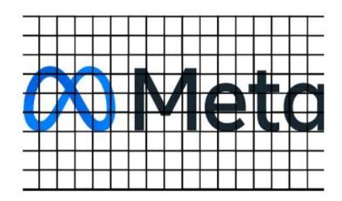
Based on the form of construction, the Meta Logo can resemble the "infinity" symbol, whose symbol reflects an infinite boundary in the Metaverse where the shape has a continuous pattern. Continuity
according to Usman, S. M., Faisal, M., &; Ashari, M. (2022) is that elements that are arranged continuously will be interpreted as a new form that shows a flow. Continuity in the META logo has the ability of the eye to follow a pattern in an infinite direction. However, from another perspective, the Meta logo can also be classified as the letter "M", which clearly represents the Meta name. Meta designs are also structured to always live in motion or 3D, forming a continuous loop that runs smoothly between 2D and 3D contexts. It is designed to be enjoyed from different points of view and interact. Meta's "M" logo carries a type of gravity that seems to limit or reduce carelessness. However, placing the "metaverse" logo on a horizontal line with a smooth curve flow creates the impression of a friendly and gentle environment. This provides stability and reliability, while still being able to evolve to bring about change.
Gambar 3 Logo Brand Meta
(Sumber : Brandpalettes:
https://Brandpalettes.com/meta-color-codes//)
In the image also meta logos that have pattern continuity, the principle of continuation helps direct the viewer's attention when looking at a composition. Dark blue and light blue colors, with a gray font type. Similar to Facebook's original color palette, the use of blue in the logo shows calming optimism, creating coolness like blue skies and horizons. These color choices connect brands with endless opportunities. In addition, blue is a highly functional color, found consistently in logos of well-known companies such as LinkedIn, BMW, and
IBM. When combined with a gray logotype, this color palette reflects technical rigor and formal efficiency.
Gambar 4 Logo Brand Meta
(Sumber : repository.upnjatim:
https://repository.upnjatim.ac.id/10109/1/36_ SALSABILLA%20CANTIKA%20SUJARWOPUTRI% 20ZAHWA%20%28268-275%29.pdf)
If we examine in more detail regarding the grid layout of the Meta logo it can be observed carefully that the width of the M-Sense logo consists of 17 horizontal grids, while the height involves 4 vertical grids. This analysis shows the proportions used in designing the logo, by dividing the width and height in a given grid size. Then, typography in visual elements. Overall, typography is a technique of arranging letters and text in the context of visual creation, aiming to be easy to read and interesting to look at. This art is closely related to the selection of typefaces, known as fonts. Typographic principles applied in analyzing typography include
legibility, readability, visibility, Ekawardhani, Y. A., &; Natagracia, G. (2012). Legibility refers to the quality of a letter in terms of how easily it is recognizable or read. Readability focuses on the quality of ease and comfort of reading a series of letters in typographic design or layout layout. Meanwhile, visibility emphasizes the ability of letters and text to be understood clearly. "Meta" has a serif type of font where this font has a classic and stable feel that symbolizes trust, authority and honor. The aspect from one letter to another is enough to meet the aspects of legibility, readability, and visibility because of the ease of the letter when read, its layout and can be understood clearly.
B. M-SENSE MIGRAINE ANALYSIS
M-Sense Migraine, based in Germany, is a company from Germany that has a focus on the health sector by providing assistance for individuals suffering from migraine through the use of digital applications.
Figure 5 "M" Logo on M-Sense
(Sumber: Twitter/@msense_app)
In the analysis there is the M-Sense Migraine logo, the letter 'M' shape element has a striking characteristic, where the shape visually connects, resembling an infinity symbol. In addition, there are similarities in the dimensions or size of the letter 'M', which is found in the logo. However, it should be noted that there is a slight difference added by M-Sense, namely the presence of additional symbols that complement the shape of the letter 'M', providing an additional visual element that distinguishes this logo. The selection of a design with an 'M' shape that connects like an infinite symbol can be considered a design decision that considers symbolic messages. Infinite symbols are often associated with the concept of infinity, continuity, or limitless potential, and the addition of symbols by M-Sense can add a dimension of meaning to a brand logo. As such, the analysis highlights not only aesthetic aspects and visual balance in the design, but also symbolic considerations integrated in the typographic elements of the M-Sense Migraine logo.
Figure 6 "SENSE" Logo Writing
(Sumber: Twitter/@msense_app)
M-Sense Migraine logo typography. The presence of a symbol (- ) in the middle, acts as an intermediary between the logogram and the logotype in the M-Sense Migraine logo. The presence of the symbol (-) in the M-Sense Migraine logo gives an additional dimension to typography, creating a visual element that sets it apart. This symbol may contain certain meanings or concepts related to the identity and values of the company. The use of these symbols can enrich the visualization of the logo and give it a distinctive aesthetic touch. This symbol also reflects the company's efforts to create a unique brand identity that can be clearly distinguished from other brands. By incorporating the symbol (-) as a custom typographic element, the M-Sense Migraine logo demonstrates an effort to build a distinguishing brand image, while still maintaining consistency with its digital wellbeing theme.
Taking these differences into account, typographic analysis becomes essential for understanding the visual elements that detail the uniqueness and characteristics of each logo. The decision to include the symbol (-) in the M-Sense Migraine typeface reflects careful design thinking, aimed at creating a strong visual identity closely linked to the company's values. In the typographic aspect of the M-Sense Migraine logo, attention is drawn to writing the word "SENSE," where the typography used for this writing featuring serif fonts can be considered a representation of the company's intention to reveal variations or layers in brand identity and can lead to a modern or futuristic impression. Overall, it can be interpreted as a deliberate design strategy to convey certain nuances and values that M-Sense Migraine wants to introduce through typographic elements in the brand logo.
Gambar 7 Logo "M-Sense" dan Color Palette
(Sumber: Twitter/@msense_app)
If observed carefully, the use of color in the M-Sense Migraine company logo includes a combination of dark green combined with light green shades. This combination creates a striking and balanced color palette, attracting attention and giving an aesthetic impression. Dark green can give a logo a touch of elegance and depth, often associated with elements such as health, growth, and stability. On the other hand, the presence of light green gives a fresh impression, coolness, and innovation, which can be in accordance with the theme of companies engaged in digital health. The combination of these two shades of green not only provides an attractive visual dimension but can also trigger positive associations related to the company's values. Thus, the choice of colors in the logo becomes an important element in creating a strong and attractive brand identity. The combination of dark green and light
green on the M-Sense Migraine logo is likely carefully selected to achieve the desired visual impact and build a positive impression of the product or service presented.
Gambar 8 Grid Logo "M-SenSE
(Sumber : repository.upnjatim: https://repository.upnjatim.ac.id/ 10109/1/36_SALSABILLA%20CANTIKA% 20SUJARWOPUTRI%20ZAHWA%20%28268- 275%29)
In the discussion of the M-Sense Migraine logo layout grid, it can be carefully observed that the width of the M-Sense logo consists of 17 horizontal grids, while the height involves 4 vertical grids. This analysis shows the proportions used in designing the logo, by dividing the width and height in a given grid size. Furthermore, an observation of the specific elements of the logo shows a size comparison between the "M" logo and the words "SENSE". The "M" logo appears larger compared to the words "SENSE". These proportions create a visual hierarchy that emphasizes the main element of the logo, the letter "M", which may be considered the most significant or striking element in the identity Brand. This selection of size and proportion can have a specific design purpose, such as highlighting key elements or ensuring clarity of the message conveyed. Size comparisons between logos and text can influence how these logos are received by audiences, emphasizing certain elements according to the design strategy desired by M-Sense Migraine.
SEMIOTICS ANALYSIS OF META LOGOS AND M-SENSE
Denotative, Connotative, and Mythical Impairment on META and M-SENSE Logos
The author describes the results of the analysis based on what has been explained previously about the Meta and M-sense logos that have the same meaning but some are different. In this context, to elaborate the meanings contained, the author adopts Roland Barthes' semiotic approach. In this semiotics, Barthes grouped meanings into three main categories. First, denotative meaning, where interpretation is done based on what is seen in a sign or visual element. Second, connotative meaning, where there are hidden meanings in the observed visual elements. Finally, the meaning of myth, which includes connotative meanings that have been part of people's consciousness for a certain time. Here is a comparison of denotative, connotative, and mythical meanings between Meta and M-SENSE logos:
1. Comparison of Denotative Meanings of M-SENSE & META M-SENSE LOGO:
(a) M-SENSE has a logo that has a continuous pattern or continuity, the letterform element resembles the symbol "M" which indicates the name Migraine. Furthermore, in the M-Sense Migraine logo typography, the presence of the symbol (-) in the middle, acts as an intermediary between the logogram and logotype in the M-Sense Migraine logo which shows an effort to build a distinguishing brand image but the use of "serif" fonts and aspects of the use of M-Sense Migraine colors include a combination of dark green combined with light green shades with a layout of 17 horizontal grids, while the height involves 4 vertical grids.
(b) META has a similar form where there is a continuity of patterns in an infinite direction with the classification as the letter "M" clearly represents the name Meta and plus text that clarifies and supports. The layout is on 17 horizontal grids, while the height involves 4 vertical grids and involves dark blue and light blue mixed together and using a serif font with the color in the font type gray.
2. Comparison of Connotative Meanings of M-SENSE &; META LOGOS
(a) M-SENSE: The shape of the Msense logo resembles the symbol "infinity" which symbolizes infinity. M-Sense Migraine has additional elements that complement the shape of the letter 'M', adding visual value by including the symbol (-) in its typography. This reflects meticulous design design, with the aim of forming a strong visual identity that is closely aligned with the company's values. The M-Sense Migraine logo shows a dedication to building a brand image that distinguishes itself, while maintaining consistency with its digital health theme. The typography used for this writing featuring serif fonts can be considered a representation of a company's value to reveal variations or layers in a brand's brand identity and can lead to a modern or futuristic impression. A combination of dark green combined with light green shades. This combination creates a striking and balanced color palette, attracting attention and giving an aesthetic impression. Dark green can give a logo a touch of elegance and depth, often associated with elements such as health, growth, and stability. On the other hand, the presence of light green gives a fresh impression, coolness, and innovation, which can be in accordance with the theme and values of companies engaged in digital health. This goal is to communicate the message of a particular value that M-Sense Migraine wants to introduce through the typographic elements contained in the brand logo.
(b) META: The Meta logo means "outside." the word outside has meanings such as future, beyond, outside the boundaries of the screen, distance limit. The word "Meta" is made to be simple when incorporated into various small applications to the world of the metaverse because it remembers the meaning of meta itself that there is always more to build or live. The construction form of the Meta Logo resembles the "infinity" symbol, whose symbol reflects infinite boundaries in the Metaverse, the shape has a continuity pattern where the ability of the eye to follow the pattern in an infinite direction. However, from another perspective, the Meta logo can also be classified as the letter "M", which clearly represents the Meta name. Dark blue and light blue, with a gray font type that shows calming optimism, creates a coolness like sky blue and horizon, and combined with a gray logotype, this color palette reflects technical rigor and formal efficiency. Where this font has a classic and stable feel that symbolizes trust, authority and honor. however, the same logo shape and similar fonts make a representation of this logo which refers to plagiarism that is widely discussed in the public which affects the Brand Branding itself.
3. Mitos Meaning of LOGO M-SENSE & META
(a) M-SENSE: The shape of the logo resembles the symbol "infinity" which means it symbolizes infinity as M-sense has that the infinity symbol comes from an ancient symbol called "ouroboros". The symbol "ouroboros" depicts an image depicting a snake or dragon eating its own tail, forming a circle or the number 8 horizontally. Parallel to that, the "infinity" symbol is also displayed with a line curve that forms the number 8 horizontally. Historically, the symbol "ouroboros" had a deep meaning, symbolizing infinity and the cycle of birth and death. The concept of a snake or dragon eating its own tail creates a visual representation of endless continuity, as well as ideas about the passage of time and eternity. This symbol is often associated with ancient philosophy, alchemy, and mystical thought. Thus, the "infinity" symbol probably adopted conceptual elements of this "ouroboros" symbol, creating an additional sense of infinity, continuity, and continuous cycle. With this historical linkage, the symbol "infinity" becomes richer in its symbolic meaning, encompassing the heritage and deep meaning of the ancient symbol "ouroboros".
(b) META: Similarly, the Meta logo that resembles an infinity shape reflects the infinite limits of the Metaverse. Metaverse is a virtual world concept idea that involves social interaction and various activities within the sound of the digital environment, which is formed using technologies such as virtual reality and augmented reality. Meta's vision is to create a fully connected metaverse, where individuals can perform activities such as work, play and interact just like in real life, but done in a digital environment that marks a major step in symbolizing the transformation that is happening. The metaverse comes from an ancient emblem known as "ouroboros". Where the symbol "ouroboros" illustrates the image of a snake or dragon swallowing its own tail, forming a circle or the number 8 horizontally which thus creates a new sense of the symbol "infinity" of infinity, continuity, and continuous cycle.
Through comparisons made regarding the denotative, connotative, and mythical meanings between the META and M-SENSE logos, several similarities were revealed in their meanings and elements. Denotative meaning indicates the presence of similar elements between the two logos, including similar shapes, font
usage, and layout. Furthermore, in terms of connotative meaning, the significance of the shape of the logo itself reflects the meaning of "infinity" or symbolizes infinity.
VISUAL COGNITIVE ON LOGO META & M-SENSE
The use of logos in the context of the company is not just a representation of graphic design, but also a visual symbol that contains values, identity, and messages to be conveyed to the audience. Logos not only serve as aesthetic elements, but also become visual symbols that contain deep meanings related to identity Brand. Visual Cognitive Analysis, especially within the framework of the Meta logo and M-Sense Migraine, has the potential to reveal the way visual elements are Brand shaping meaning and influencing how the human brain processes visual information spanning multiple disciplines. With a deep understanding of visual cognitive theory, we can explore the complexity of the interaction between visual elements in Meta logos and M-sense Migraine such as color, shape and composition can stimulate cognitive and emotional responses in individuals that affect identity Brand both companies.
If we look at the discussion above where the Meta and M-Sense logos have a slight similarity, visual cognitive focuses on understanding how the human brain processes visual information covering various disciplines such as neurobiology which explains the nervous system, intelligence, to mental processes where Mental processes refer to how to perceive, remember, shape, and edit visual information. There are three key stages in visual cognition such as Visual Perception, Visual Memory, and Visualization. Visual perception involves the ability to mentally perceive visual information, while visual memory involves the ability to mentally retain information and recall it and visualization is the ability to mentally form and edit visual information. It provides the basis for a deep understanding of how individuals process and interact with visual information whereby both logos are consciously formed, systematically and structurally or (Conscious cognitive)
which includes rational processing by the left side of the brain
See the "M" logo that refers to Three key stages are in visual cognition, Facebook company "META" and German health company the writing "M" refers to "MIGRAINE" in this case it can be seen that from a writing "M" which has a different and specific meaning for each company. But judging from the research conducted by the author where the writing "M" on the Facebook company namely "META" in only has such a meaning but seeing this Facebook company wants to launch a new breakthrough where Brand want to make it seem as if "META" can also refer to "METAVERSE" which in it is always related to technology that is sophisticated and beyond the logic of the human brain. This is what the Facebook company wants to highlight by changing it to "META" which if examined in depth means "METAVERSE". While the "M" on the logo of the German health company is just an abbreviation of "MIGRAINE" which the German health company only focuses on migraine disease. But looking at an ancient logo, namely
"OUROBOROS" which has a shape like "INFINITY" where the two logos have a deep meaning that is an infinity or continuity which means a company or the like that uses such a shape or logo hopes that there will continue to be continuity and the company can last a long time, and that is what the company "M-SENSE" wants to convey to the audience.
Although there are few similarities between the two logos, researchers note that there is a significant difference in the M-Sense logo, there is a line symbol "-" that connects the first and subsequent sentences. The symbol shows a striking difference in representation between the elements of the logo. In addition, a striking difference is also seen in the use of color by the two companies. When viewing it, the audience can easily distinguish the logos of the two. The colors applied by Meta to "META" include dark blue, light blue on the "M" logo, and gray on the words "META". This color choice may reflect the company's message that wants to show that although Facebook has transformed into Meta, Facebook's
distinctive color identity has been maintained. Thus, this color difference can be considered a visual strategy to convey continuity and change in the Meta brand. Meanwhile, in the "M-SENSE" logo, the company uses dark green as an identity element that it wants to convey to the audience.
This color choice is believed to have ties to the healthcare sector, and the company hopes that the use of this dark green color can help audiences identify that M-Sense operates in the healthcare sector. This decision reflects the company's efforts to use color as a strong visual communication element, hoping to convey a message regarding the industry focus and values that M-Sense carries in the healthcare sector. This explanation provides a direct reason that visual perception can help individuals recognize and understand both brands, where this stage shows that the "Meta" logo creates a broader impression related to innovation and advanced technology in the metaverse while the "M-Sense" logo refers to "MIGRAINE" which creates visual perception related to the company's focus on health especially on migraine
management. The symbols present in the M-sense also provide an interesting element of relationship in creating a sense of integrity and sophistication in visual representation.
The visual memory of the "Meta" logo creates memory by associating the brand with the Metaverse concept even though "Meta" is graphically similar to the "M" but manages to create that impression by changing its original meaning which triggers wider and deeper associations in the minds of users. The "M-Sense" logo creates memorability by associating the "M" with certain health diseases where the "-" symbol can improve visual memory in creating a cohesive impression of migraine management. Each of the "Meta" visualizations refers to the concept of the Metaverse and infinite advanced technology and M-sense creates visualizations with the use of healthfocused colors i.e. migraine disease. Through visual perception, visual memory and visualization that can distinguish the identity of the two brands .
THE RELATIONSHIP VISUAL ELEMENTS BETWEEN M-SENSE AND META LOGOS TOWARD BRAND IDENTITY
In the previous analysis, it was revealed the relationship between the similarity between the "Infinity" symbol in the Meta logo and the "ouroboros" symbol used by M-sense. Although there are symbolic similarities, a deeper analysis based on the theory of visual cognition provides additional understanding related to the process of processing logo elements by audiences. This understanding plays a central role in shaping the perception of a brand, the branding process, and the identity of the company itself. For example , the infinity symbol on Meta can give the context of infinity in the context of the Metaverse, while ouroboros on M-Sense creates an image of sustainability and resilience in the field of health. With this, the relationship between logo elements and theories of visual cognition and audience perception becomes an important factor in forming a strong brand identity.
META, formerly known as Facebook, is an American brand owned by Mark Zuckerberg. Facebook has
earned an excellent reputation among the public, and the name change to META has not diminished the level of trust that has accumulated. It's important to remember that imagebuilding takes significant time, and previous successes play a crucial role in maintaining a preconceived reputation. However, this change also has an impact on brand identity which includes not only visual elements, but also the values, vision and direction of the company. So, by understanding these two logos we can see how visual elements can play a message in conveying identity and building relationships with users of both brands.
In this context, audience refers to social media users who form opinions on the basis of untruths in the processing of visual information in their cognition. Netizens form their opinions based on visual perception of the logo and the visual elements contained in it, errors in the interpretation of visual information can occur when the audience does not accurately understand the elements contained in the logo, such as the similarities and differences between Meta and M-
Sense. This can have an effect on the way brands are recognized and understood by the public. Incomprehension that occurs in the process of interpreting visual information by audiences can also have a significant impact on brand identity, especially if there are misperceptions related to the visual elements of the logo. This kind of situation can damage the brand image and obscure the identity desired by the company. Because brand identity is not only about visual elements but brand identity also includes values, image and messages conveyed by the brand. Errors in visual interpretation can affect the overall brand experience identified by the audience. In this case, other errors such as visual cognitive errors can arise due to involuntary discrepancies or differences by visual elements of the brand, therefore it is important to maintain visual consistency so that audiences can understand and identify the brand properly and correctly.
Misinterpretation of visual information, especially related to Meta logos and M-sense can have a negative impact on Meta's brand identity. Brand
identities that are supposed to be unique and exclusive are threatened due to misperception of the audience on both logos. The lack of knowledge of the audience towards both brands which ultimately creates confusion in the minds of the audience and undermines the cohesive and exclusivity elements in building brand identity. Meta's brand identity, especially the shape of the "M" logo that resembles the "infinity" symbol owned by M-Sense, reflects the infinity that characterizes the logo which shows how the shape of the logo can be an element that permeates the brand identity and provides deep meaning related to the unique characteristics of a brand. People's perception of the visual elements of the brand towards the visual elements of the logo greatly affects the way they understand the characteristics and values of a brand. A strong brand identity especially through the visual elements of the logo is key to building effective branding such as corporate appeal, a unique and easily identifiable logo helps create a solid impression and helps people realize the existence and unique characteristics of itself.
CONCLUSION
After undergoing research with a qualitative analysis approach and literature study, researchers concluded that there are indications of incomprehension in the visual cognitive process of the M-SENSE logo when compared to the META logo, which has the potential to have an impact on the formation of M-SENSE branding. See the Meta logo and M-sense as a symbolic representation where the Meta logo is in the shape of an "M" which is a symbol of infinity, the concept of infinity and technological progress. On the other hand, the M-Sense logo uses the "ouroboros" symbol to convey a message about sustainability and healthcare. Visual cognitives play a crucial role in the way logos are understood by audiences. People's visual perception of logo elements can form inappropriate visual information related to Meta and M-Sense, this is also related to how these logos affect visual memory and visualization in the minds of audiences as observers.
Although this event happened to companies operating in different sectors (Meta in the technology industry and M-Sense in the digital health industry), it can still have an impact on the formation of branding for both. Brand identity formed from the logo is key in providing recognition and impression to the public. Although there are other companies with similar logos, a strong brand identity can still help people to identify more deeply and remember the brand. Both of these logos also have a negative impact, especially on public confusion and the potential decline of a unique Brand identity. Thus, the logo between Meta and M-Sense not only creates challenges in building a strong brand identity, but also illustrates how important careful planning of logo design is to prevent misperceptions that can be detrimental to company branding. This emphasizes that logo design is not only a visual element, but also as an identity of values, identity, and image that a brand wants to convey to the public.
BIBLIOGRAPHY
- Arianty, N., &; Andira, A. (2021). Influence Brand Image and Brand awareness towards Results purchase. Maneggio: Journal Scientific Master of Management, 4(1), 39-50.
- Asma, S. M., Faisal, M., & Ash'ari, M. (2022). Comparative Theory Gestalt And Aam Djelantik: Design Case Study Visual Communication In Advertising Nucifera. Harmony Of The Bind, 12(1), 13- 27.
- Burger King Brand and Sales Strategy Against Purchase Decisions User. Horizon-Journal Humaniora, 21(1), 10-18.
- Calabretta, G., Gemser, G., & Wijnberg, N.
- M. (2017). The Interplay between Intuition and Rationality in Strategic Decision Making: A Paradox Perspective. Organization Studies, 38(3-4), 365-401. https://doi.org/10.1177/0170840 616655483
- Designing our new company Brand: Meta.
- (2021). Facebook.com
- Ekawardhani, Y. A., & Natagracia, G. (2012). Study of Tree Principles Tipografi (Legibility, Readbility, Visibility, Dan Clarity) Pada Poster Lambing in the Grave Movie Movie and Cross. Visualita, 4(1), 266957.
- Halim, B. C., Dharmyanthi, D., Karina, R., & Brahmins. (2014). Influence Brand Identity Towards Onset Brand Preference and Repurchase Intention on Brand Toyota. Journal of Management Petra Marketing, Vol. 2, No. 1, (2014) 1-11.
- Hidayat, M. J. (2011). Cognition survey Design packaging products as Elements of popular culture identity top food packaging products Secondary Small Industry (IKM).Kawistara Journal,1(3).
- Hanafi, M., &; Yasir, Y. (2016). Influence
- Use of Social Media Facebook Against Motivation Study Student Fisip University of Riau (Doctoral dissertation, Riau University). June, Elsa D., and Tantri P. Yazid
- Lustyantie, N. (2012, December). Model semiotic approach Roland Barthes in the works French literature. In Seminars National Fib Ui (pp. 1-15).
- Metavisual How Facebook's 'Meta' logo points to the Brand's cyclical nature. signsalad.com. https://signsalad.com/our-Thoughts/MetaVision/
- Nasirin, C., & Pithaloka, D. (2022). Analisis Semiotika Roland Barthes TheOry Violence in The Raid 2 Delinquent. Journal of Discourse and Media Research, 1(01), 28-43.
- Oscario, A. (2013). The importance of the role of logos in build Brand. Humaniora, 4(1), 191- 202.
- Pramezwari, A., Juliana, J., Egan, B., Princess, F. J., & Setiadi, S.
- (2021). The Influence of Identity Brand And Burger King Sales Strategy Against Purchase Decisions User. Horizon-Journal Humaniora, 21(1), 10-18. Pratiwi, T. S., &; Putri, Y. R.,S.Ip.,MM. Suckandi, M. S., S.E., M.IKOM. (2015). Analytic Semiotics Roland Barthes Against Logo Calais Tea Roland Barthes Semiotics Analysis On Calais Tea Logo. 2(3)
- Rianto, G.P. & Prothom,E. (2021) Makna and the Origins of the Meta Logo, Facebook's New Parent Company
- Tono, S. (2016). Brand Portrayal Tri Indonesia Identity in Content Tri Indonesia TVC Ad Message. Journal of E-Communication: Program University Communication Studies Christian Received, Surabaya, 4(1).
- Wepo. 2023, SEPTEMBER 7. Break out Facebook Business Strategy: From Social Networks to Metaverse. accessed from https://annur.ac.id/esy/membongkar-
- Facebook-Business-Strategy-ofsocial-network-tometaverse.html
- Widyatmoko, F. X., & Mahatma Putra, A. (2019). Principles in Typography Design on Media Print and Digital.
- Yusniar, Y. (2022). Ownership Review Brand in Islamic Perspective. Jurnal Mediasas: Media Shari'ah and Ahwal Al-Syakhsiyyah, 5(1), 62-72.
- Zhuhua, S. K. S., & Romadhona, M. (2022). Plagiarism Case Analysis
- Logo Meta Facebook. Inc With M-Sense Logo Corporate Migraine Digital Wellbeing (Case Violation of the Code of Professional Ethics or Plagiarism in the Field Design or Art).
- Zellatifanny, C. M., & Mudjiyanto, B. (2018). The Types of description research in communication study. Jurnal Diakom, Vol.1 No.2, pp. 83- 90.